We decided we wanted the release game to be called 'Snap World', and so I decided I wanted the game logo to feature the console logo where the snap in the name would be as it was the release game, so it would be more heavily tied to the console product.
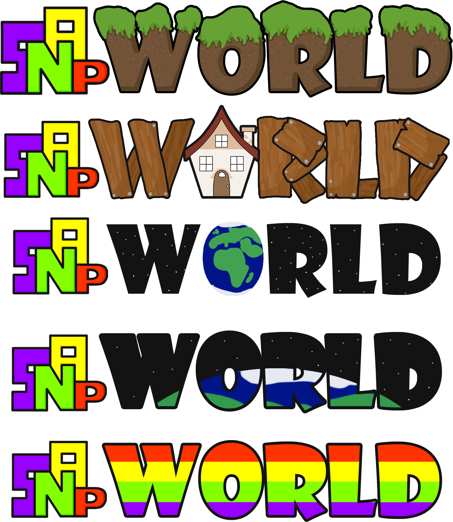
I tried to make some logo concepts focusing on associations with the word 'world' as well as what was featured in the game.
For my first design, I tried to go for a grassy feel to associate with the outdoors and adventuring, as the point of our game was encouraging kids to go outside and socialise with other children and connect with them. For this logo, I took inspiration from games such as terraria and Minecraft, as these games are popular among our target audience. I felt as though this logo was quite boring and didn't really match the style of the 'Snap' part.
Instead of looking at the adventuring portion, I then instead tried to take inspiration from the idea of socialising. Being that one of our previous name ideas was 'Snap World', I tried to go for a neighbourhood feel with this logo, and also took the idea of parts of our game being about upgrading your house by giving it a bit of rustic building planks. I also then used the house from the game as the O to further the idea of the neighbourhood theme, as well as pushing the upgrading the house more into focus. Some feedback I received on this logo was it looked like a 'house-flipper' game, where you were actually building stuff, whereas in our game you merely purchased upgrades. I also felt as though, for a minigame based game, it put too much focus on a reward system, when I wanted it to be more about the socialisation aspect.
My next two designs were heavily themed around the word 'world', though I quite like these designs, I found that they largely implied a more sci-fi theme than I would have hoped, as this was not at all related to our game.
The last logo design I tried was just based on the colours used for the snap logo, because I was struggling to colour match, however I did not like this design at all.
I then also made a reformatted option for layout which highlighted the 'snap' part of the logo more, whilst I considered this may have not been the best option since we didn't want too much focus on the console, as the game was it's own thing, my group largely liked this version more, as did a lot of people who offered feedback, so I ended up going ahead with this layout design, however still struggling with the design of the word 'World'.
During my logo design process, we received feedback from a large group of people, who offered some suggestions to help solve some of my issues, so I quickly sketched out some of these ideas. The general consensus was that my planetary-based logos were most favoured, but to help solve the concern of it being to sci-fi themed they suggested the space portion was what caused the issue, and that if it was just the earth without the dark background it may work a lot better.
The first suggestion was that there could be the implication of a globe by having the text for the word 'world' be curved, which is shown in my first sketch. The next suggestion was what was said previous, which is that there's a globe behind the text, however no space to imply the sci-fi genre. The third sketch shows houses on top, like the house from the wooden logo, just to further imply the community aspect as that's the reason for the globe, rather than just a planet.
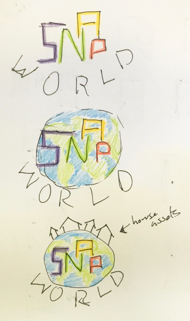
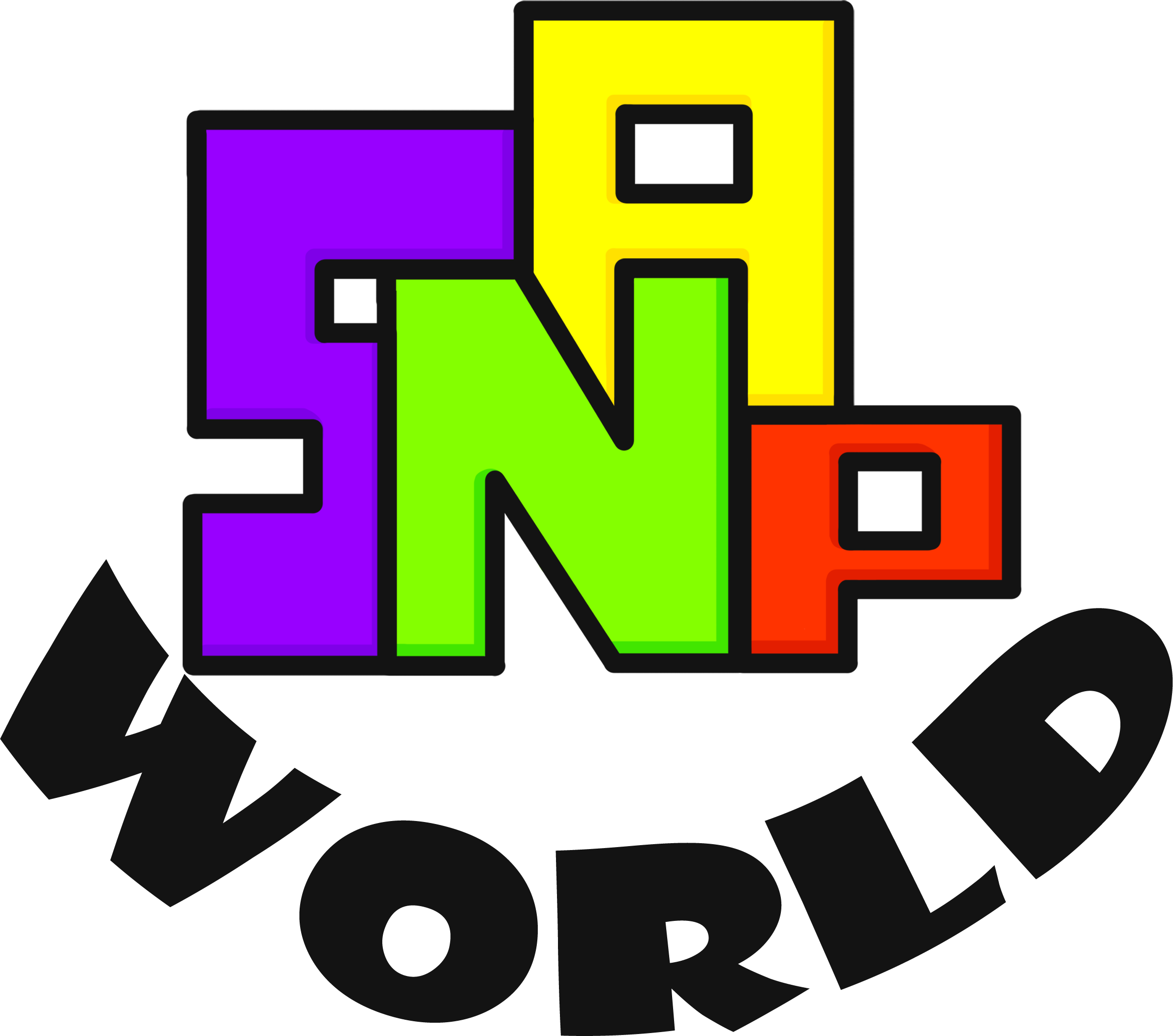
I started by designing the first sketch, however I found this to be quite dull and boring. Partially, I believe this was due to the fact that the word 'world' wasn't long enough to extend that far without being too stretched, but I also feel the design just looks slightly disjointed as a whole, so I promptly moved onto the next ideas.
For the next designs, I needed to create a globe to be situated behind the text as shown by the sketches. I wanted this design to be fairly simplistic, so I limited it to being the blue and green rather than including colours for deserts or ice or anything of that sort. In terms of continental shapes, I also tried to simplify a lot of them, as it didn't need to be a picture perfect map, although a lot of it would be hidden behind the type anyway. I then added a gradient to the outer rim to give the globe a bit more depth.
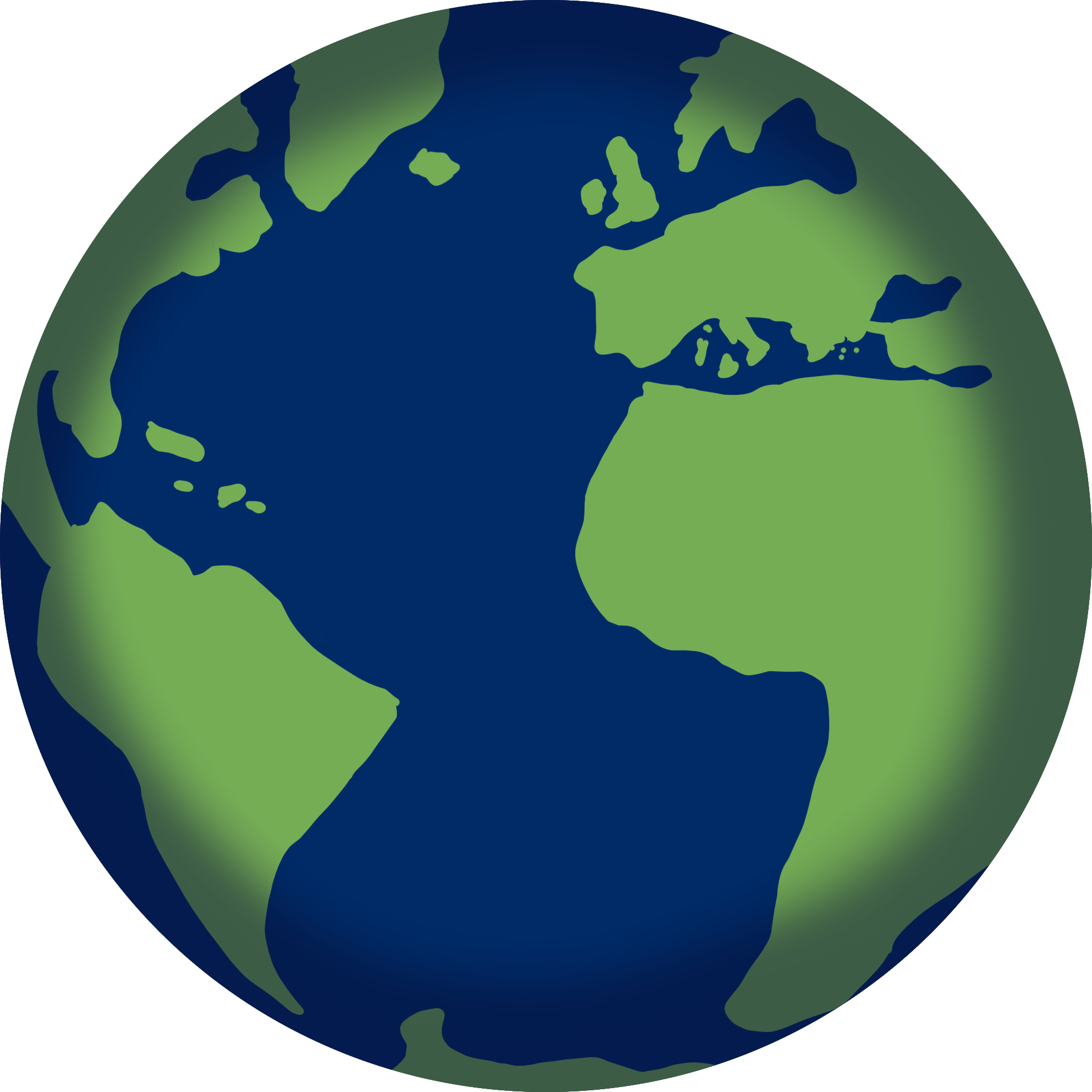
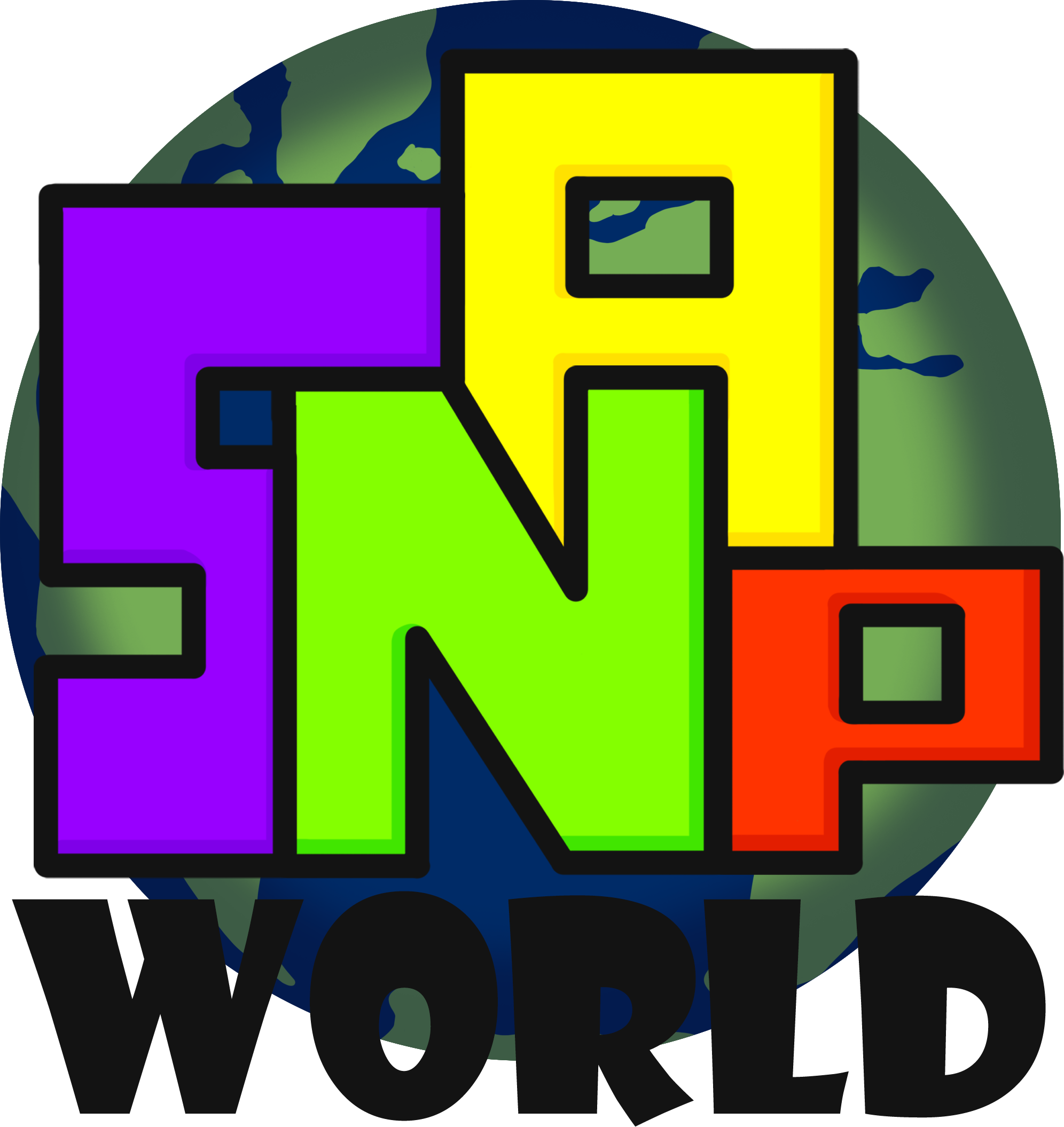
I then put the text on top of the globe design I made, and whilst this version looks quite nice and put together, it does seem that the 'world' part is slightly too hard to read, and doesn't really stand out too well. I tried some lightening of the type to fix this, but it all seemed a little awkward, so instead I resorted to using a lighter blue for the water as well as removing the darkened gradient on the globe, and it did turn out better than the other options. Overall, the removal of the gradient was also more loyal to the style of the game, as the game itself is very simplistic and lacks shading and details.
One thing that was changed from my sketch to this version was I straightened out the 'World' part to not be curved, this was due to my knowledge from the previous design that when the word 'world' is curved it's not long enough and looks a bit strange. Overall, I do think the flattened word works a lot better, and just helps with balance, as the word 'snap' already isn't the most balanced word.
[I think this design looks quite nice and put together, however the type of 'world' is slightly hard to read, as it doesn't stand out so well, so I had to fix this for the final design, by using a lighter shade of blue, and unfortunately removing the gradient on the globe. I did try some other solutions, however this was the only one that worked. The removal of the gradient also compliments the style of the game a lot better.
