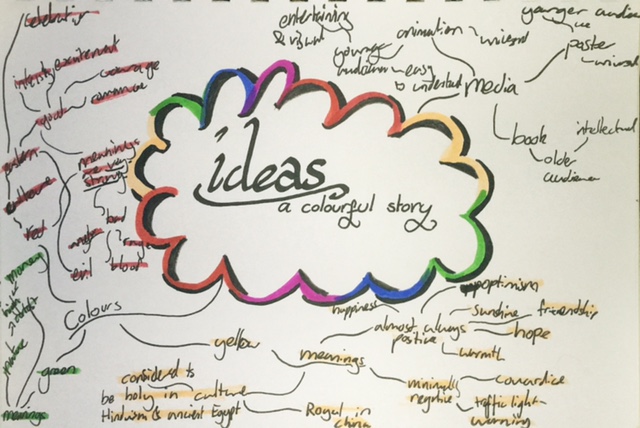
The goal of this task was to explore one of the briefs set by the International Society of Typographic Designers (ISTD). Rather than coming up with a detailed outcome, this exercise was to be exploring ideas and development of an idea. As a starting point, I chose the 'A Colourful Story' brief set that was about exploring the meanings of different colours, however picking one specific colour to study in detail.
I started with a mind map exploring the theme of 'a colourful story'. Since we were to explore multiple ideas within the theme, I did research into multiple colours, including red, yellow, and green, and added these meanings that I had uncovered into my mind map. I also explored the potential kinds of media I could express my idea within, or potentially express as this was a mini-project focused on research and ideas. Whilst looking at media, I especially focused on what kinds of media appealed to differently aged audiences. Whilst doing the mind map, I was especially fascinated with most of the things associated with green having clear opposites, however I didn't have much room to make this clear in my initial mind map.
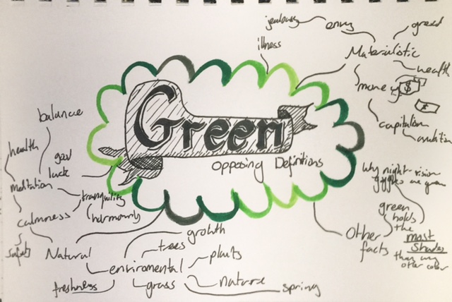
As I didn't have room in my previous mind map, I made a new mind map hyper focused on all of the themes associated with the colour green, however I split the mind map up into two clear, different branches. The first branch housed words to do with nature. This included plant-like words, and words themed around freshness and life, but also featured themes to do with calmness, meditation, and health. The opposite side of the mind map was much more to do with materialism, due to American money being green, which is the money seen in most media. This side housed words like capitalism, and wealth, but also spread to definitions such as ambition, greed, and envy. These two separate themes seemed to have directly opposing definitions, and both sides seemed to be in constant war with one another, such as most of nature dying due the coming of the modern world and big industries. Yet, both sides have the colour green in common.
Another branch I also decided to add to this mind map was neutral facts, such as night vision goggles being green due to green having more shades than any other colour to the human eye. I felt as though some of these facts could be useful further into my project.
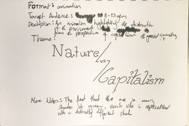
After using my prior mind map to create the theme of my project, I then wrote up a proposal to outline the different aspects to this project that I deemed important. The general concept of my idea was that it would be educating people about the bigger industries being the main danger to the survival of natural areas. Due to this being an educational topic, I felt as though the best target audience would be older children, as they are the future of our generation and are the most susceptible to information around them. Due to this, the most fitting media for this potential project would be to create it within an animation, as previously explored in my first mind map, this would be a good way to appeal to children. As well as this, the media of animation fits well to the theme of 'a colourful story' as visuals are a good medium for storytelling. I also added some other notes to my proposal, such as the factor of there being the most shades of green, as mentioned prior, which would mean it would be quite easy to represent the two sides with two distinct shades.
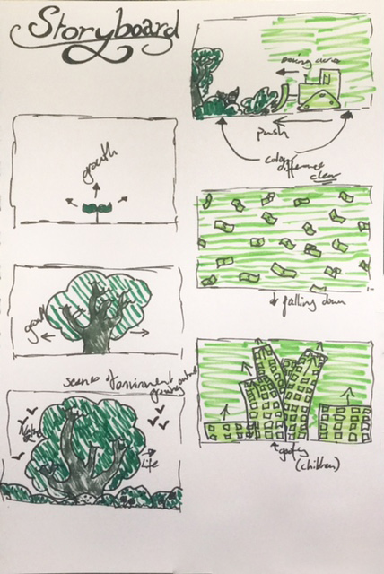
Due to the theme being a colourful story, I felt as though a storyboard would be integral to the development of this project. The storyboard begins in the top of the left column and travels downward before moving onto the next column. The story beings with the growth of nature, and a sense of flourishing as it grows. A few frames a focused on this growth, as I felt it was important to focus on this, and become grounded by it. Quickly after this beautiful scene is created, it gets forcibly pushed out of the way, before dollars start raining from the sky, creating way for green skyscrapers to start erupting from the ground in it's place. Due to the age I was aiming at being of a younger audience, I wanted the art style to be a bit goofier, especially when looking at the springing up of the skyscrapers. It's also visualised in my storyboard how the two different shades are distinct from another, and the coming in of the green of materialism makes way for a completely different scene.
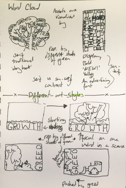
I then started to look at the sort of art styles I would use for this task, as at this point the project didn't have too strong of a link to typography. My first idea was to do a word cloud, where each asset of the animation would be made up of the main key associates of that theme. Such that the imagery that were on the nature side would be filled up with words that were on the left side of my green mind map, and imagery that were to do with capitalism would be filled up with words that were featured in the upper right of my green mind map. This would mean that the words wouldn't be as in your face, but at the same time would act as an implicit notion and would possibly go into the watcher's head without realising.
for the second style, it would be more bold, and the focus of the animation. The words would move as the scene grew and changed, as seen by the tree growing from the word growth, as the word growth would get bigger, or as the seen transitions to more of an industrial word, it's the word greed that pushes it along to there. This style would make it so the watcher definitely knew what was going on.
In both styles, I wanted the nature related words to have a serif font. This would link it to traditionalism, and having a sort of storybook font would link to the story theme as well as it appealing to children. By contrast, the font associated with materialism and capitalism would be a san serif, or a display font to represent the new era coming in. The font would be modern and flashy and 'new', the sort of thing an advertiser would use, as it would be quite bold.
Made on WordArt.com
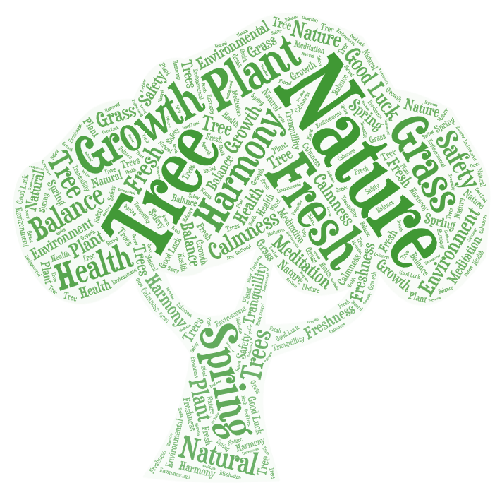
To illustrate the word cloud idea better, I made some of my own to further strengthen the idea of my theme. I put in all the words I had on the left of my mind map and used a serif storybook-like font I had envisioned. I tried to make the more important words to the theme larger, and the less focal words a bit smaller, as per the use of a word cloud.
Made on WordArt.com
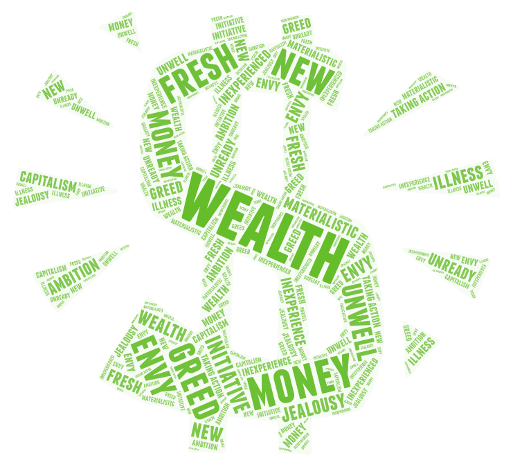
I then also made another design for how the imagery on the capitalism side of my animation would work. I'm not sure the font choice is quite as fitting as I would like, but it still gets the point across of being a shouty, bold, sans serif font. For this design I used all the words I had in the upper right of my mind map and, again, tried to make the words that were more important to my theming larger.
One interesting thing I found when making the word clouds is that the word fresh seemed to apply to both opposing definitions I had. For nature, it applied to fresh air, and feeling fresher and healthier as a person. To materialism, it applied to the theming of always needing to have the new "thing", such as items being fresh and you needed them, or this era being new, and therefore being a fresh era.