Last semester I completed the beginning phase of this project which consisted of me obtaining a client to make a board game. The problem that I was assigned to solve was that my client, the board game society, had players who really enjoyed playing board games with lots of player interaction, however they had issues with people “bullying”, or having poor reaction to interacting with each other in negative ways. I solved this by creating a board game that rewarded players for taking positive actions with each other, and punishing negative actions. Players still have the option to make plays against one another, but it is now a strategical choice rather than doing it for the fun of it. The theme of the game, which will be further developed through my work this semester, is players playing as witches preparing for a duel to become head of their coven. In the final round, players battle with a unique gaming format using the cards they have accumulated throughout the game.
The target audience for this game are people between the ages of 18 – 25, where board games are most popular, mainly students of that age, as they were my clients. The USPs of the game are having a lot of player interaction with a karma system, and the unique duel round at the end of the game.
To view more about this phase of my project, see my work on Coven Chaos.
The goals for this term is to complete the branding for the game, and finalise many of the assets needed to play it. At its current stage, this involves cards, game boards, tokens, an instruction manual, and a box design. The most important thing for this semester is to have a clear idea of the branding, so that even if I do not have everything done, I, or someone else, would be able to continue this project and complete everything. This would most likely be published as a brand guidelines document to outline all of the branding choices and stylisation. I will be using the brand guidelines document as my handover document.
To begin, I felt the most important thing to start with would be making a logo to represent the game, which also involved naming the game, as I had not officially done so last semester. One of my reasons for this was to give the name the proper research it deserved, which is where I began. One of the themes I came across when researching other board game names was the company ‘Leder Games’ (Leder Games, 2023). One thing all of their games have in common is that they are all four letters: Vast, Root, Fort, Oath, and Ahoy. This not only creates a short punchy name to remember, but also the names all give an insight into the uniqueness of the game with only one word. As some examples, Root is a woodland game in which animals fight for their right of ownership of the forest. The roots are also the heritage of each faction they play. Oath is a long style game which allows you to continue a larger story across multiple plays of the game, and an oath is a long-lasting promise. Fort is themed heavily after players playing as kids building a fort, and has a lot of immersive themes to deliver this effect. It’s straightforward, but it sets up the expectations.
To help give me inspiration for a name, I decided to name my game using this four letter theme and imagery. Some I came up with were ‘Duel’, to refer to the uniqueness of the end game duel, and ‘Cast’. I liked Cast as a name because it game imagery of an action, casting a spell, similar to when I hear the game ‘Ahoy’, it presents to me an atmosphere of pirates cheering, fists pumping in the air. Along with the act of casting a spell, as witches do, some other connotations I related were the cast of a play. This related to the communal aspect of the game having a lot of player interaction. Another link I made was the idea of casting light, or casting shadow, linking to the karma system of the game. Though I think these are stretches to make direct links, they do provoke the imagery. The word may have that implication in some people’s heads without realising. I do understand that the word could be understood to mean a hospital cast, or the casting system in India, however I do not think a board game would be relevant in any of these contexts.
To reinforce the theme of magic through my logo, I wanted to have that as imagery within the logo. Though I do understand the desire to be simplistic in a logo, my analysis of video game and board game logos is that they are very decorative to create immersion with the player, but sacrifice usability in many areas, mainly because they only need to be displayed in one place.
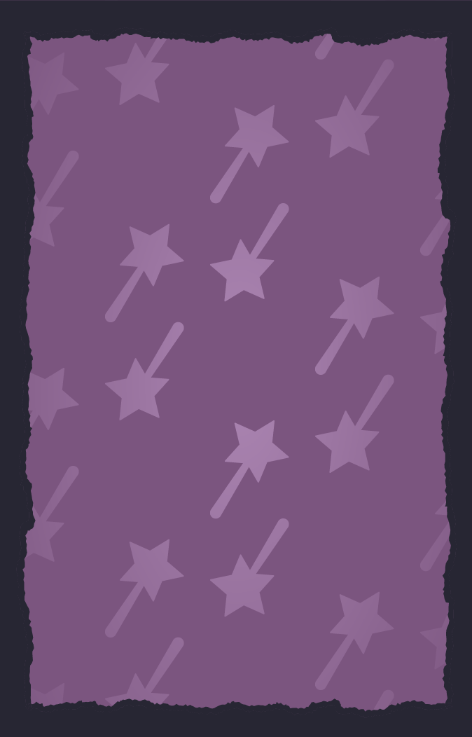
With my sketches, many of them featured spells getting cast across the logo, and I knew this would be hard to recreate without the logo getting too overcomplicated. I decided I would go with the design of multiple flowing spells, as pictured in the bottom right, to best illustrate the theme of multiple witches battling in a duel, and their spells crossing over each other in the air.
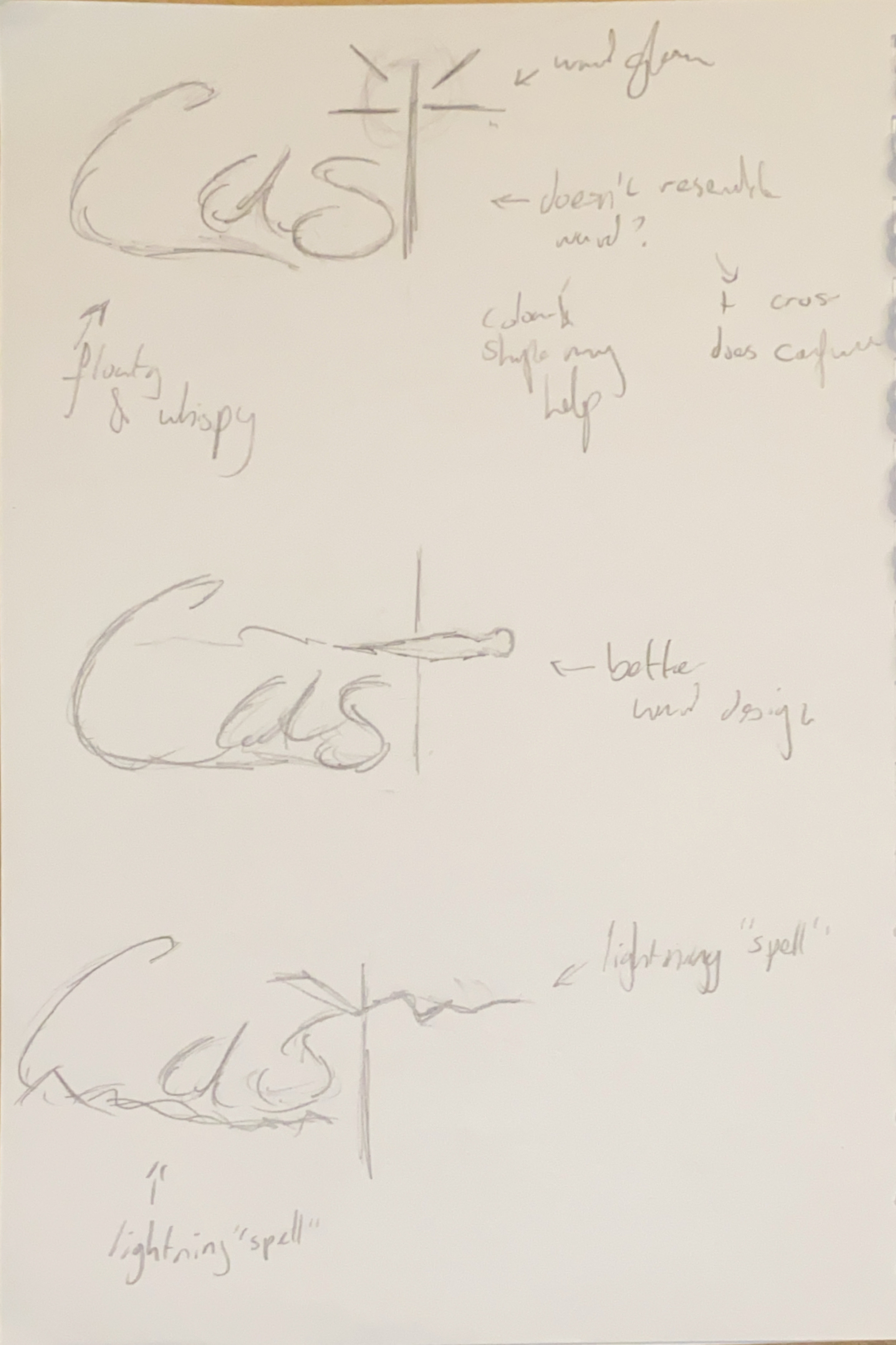
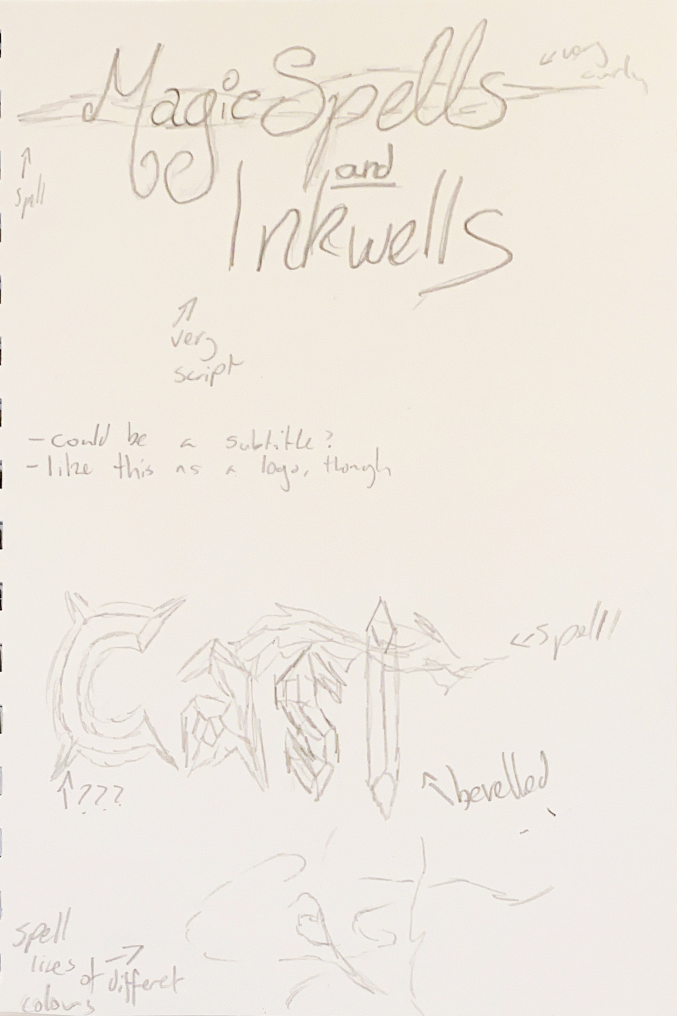
With my first design, the imagery I wanted to invoke was both glowing spells, as well as type that was angled as though it was written with a fountain pen or quill. This goal went well, as I think it achieves the written effect, and I was able to do this by utilising the ‘width tool’ in Adobe Illustrator. This was my first time using the tool, and though it took some understanding, and a while to shape it how I wanted, the outcome of the shape looks how I envisioned it.
My goal of glowing spell imagery was a bit more debatable. I had tried using a tutorial on glowing effects in digital art by Pierce (2014), but something was not right about it. It looked vaguely, but just did not come together in the way that I had initially desired. I received some feedback for the logo which involved making the ‘t’ all one colour for readability, and removing the white lines in the strokes, which I had added with advice from the tutorial.
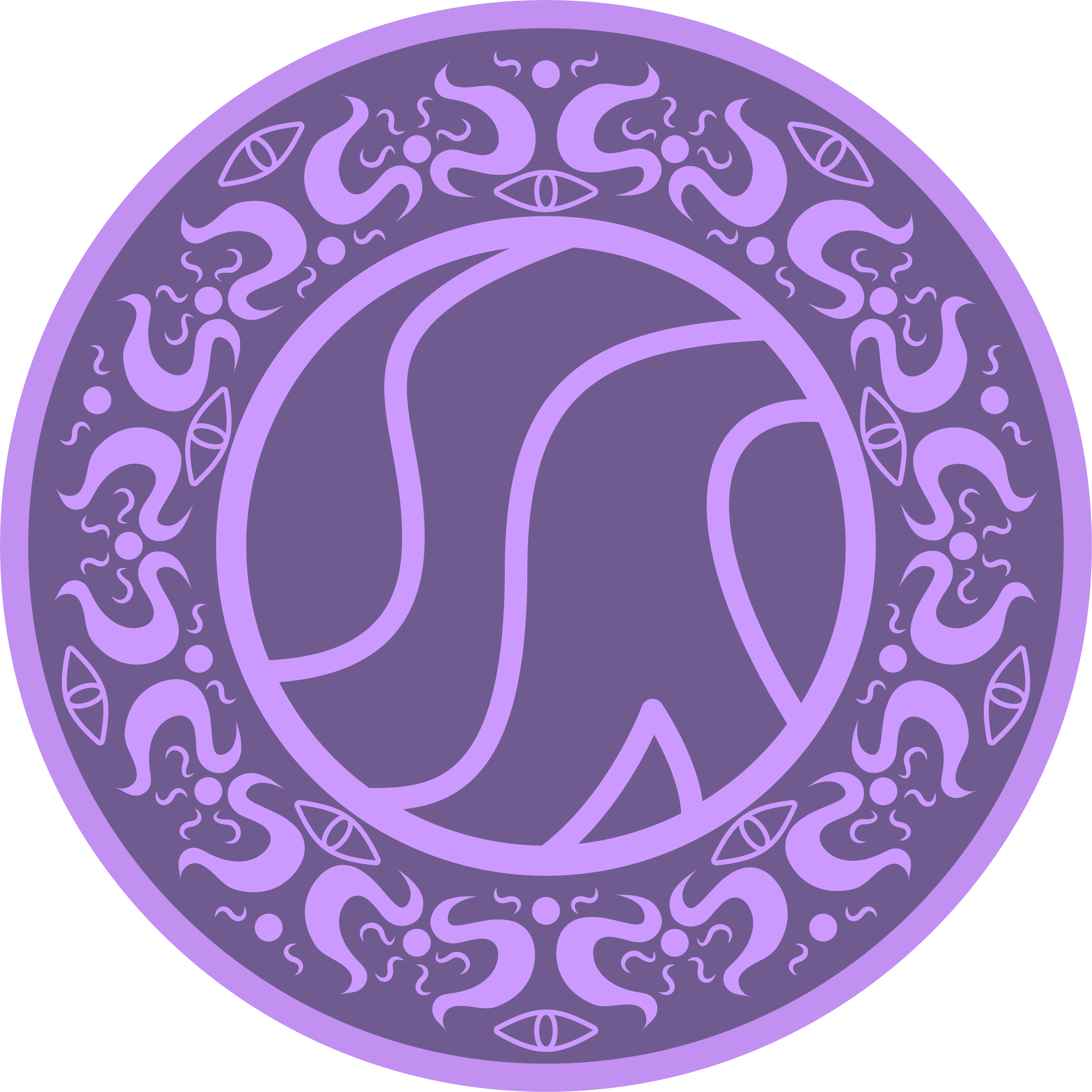
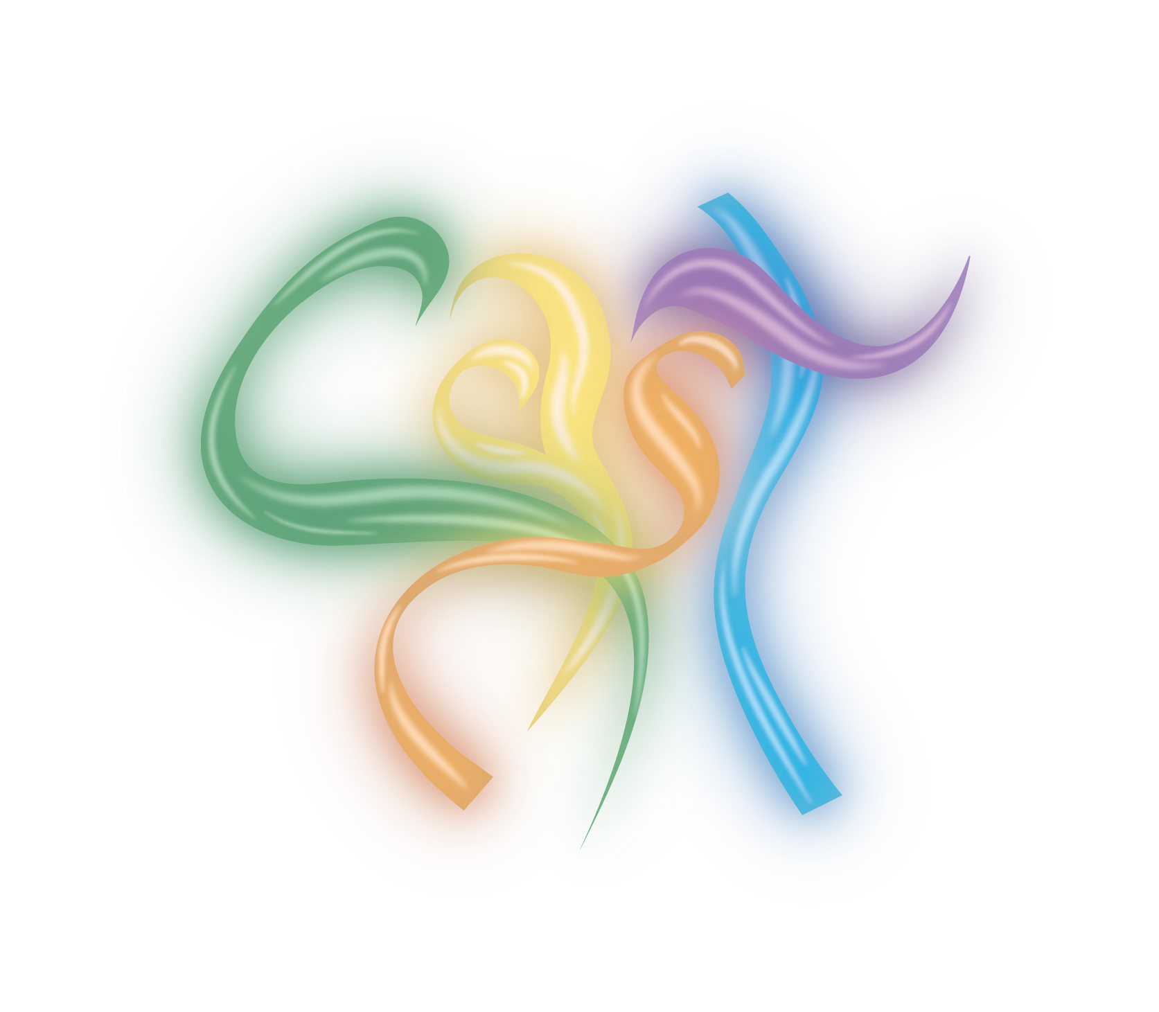
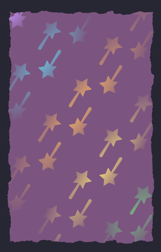
With the colours for the logo, I used the colours of the five magic types to further the theme of magic spells all erupting at the same time from witches in a duel, and the idea of people against one another. It also advertises the five asymmetric roles in the game. I do like how the colours turned out, however making the ‘t’ all one colour proved to be an issue when removing the purple from the logo, which was very important when it came to balance and representation.
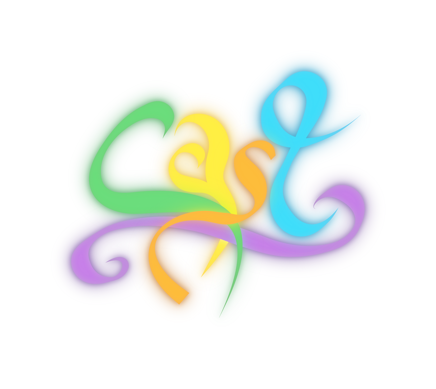
Due to making the ‘t’ all one colour, I also needed to change it’s shape so that it was one continuous line, which in the end proved better for the readability of the logo as the ‘t’ now looked a lot more recognisable in both shape and colour. It also reinforced the handwritten fountain pen look, and in retrospect the previous version looks rather floppy. In solving my issue of the missing purple, I added an underline to the text, which completes the logo in a way I felt it looked unfinished before. The new version does, however, sacrifice the theming of spells intertwining across each other slightly, but it definitely resembles something magical in origin, and I’ve received many good comments about the new version of the logo.
Last semester I wrote out all the cards and their abilities, however just used a placeholder as a design to display them on. My initial idea was to display the text on the card as if it were written on a scroll, like some spells are written on scrolls, since the cards are meant to be like casting spells in the game. When I started drawing this out, however, the design didn’t balance well on the scroll as it was angled, and it just didn’t fit well. A common theme within my work is balancing stylisation over optimisation, and this was one of the times where I had to admit my idea just did not work.
Instead, I took inspiration from earlier stylisation in the project of using a handwritten theme. Part of the brand I will talk about later is the imagery of someone studying and writing in a book, a witch preparing for a duel. This gave me the idea to make the card design on a book page, it was similar to the scroll idea, but gave a more regulated shape to work with.
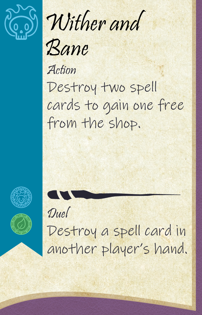
Through research, I found many games put important information on the left edge of the card, which I understand is because this is the edge you see when fanning out cards in a hand. Due to this, I put important information on a bookmark on the left edge such as the magic type, and whether the spell was corrupted. I did also spend time creating fun names for all the spells to further immerse players within the world.
Last semester, I had planned to give each spell an illustration for the card, however when it came down to it I did not have the time, as there are over 40 different cards. In reflection, I do really like this design for the cards, and could not imagine where an image would go on the design without either interrupting information, or ruining the theming of the card.

To inform my design of the back of the card, I looked at some examples and how they used imagery to decorate the back. The cards pictured here are from the games Root (Wehrle, 2018), Equinox (Knizia, 2021), Ahoy (Loring-Albright, (2022), Wyrmspan (Vogelmann, 2024), Adventure Mart (DigiSprite, 2020), Astra (Krisztina Sas, Porkoláb and Schőberl), and Fort (Rodiek, 2020). I picked out these designs as they seemed to either match the visual style I was going for, or the theme. Initially, I assumed I would put the logo on the back of the cards, but looking at the examples, it really wasn’t common to do that, even among the games that didn’t need to differentiate decks. I also assumed that borders would be more common, and whilst they were used, many had very stylised borders to increase immersion of the game, like breaking the bounds of the border with an illustration, or using a textured edge rather than a clean edge. Many cards had full art pieces, though I knew I wouldn’t be able to achieve this in the time, I instead took inspiration from the organisation of information, and the content on the card. I then started creating designs using the assets I already had made.
I liked the imagery of a magic wand I had used earlier in my project, but had mixed feelings on the design I created for it. It looks professional and well-made, but maybe more suited to a custom deck of playing cards than a board game. I tried to make the coloured version a little more exiting like the colours of the magic and logo, but instead the colours just ended up looking unbalanced and uncoordinated. Both versions looked a little childish, as I think the imagery for the icon was used incorrectly. I also think the design doesn’t mean anything. I tried to use the texture for the outline, but it just doesn’t have any context. I did, however, pick up some skills in Illustrator whilst making this design, such as the ‘compound path’ function to apply a gradient across multiple objects.
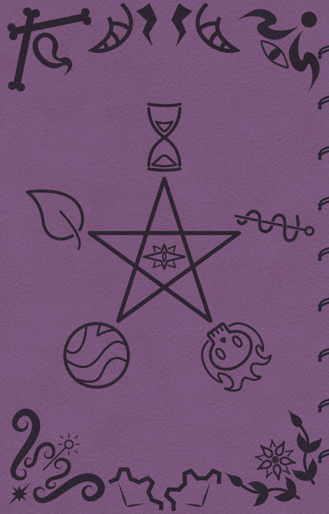
My previous design was created prior to making the front design for the card. After the attempt, I took a step back and begun to work on other designs, and after creating the card front, I had a new idea. Inspired by the card back imagery, and doing research on some visual references on spellbooks, I decided to take inspiration on my card front being based on a book, and have the back act as the cover for the book. The imagery depicted does give a sense of ‘forbidden tome’, but I do think the feel of a forbidden knowledge is intriguing, and the imagery does relate to my witch-theming well. The pentagram shape is also used elsewhere in the game for mechanical purposes, so makes perfect sense for it to be used here in context. I like that the design, paired with the card front, give an immersion of casting spells from a book whilst you are playing. I also added a spiral binder to the design to enforce the imagery of a book, and enhance the feeling of a handwritten book the player is writing in.
When creating the design, I decided to use a leather texture rather than having purely flat colours, the idea is that the book is leather bound, which makes sense in context. By using the ‘compound path’ function I just learnt, this made the process a lot quicker.
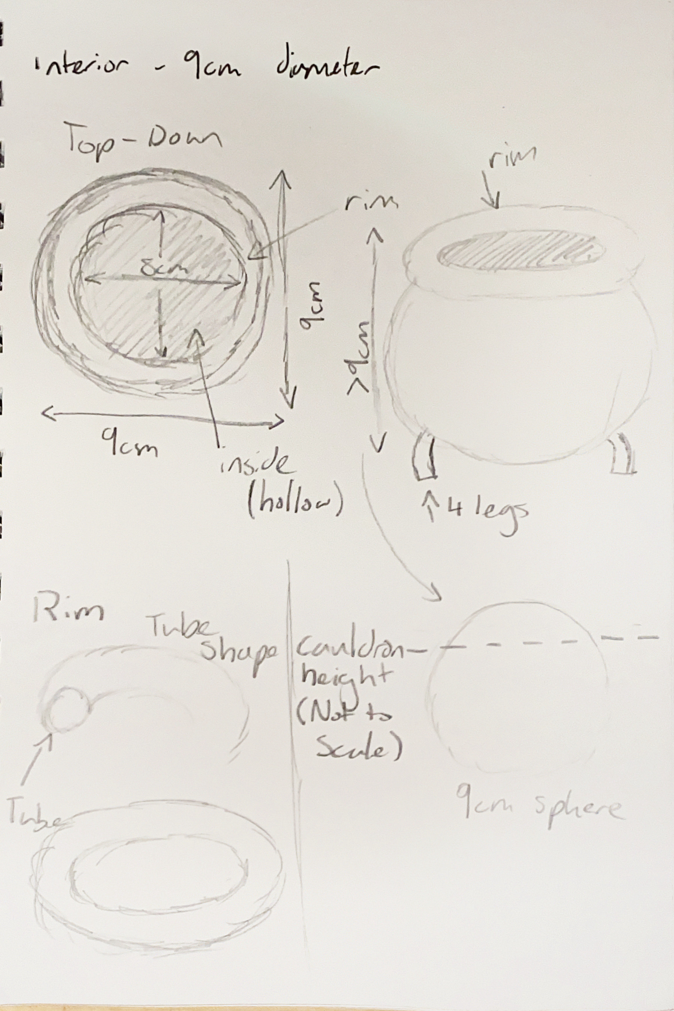
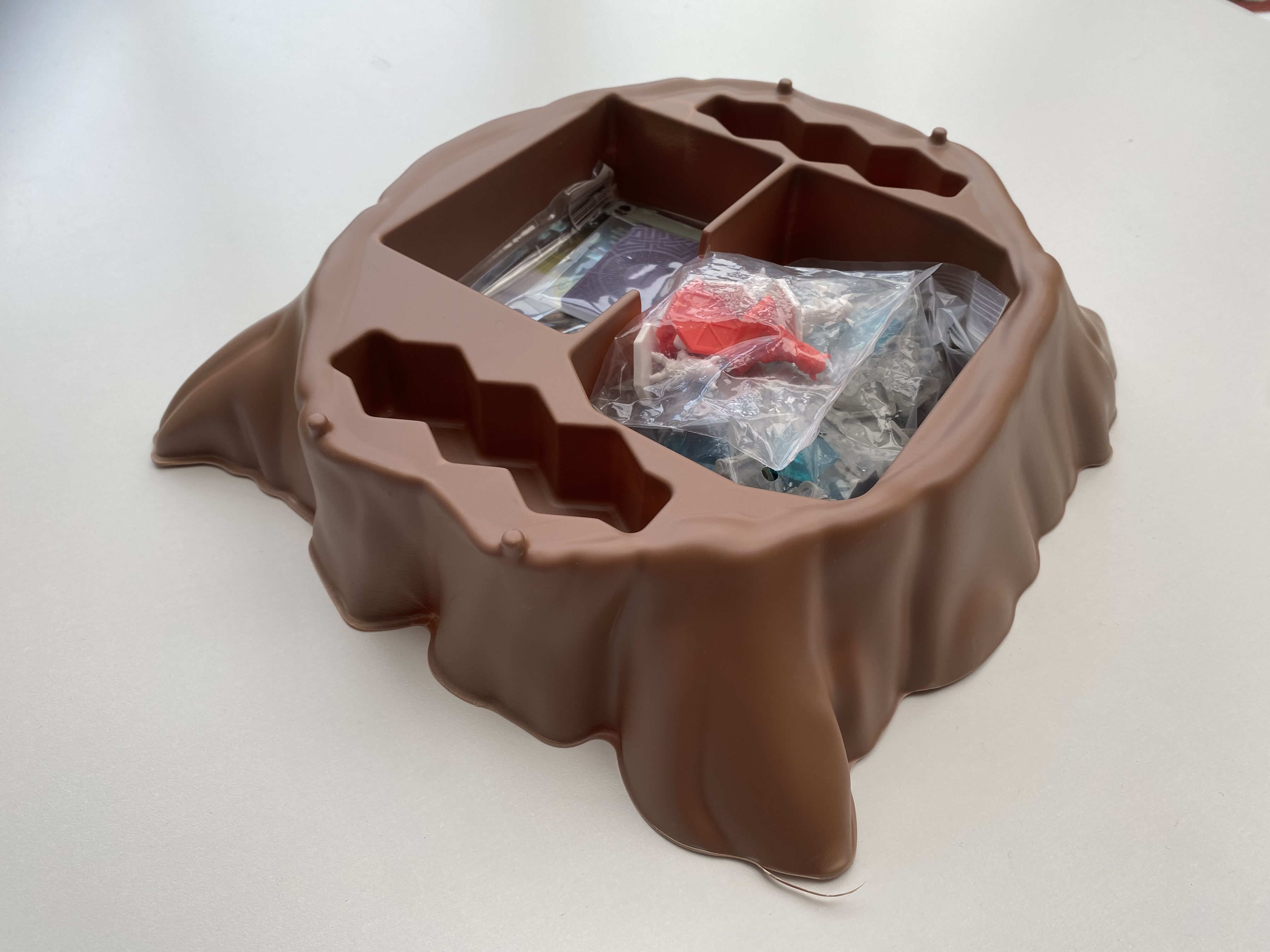
As I had planned to work on my 3D skills for this project, I decided to make a cauldron to store the tokens for the game in whilst playing, instead of having them on the table. This idea was from some feedback I received last semester whilst user-testing.
I created a sketch for what I planned to make in the 3D software, however before starting, considered the sustainable practice involved with this. To print and put a large chunk of plastic in every game not only wasn’t fuel efficient, but using that much plastic is not very sustainable. By looking at the United Nations Sustainable Development Goals for 2030, we can see, by looking at Goal 12, it would be going against sustainable consumption by producing a lot of waste (United Nations, 2015).
Here are two examples of eco adaptability in board games. One to show what a good sustainable option might look like, and what a less sustainable option might look like. In the game Ragnarocks (Gord!, 2022), there is a large tree stump made of plastic that takes up room in a box that could otherwise be a lot smaller. The stump serves to create immersion in the game, but just ends up being a tacky piece of plastic. Though it does store the pieces for the game, there are much better ways to accomplish this.
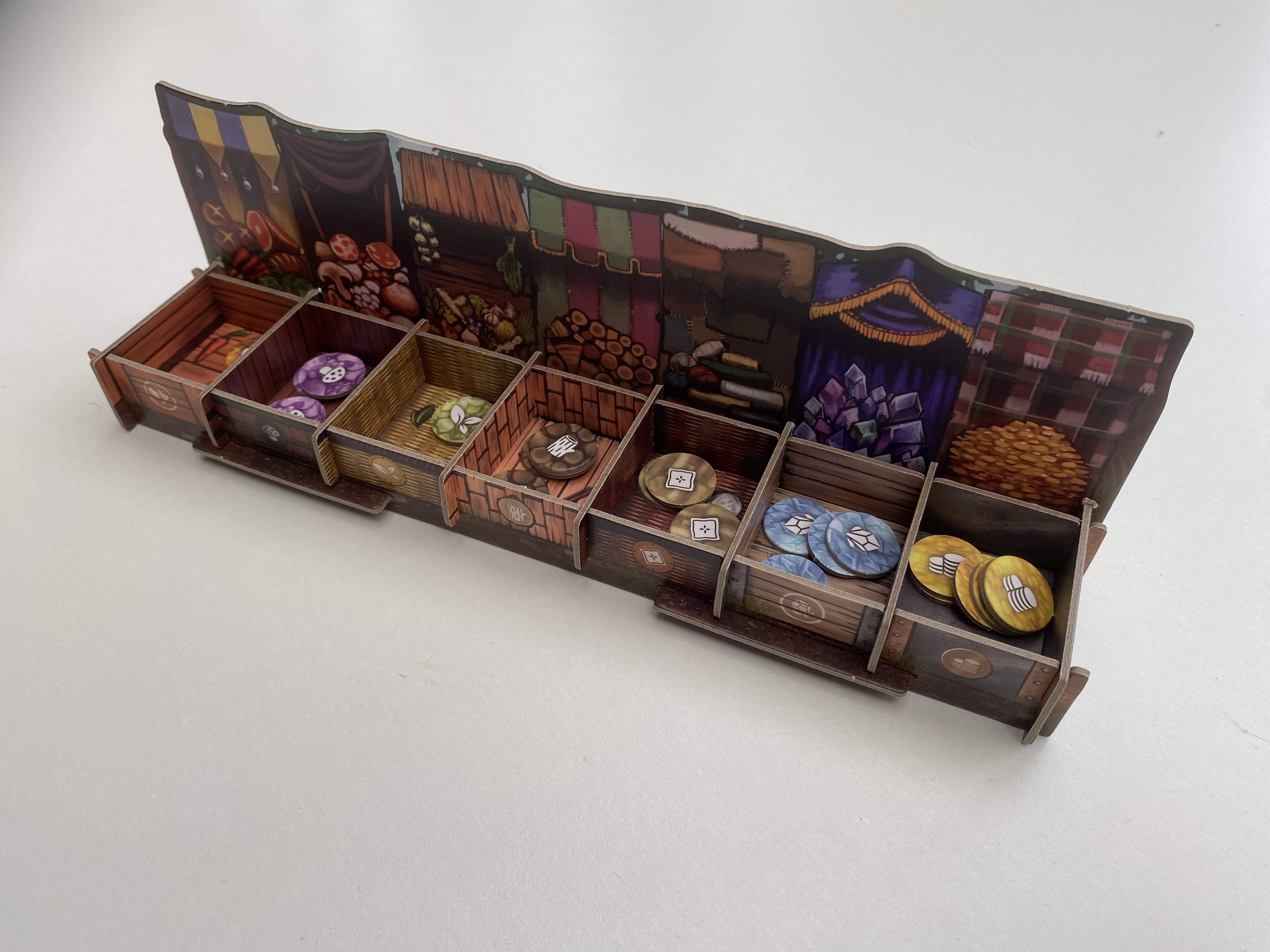
As a better example, in the game Familiar Tales (Hawthorne, 2022) tokens are put in a cardboard unit that fits together and organises them well. Using cardboard in the design is a lot more sustainable to use, as it can be made from recycled materials as well as be recycled when manufactured, and after it has worn it’s use.
Instead of 3D modelling a cauldron, I will instead make a cardboard cauldron to slot together to hold the tokens.
This is the design I would use for a cauldron that slotted together for use in the game to store tokens. There would be four edge pieces that would slot into the tabs on the green bubble texture to create a cauldron. This variation of the design is also good for utilisation of space, as can be easily disassembled into a flat version to take up less room in a smaller box. By using cardboard in the design, this is a lot more sustainable.

When creating media for consumption, it’s important to use sustainable business practices. This isn’t just about resource consumption sustainability, but also sustaining culture, and human well-being, which are currently not as optimal as they could be, especially in certain countries where it can be dangerous to be a minority group. By creating my board game, I hope that I can work towards helping to achieve Goal 5 and Goal 10 of the United Nations Sustainable Development Goals for 2030 (United Nations, 2015). Goal 5 is about achieving gender equality and empowering women, as in many countries they do not have equal rights. By working towards this goal, I also hope to work towards achieving Goal 10 of reducing inequalities by helping empower women in other countries, where they may otherwise feel threatened.
In media, women are often underrepresented by a wise margin. Using data from Lavey (2018), we can see that, in 2015, women made up roughly 25% of representation in media, which does not represent the proportion to society, which is 50%. Underrepresentation of women is a clear issue within society. Lavey states the best thing we can do is to raise awareness for the issue, and I believe I have encountered a rather relevant way to do so. Sundén and Paasonen (2020) state that an online resistance of feminists are battling misogyny by reclaiming the term “hag”, which is used to “embody shameless femininity and feminist solidarity”. This can work in conjunction of my theme of witches, who may have historically been viewed as hag-like now being symbols for an ability to be care-free and embody a pure femininity without having to prove it to anybody, as it is only important to themselves.
In many modern media depictions nowadays, witches are typically depicted as being modern powerful symbols for women in contrast to their most famous portrayal in the Salem Witch Trials which centred around persecuting women for daring to be different.
Modern media depictions of this “new” witch include Cole (2022) singing about a W.I.T.C.H being a “Woman In Total Control of Herself”. The song details many rumours created about this “witch” however, as the song describes it, this is just a woman being herself which leads to her being ostracised by society.
The United Nations (2015) also state that girls can help the issue by “empowering female classmates”. As my game has a lot of imagery of studying for something, this does create imagery of a classmate, and my target audience of students are of this age, so one way to continue to help this issue is by creating positive role models of the characters that girls and women can look up to and relate to. These also serve to prove as strong female figures to boys and men growing into this society where they can see a “real” female character who is confident, and can apply this same respect to other women they meet in their life. The United Nations also states we can help by “address[ing] unconscious biases”. In many games, and media in general, pronouns can be reserved to only speak to men by using he/him when addressing the reader, or any unknown person. It can be debilitating to a persons morale to be immediately discarded as a possibility without ever being considered. By the playable characters only being women, this strengthens the inclusion. Instructions in the game will use they/them to refer to the players in order to include everyone who may be playing.
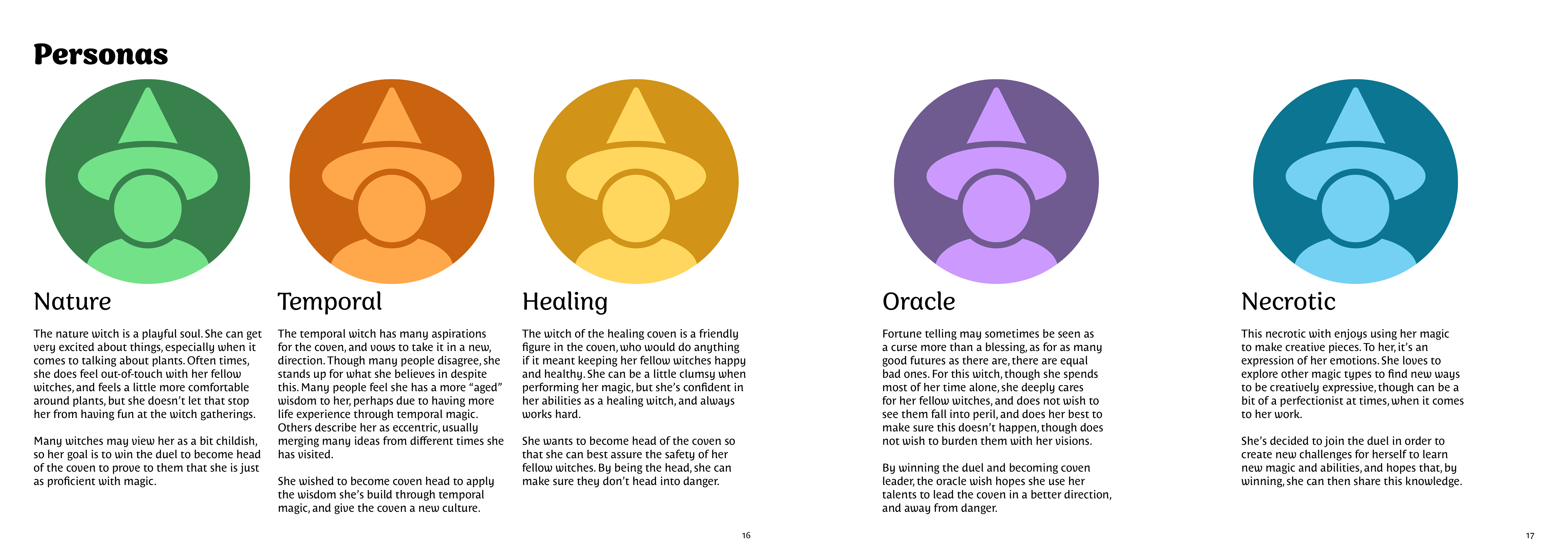
To create these positive role models players can look up to, I need to give each witch you can play as a defined personality with both strengths and flaws, as well as giving them a clear goal as to why they are present in the duel. The character personas can’t be too specific, so they can appeal to a wider audience, and many play styles someone may use. It would be jarring if one character were to “do no wrong” but the player is happy to use as much corrupted magic as possible, so it’s important to have a balance of detail.
The personas can be better viewed in my brand guidelines document.
Though I had many aspects of the brand identity for the game figured out, I needed an official document to write it all down to keep these aspects consistent, and to create a document anyone else could use if they were to make media for the game. Because I had a very clear image for how I wanted the game to look, I had thought it would be easy and quick to make the document, however this was not the case. My first hurdle was trying to figure out all the information I needed to deliver. I had a clear image of what something would look like, but some aspects I had not considered writing down, which is why I took inspiration from brand guidelines for large companies, as these not only helped with organising the information, but also what writing was important to pair with it.
My main inspiration was from Starbucks (Starbucks Coffee Company, 2019) as I best liked the information they delivered to people doing branding but also liked their organisation of such informtion, but I also took inspiration from Spotify (developer.spotify.com, n.d.) and ActiveCampaign (www.activecampaign.com, n.d.) for other features of the guidelines. After viewing the way Spotify organised their branding, it was easy for me to impose my own conceptions of my brand into their organisation system. I did change some names and added some of my own sections, such as 'Personas' and 'Anatomy' to explain sizes and diagram sections of the design if someone where to make more. Another section I deemed important to add was one on textures I had used, as these were important to record to maintain consistent design. One of the larger sections of my brand guidelines document was the imagery section. Though I was concise explaining the more general imagery themes, I wanted to explain the different visual style for each of the magic types. This did make me worried and slightly concerned that the game imagery may feel a bit mismatched from an outsider’s perspective, however I have not noticed an issue until now.
I think another thing I struggled with whilst creating the guidelines was the fact that I knew the information was in my head, but was struggling to put it into words, or having a visual style I wanted to use, but not having the words or correct terminology to explain it. This is where pairing the information with images was handy, however it did take a while to gather all of the assets used.
When designing the document, I would have liked to make it look more visually appealing and in-theme, similar to the examples I looked at, however I did not feel I had ample time to accomplish this, and at least I can ensure now that the information is being delivered efficiently without visual distraction. One thing I did notice when making the document is that, whilst I had fonts picked out, both were script fonts and would not work well on something like a website or anything using large blocks of text. I then created an ‘immersive’ set of fonts, for creating assets, or immersion in an advertising piece, and an ‘accessible’ set of fonts for more professional usage. This is something I haven’t seen any other company do, so it is hard to say whether it was a good decision or not, but I do like the accessible fonts I chose, and whilst still slightly stylised, they are serif and sans serif fonts, so can lend well to easy-reading.
Overall, I am really pleased with the brand I have produced. Not only seeing it within the assets I have created, but also seeing it conceptualised within the brand guidelines. I also truly feel that there is enough detail on there that someone could easily pick up the project after me and continue with the consistent branding, which is nice to think about as the concept of making a brand guidelines document is new to me.
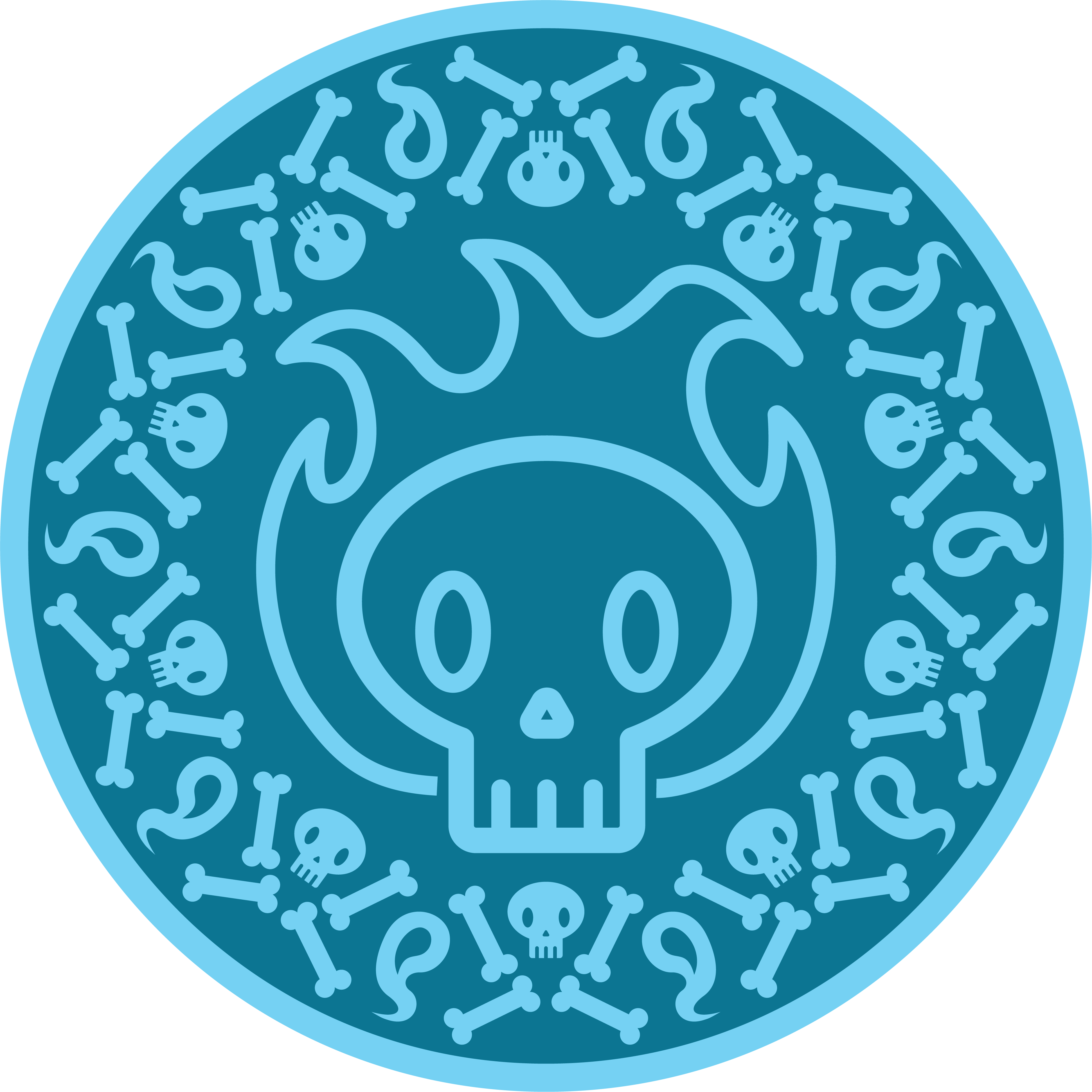
Though I don’t have much detail to go into for creating these assets, these are some of the assets that most helped me develop the visual style of the game. I particularly enjoyed creating the tokens. The imagery for each token is both detailed to give immersion, and also distinct from a distance to give an idea of style without actually seeing the imagery. One of the things I enjoyed best about this was experimenting on how to create the pattern surround the circle. My favourite example of this is with the purple icon representing oracle magic. One slight issue with the designs is that only the oracle one is completely circle based, though I do think the others fit well enough.
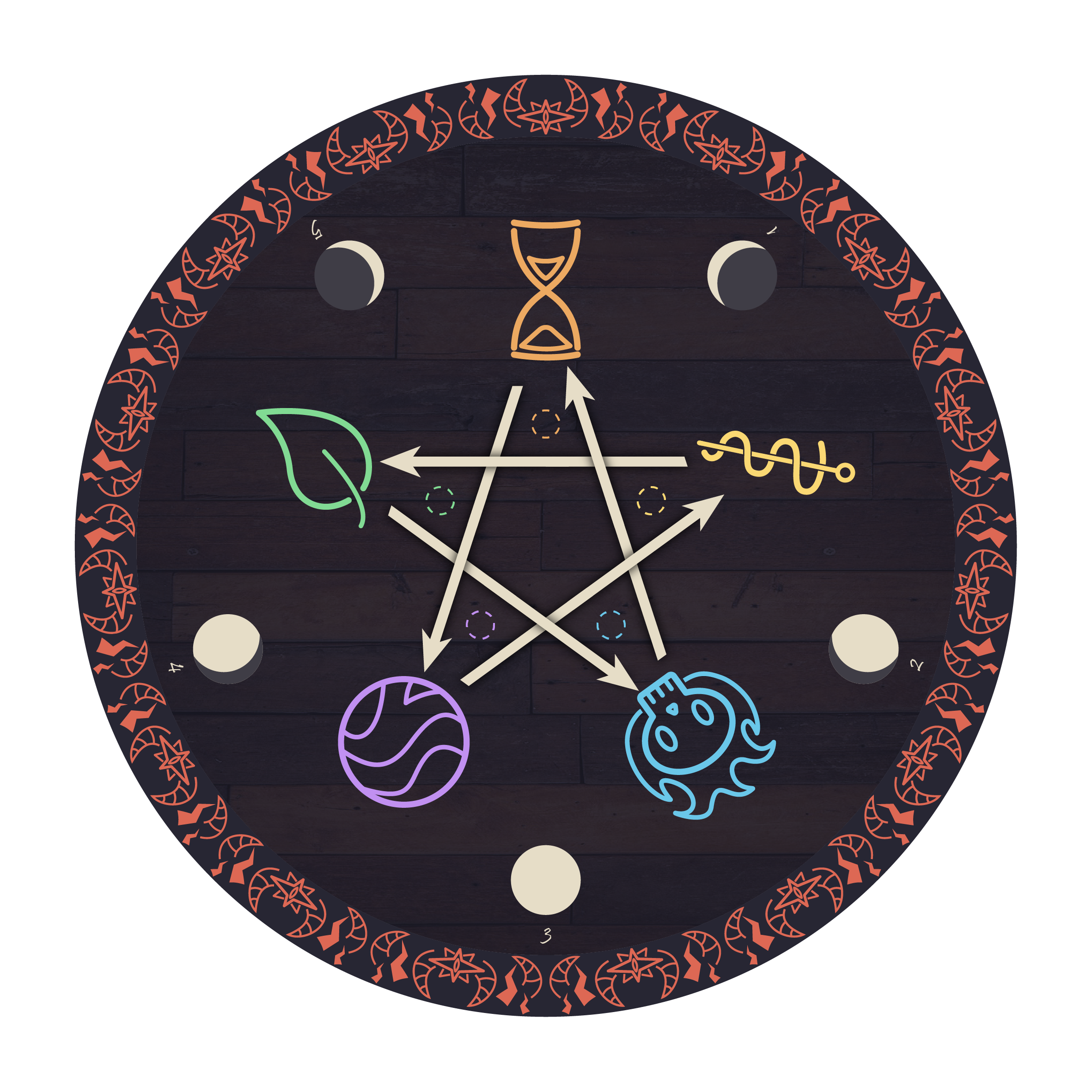
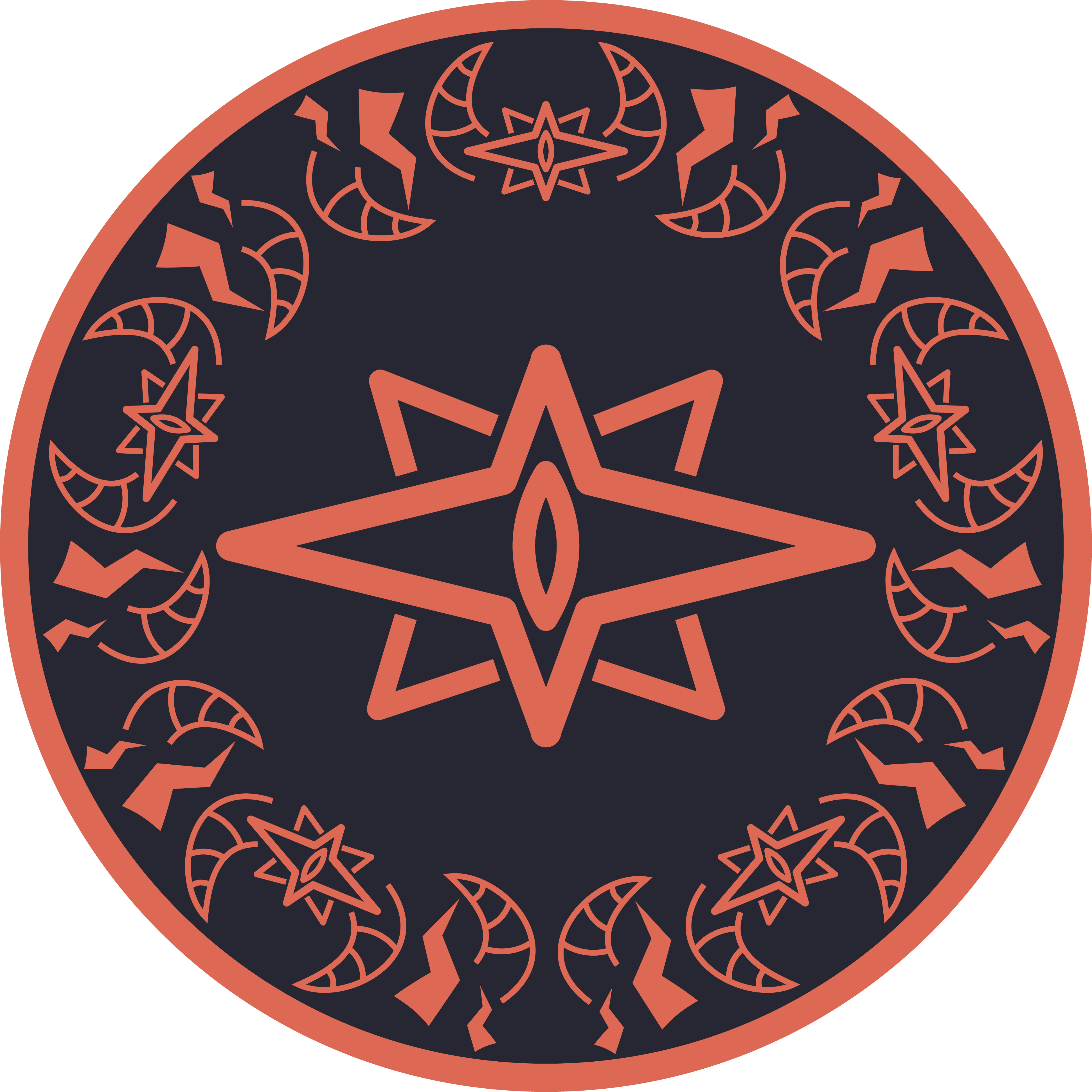
When making the board, I decided to merge the design for the magic chart and the round tracker into one. Since they are both base five, the design just works perfectly. I used the wooden texture to give an atmosphere of drawing a ritual circle on some old floorboards and, whilst a bit creepy, the design does seem to work really well. Based on some visual inspiration, I made a version of the pentagram with overlapping arrows which took a while, but I believe it really completes the design.
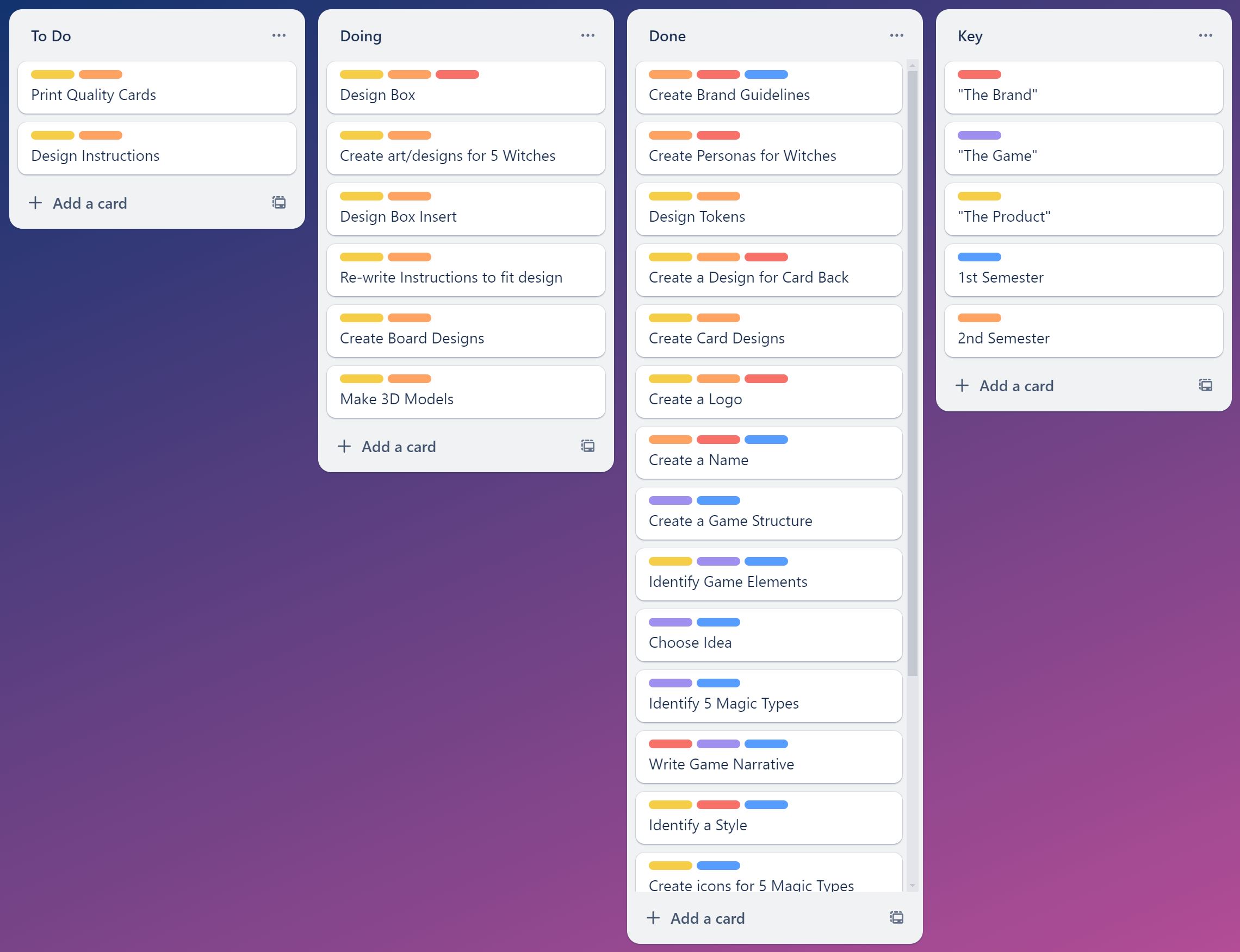
Using Trello to create a to-do list best suits my way of working as I am able to pick up tasks when I feel the inspiration to do them, and easily add tasks when my plans change. One example of when this happened was when I was creating the card backs, I was having issues finding imagery, so I went to work on other assets to further develop the brand before coming back to do the card back in the same style. If I had been using a timeline based time management system like a Gantt Chart, this would have thrown off my timeline for my work, and meant that I would have to rework it. For projects that are linear, and you know all the steps ahead of time, a Gantt Chart is a very good option, however when completing non-linear projects that can be completed in any order and are subject to change, it can be disorienting to have planned out a timeline just for it to inevitably change. I understand some of the limitations of a to-do list are that if I am spending too long on something, I am not aware of it, however, sometimes there is no way to “speed-up” a creative process, so with a Gantt Chart, you may just watch yourself fall behind schedule with nothing you are able to do about it.
I did encounter some of the limitations of a to-do list when undertaking this project, such as the fact I was not able to finish designing all the assets I had planned to. In retrospect, it was a tall-order to want to design every single asset this semester. If I were to go back, I would definitely limit the amount of work I gave myself, however I deem myself in a good position currently. I did acomplish the main goal of finishing the brand guidelines, and so finialising the game's identity. Going forward, I will continue to complete this game until I have designed every part of it. By creating the brand guidelines document I have created the foundations for how I wish the assets I have yet to create to look, and if someone were to take this project from me, I would feel confident that with my guidelines they would create something consistent with my style.
For this project, other than creating the brand guidelines in InDesign, I primarily used Illustrator. At the beginning of my course at the university, Illustrator was something I hardly used, and resigned myself to only using the parts I was familiar with, mostly being the shape builder. The pen tool is in many Adobe products, though most notable within Illustrator, and I had not used the tool until this year as it had been rather intimidating prior. Since then, I really feel like my skills in both Illustrator and this tool have greatly increased, and it has been interesting watching my skills develop. I now see myself, when needing to create a design, immediately gravitating towards the pen tool, and I am confident that I can create any shape I can on paper using the line from the pen tool. Seeing my skills creating iconography and assets in Illustrator develop, I am looking forward to seeing what I may be able to create this time next year. This project has definitely done well to develop my software skills in Illustrator. Though I have not developed any skills in 3D like I had hoped to, I refined my skills in a design-centred software, and created things I hadn’t made before, such as the brand guidelines, and I can only hope that I will continue to create designs in this area.
Overall, I am really proud of myself for what I undertook in this project, and the outcome I have created, though not yet finished, I am only one person who has given myself less than a year to develop this in its entirety, and that was an aspirational goal that may have been impossible to achieve. I do really like the designs and visual impact of this project, along with the themes it delivers. I have noticed that this year of university has been one of my loneliest, and it does show. This is both within personal life, and within the university. Only going in once a week, and us all completing individual projects without doing presentations with one another does mean that it is harder to receive feedback from classmates, especially due to doing such a niche project that not many people take an interest in. I do not feel I ever took doing group projects for granted, but I do miss the ability to gain feedback from a person who is just as involved in the project as myself. In doing an individual project, however, I have developed my skills in initiative and decision making to make the decisions I would have often left my teammates to decide. This year has done a lot to improve my confidence both socially and in my own work.