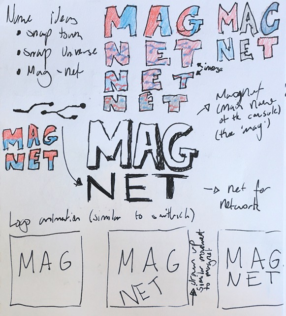
One of the earlier name concepts we created for the device was entitles the 'MagNet'. This was due to the USP of our console being the connectivity, most notably designed around magnets to be able to connect them together, however the name also featured a deeper meaning. The 'Net' in the name was also meant to symbolise the networking of the device, as it was made to promote going and interacting with other people to be able to connect consoles and share features. I decided to go with a red and blue colour scheme as magnets are commonly associated with these colours due to the connectivity of north and south. I also tried sketching some ideas for texture in the logo, some designs featured a 50/50 design as with seen in magnets, and other designs featured a circuit like texture to further lean into the networking concept.
I then storyboarded a potential animation for the logo, as I wanted our logo to animate, as I was inspired by the logo for the Nintendo switch. This would bring interest into our logo if it did have movement to it, in the animation I wanted the 'Net' part to be magnetised upwards toward the 'Mag' part.
In the end we decided to not go with this logo or name. This was, for one, due to the fact that we felt as though the colours were too close to the colours of the Nintendo switch, and due to this being our main competitor, we decided it to be an unwise move to have such associative colours. Another reason was none of us really enjoyed the name 'MagNet'. Though the name had many meanings, it just didn't seem to flow well. As well as this, we considered the shortened version to be the 'Mag' which definitely didn't sound right.
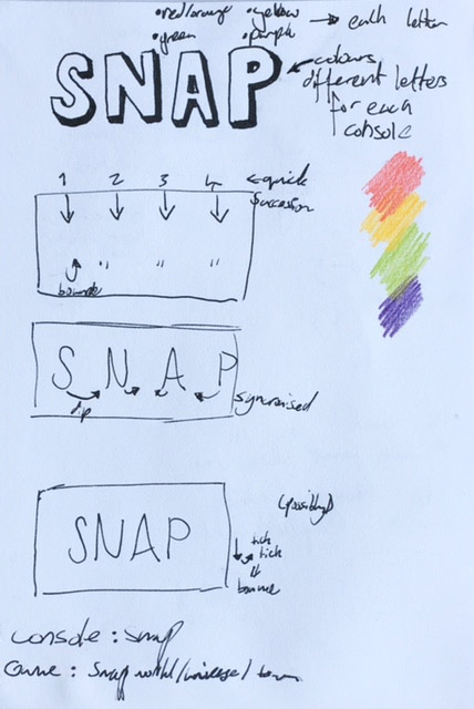
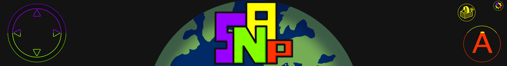
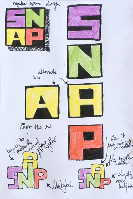
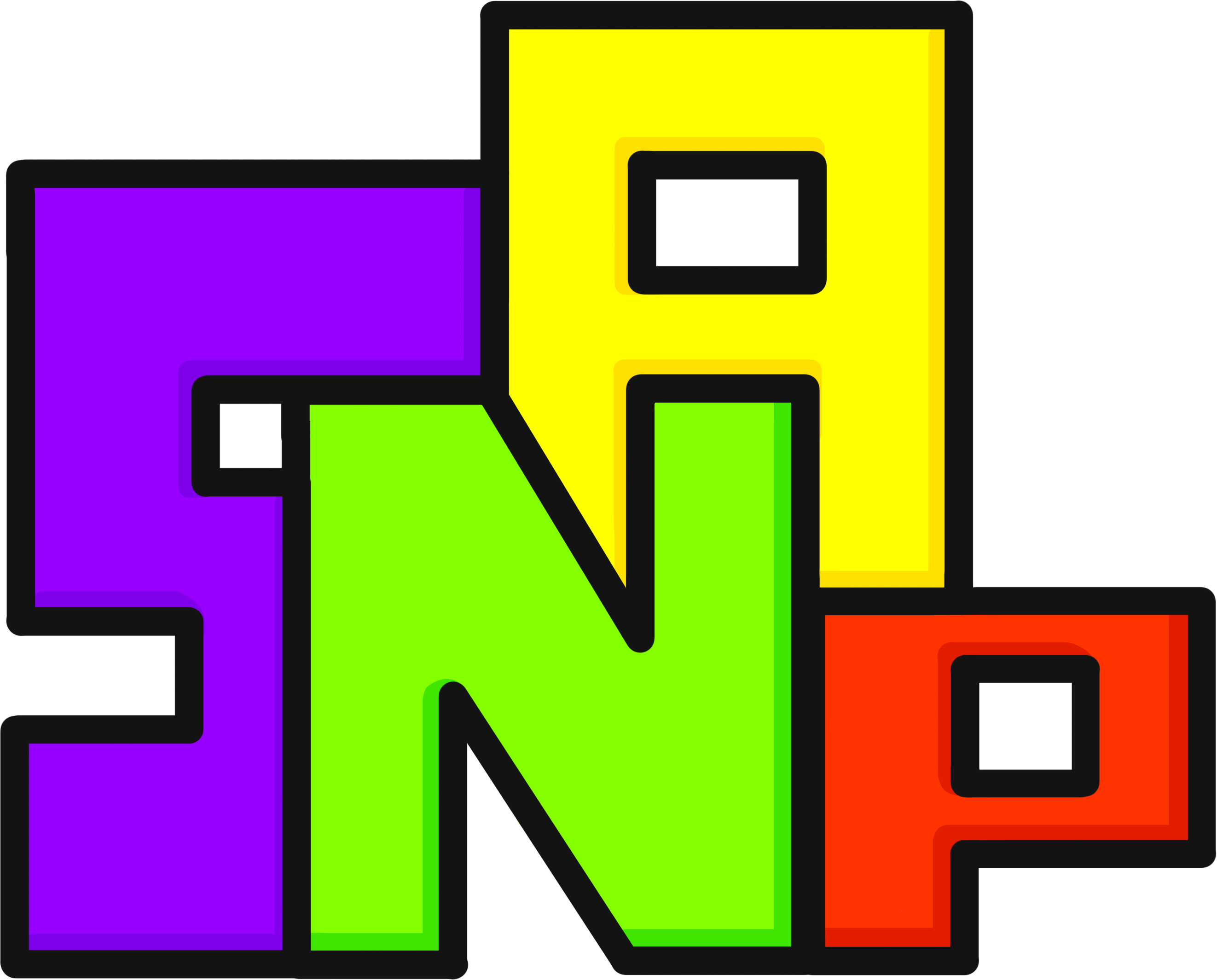
The alternative name our group went with for the console was the 'Snap', this was due to it being an onomatopoeia of the sound it would make when the devices connected which furthered our USP of the connecting of the consoles. My group decided the logo would be coloured by letter of the four initial release colours of the console, which would be red, yellow, green, and purple. I decided I wanted the font to be quite bold to be able to appeal to children, as well as quite bouncy and soft to be quite fun and creative. As I still wanted the logo to animate, I then drew another storyboard on how this version would animate. I wanted the letters to come down from above in succession and then for the letters to snap together in unison, possibly followed by a further 'click' of the letters.
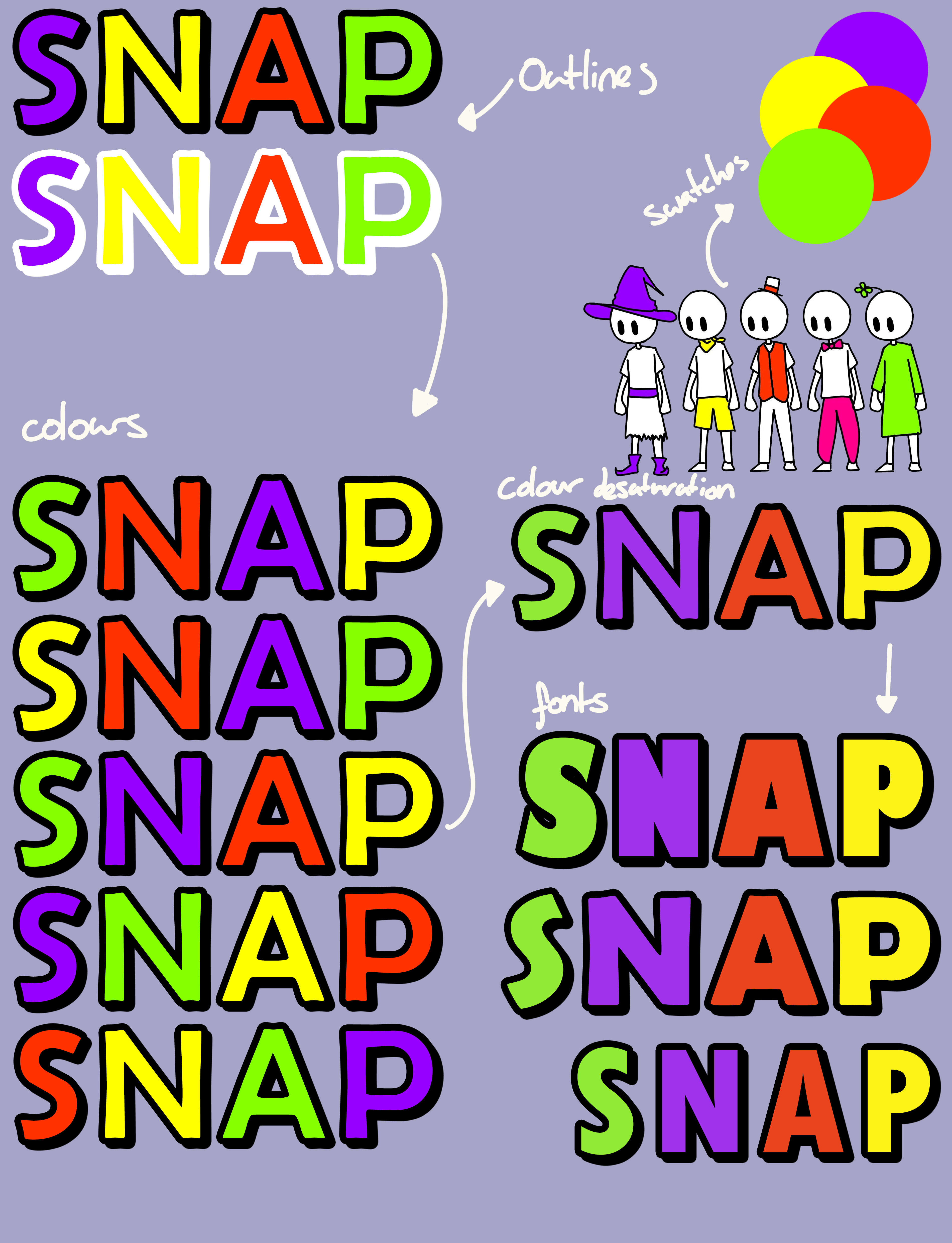
Before animating the logo, I had to decide what I wanted the final version of the logo to look like, so I made some alternate designs to show to my group for them to pick from. I started by taking swatches directly from the characters for each associated console, to ensure that I had the exact colours that would be used. My original sketches had featured a bold outline and shadow, so I looked at some possibilities for outline colours, and decided that black looked better. Another important decision was colour ordering, so I made multiple different variations to show different possibilities of ones I thought were the most balanced. Some other variations I included was in font choice, where my group ended up deciding the font 3rd down looked the best, so this was the one I went with to make the animation.
Following on from my animation storyboard, I then made the animation for the logo in after effects. I continued to try to go for the bouncy look as I felt this most appealed to children, and just overall keep the fun game appeal in mine.
When presenting this version of the logo to the lecturers, I received feedback saying it wasn't 'snappy' enough and that I should try making it more puzzle piece based, which led to me completely restarting on making my logo.
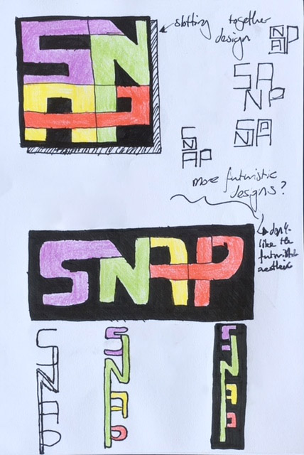
Trying to build off the logo being 'snappy-er', I tried to go for a more geometric style with the squares and negative space designs. I then also created some designs based off trying to make a more puzzle piece based design. My main concern with these designs was the legibility of them however my group decided they liked these designs the most.
I did take some of my more geometric designs, and tried to implement a puzzle theme to them by joining parts of some of the letters into the others. I tried this in a variety of formats, and also created some designs of them within other letters, but eventually decided the outstretched nature of some of the letters created a little too much of a sci-fi feel, which wasn't what we were going for at all with our device, and further, our game.
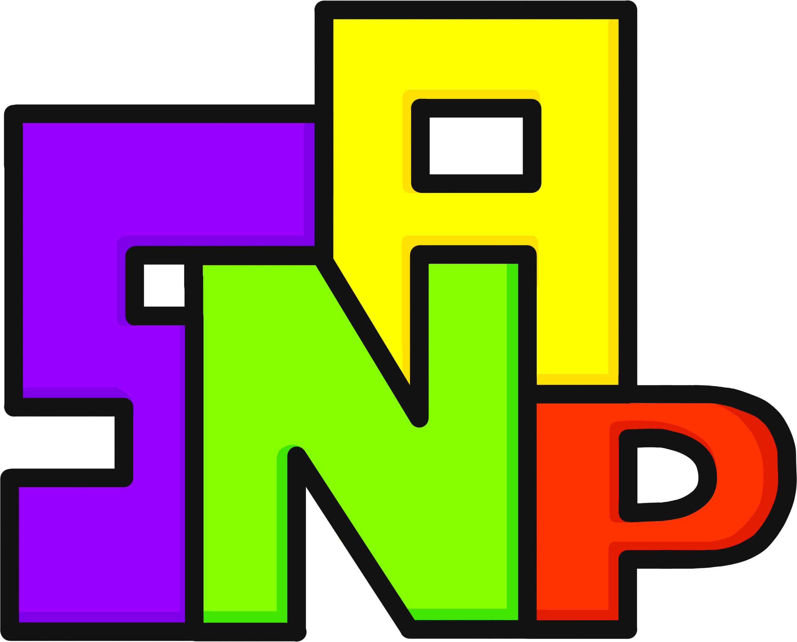
After hearing which design my group favoured, I then created a design based on it, where the letters slotted in to each other to create the design. I continued to use the colours from my previous design, as these represented the four initial releasing consoles, however this time I substituted the black for a darker grey, as I felt this suited the new design better, and just created less of a mass contrasting design.
Some feedback received on this iteration was mostly surrounding the P. It was said that the P was too small compared with the other letters in the design, as well as the curved nature of the P not matching the rest of the more geometric based letters.
To quickly create a version with a larger P, I stretched the original P to quickly show a concept of how it would look. I found when trying to make this design, I couldn't make the P stretch upwards, as it would off balance the A, or make the A too short to slot into the N very nicely. I resorted to stretching the P downward to create a look of a lower case P dropped below the baseline. I found that this design looked quite awkward, and I prefered the look of them all sitting on the same line, so I decided to keep this part of the design as is.
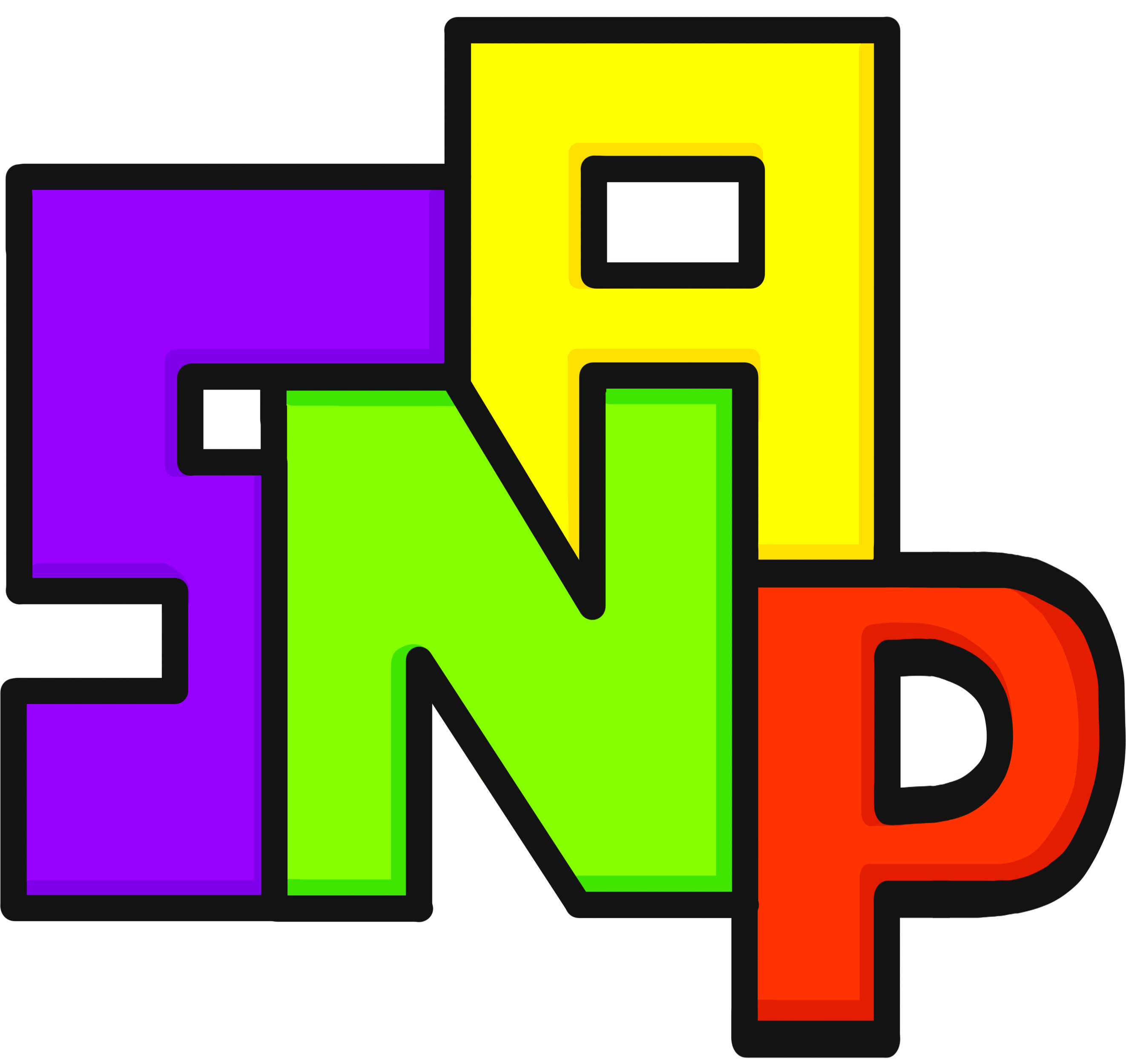
In response to the second piece of feedback I received, I also created a version of the logo with more of a geometric P with squared off corners, and found that I did prefer this design choice, as it better matched the rest of the letters, so I altered the design to keep this.
I found the fault of my previous concept, was that it relied too heavily on the animated portion to support it, so now that I felt the logo was strong enough on its own, I felt comfortable in developing an animated version for this iteration within after effects.
Whilst taking inspiration from my original logo to have the logos enter in succession, I instead had them overlap in timings to speed up the overall animation, as well as making it more dynamic by having them slide in from different directions. I hoped this would create a more 'snappy' feel to the logo that the lecturers were looking for, by taking away the curvature of the movement of the logo. I added some easing to the letters so that they sped up and came in at top speed, but unfortunately I don't think it is too visible on the final product. Compared with the previous logo animation, I feel as though this new one better represents the concept of the letters repersenting different consoles gathering together as if you were with friends, rather than the animation just being for the sake of it. Though my concept was still the same in both animations, I think the success of this one draws from the more geometric and square based letters (like the console) as well as the strength of the logo without the movement.