I decided that for my logo I wanted it to be themed around cards, this was for two reasons. The first was because this was a personal logo to reperesent me as a person, I wanted it to repersent a part of myself, in which I chose to show my love of board games through the representation of cards. Secondly, I wanted to show a representation of being a 'jack of all trades' to which would be my skills represented by each of the cards.
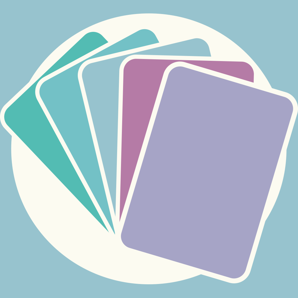
By using illustrator, I was able to use it's tools to the best of their ability to make some nice geometric shapes, because they were cards I made sure my rectangles had curved edges. I also wanted the outline to be in the same colour to create an interesting effect that I developed on later. I then used my branding colours to create 5 cards and, after some alteration, decided this was the best angle to show all of the cards in a natural fanned shape.
Next I created a bounding circle for my logo by having it be the same colour as my card outline, I felt as though it created a nice effect through which it naturally broke up the cards without being too jarring, as well as looking quite pleasing as it exceeded out the circle. I knew I wanted my logo to break this bounding circle as I had seen it done with other successful logos, such as NASA's and really enjoyed the look it created. I also felt as though, with my logo being cards, they naturally broke through as circle as though they were in a hand and were peeking above.
Do note, all these logos have a background which wouldn't be shown on my actually logo, this is only because the cream is also used as a background on my website being that it is one of my branding colours. I made sure all the areas on my website that I wanted to have the logo on were not of this cream colour, such as seen on the navigation bar.
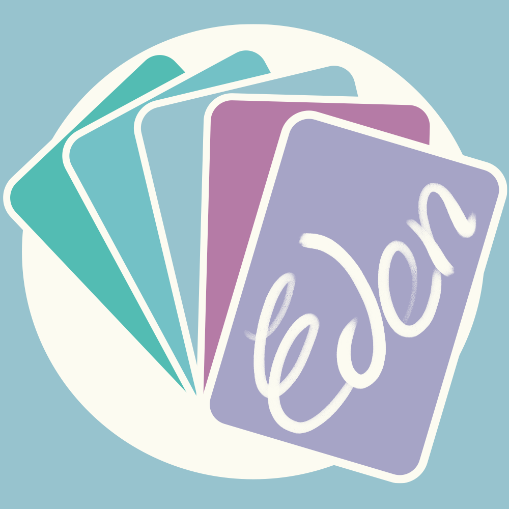
In looking at other logos, I saw that I needed to included my name on there as this was the brand I was representing. For my logo I chose to only use my first name as, for one, my last name on it's own would be too long, and them both together would definitely be too long. Another reason is I feel more connected to my first name, and prefer the personal connection and informality associated with this, and being known by my first name shouldn't be too bad as it is a particularly uncommon name. A third reason is that my name is associated with many positive qualities in society, being linked to the 'Garden of Eden' so it was a nice draw to have in my logo.
To continue to have a more personaly connection, I decided to handwrite my name, which meant I has to move this part of the project into photoshop. To give it more of a handwritten feel, I decided to use a textured brush as this had a bit more of perosnality to it, and worked well with the pressure so I had more control over what it looked like.
To strengthen the theme of the cards relating to my skills, I decided to alter the front card slightly. Instead of having simply having my name, I added a tablet icon I made to the front to focus on my skills of design and illustration. After doing this, I rewrote my name and added it to the screen of the tablet, as if it was currently being drawn onto the screen. Whilst doing this I made sure to only use the two colours to keep the negative space design that I had, which I think ended up looking quite good.