
Since making an icon logo, I found that, though the logo was very visual in what it was present, a book an a pen, it did lack type to be able to associate it to the brand. In most circumstances, I did want to be able to use the iconographic logo, because it looked very nice on its own, I did feel the need to make a logo that did have type. To do this, I started by researching logos for escape rooms, as that is largely what our project was inspired by, and I found this one which had a highlight on their icon, which is something that I wanted to use for the logo I was creating.
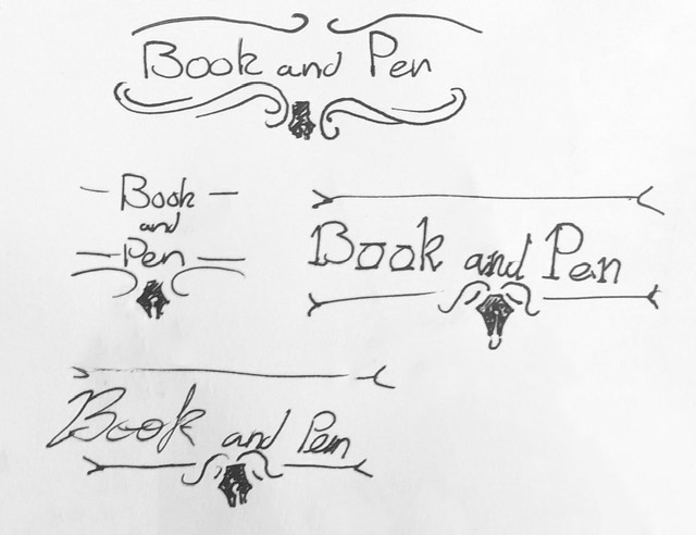
I then made sketches that had a similar theme to the logo I had looked at, however instead drew more from that dark academia theme. So, instead of the traditional straight lines, I wanted to have more flourished calligraphy boarders to outline the book and pen potion. I also wanted the pen part to interact more with the design rather than focusing aimlessly above, as if the flourishes were directly outlining it.
Using some calligraphy boarders I found, I was then able to put some of my ideas into practice. I started by making my designs, for the straight line I edited the original flourish so that it was still in the same style, then I tried some different boarders. After doing this, I liked it, however I felt the pen looked a little awkward hanging off, and realised in the logo I was taking inspiration from, it was above. Though, due to gravity, I knew I could connect the logo above the boarders, otherwise the drip would go upwards, but I then tried some designs where the pen was hanging from the above boarder, and my group decided they liked the last version the most.

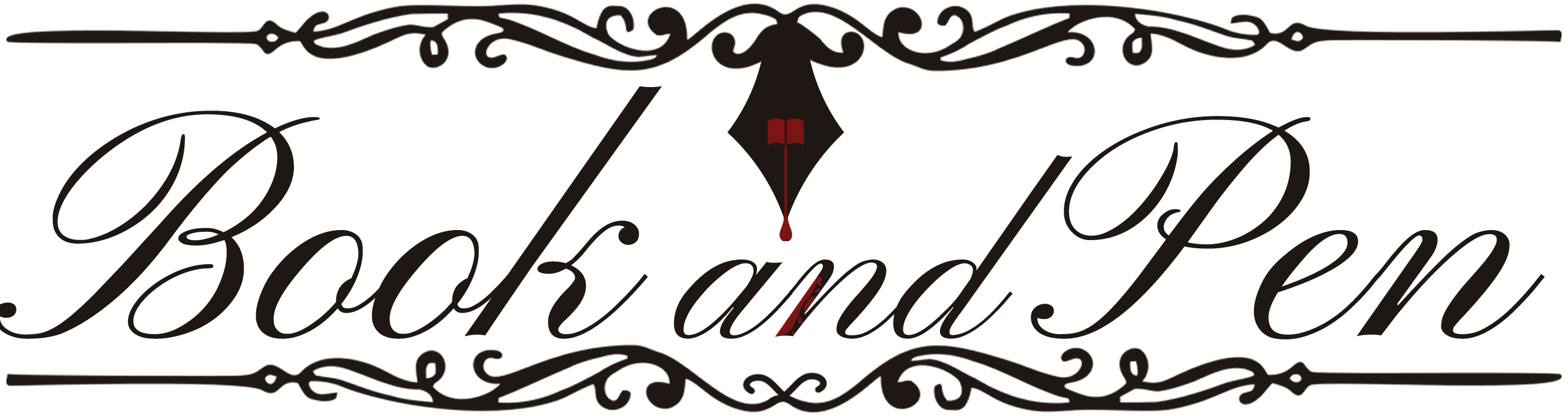
One of the people in my group suggested adding some dripping from the ink onto the words, and though it sounded great in concept, when I tried it in practice, due to the curvature of the letters at that point, it didn't quite come out how I expected it to, so we all decided to go back to the one without.