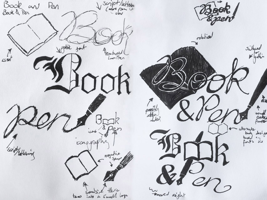
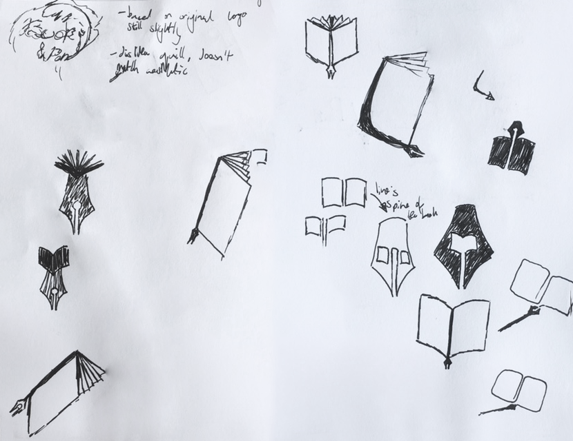
For our interactive project, my group decided upon the name 'Book and Pen' which would represent the two players in the game, the book who would use the physical puzzles in real life and the pen who would be within the VR solving puzzles in there. For our game, we had also decided we wanted a dark academia theme, and so with these two things in mind I immediately launched into making some sketches for the logo. On the left I was focusing on whether I preferred the gothic type or a more calligraphy based style. Both fit the dark academia theme largely well, but I liked how the pen being written with handwriting leaned into the theme of the interaction, as with the pen writing the word. Since I liked the idea of the pen writing the logo, I tried to find ways for the book to play a part in the logo. Eventually, I came up with two alternate ideas, as shown on the right, with the first idea being the book opening out to what was being written by the pen, and the second idea having the double O styled to look like an open book, and the Pen making up the vertical stroke of the P.
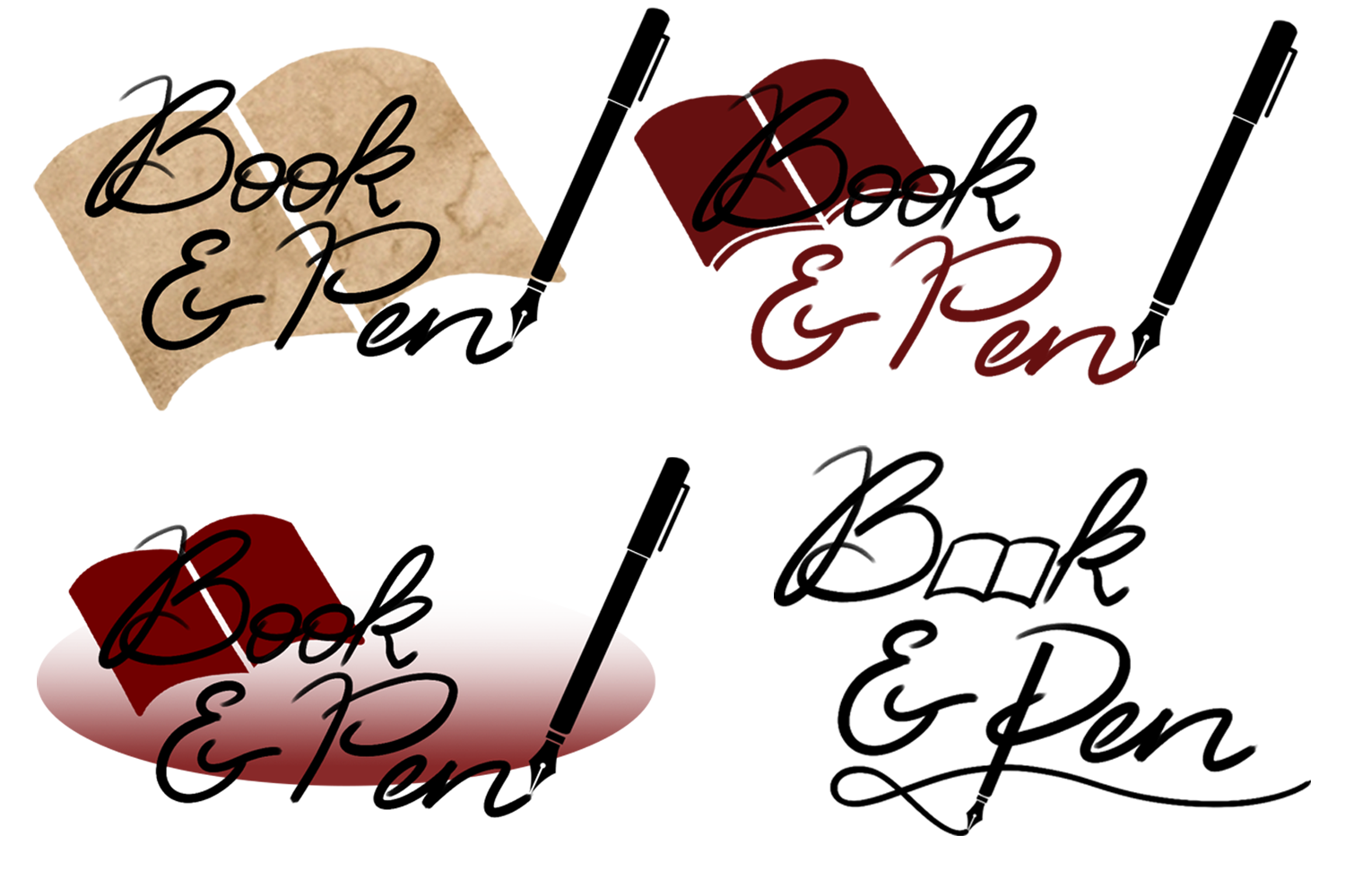
My group said they liked both ideas, however preferred the written style over the gothic font, and so I drew up some alterations of the logo digital. In making the logo, I found that a lot of the font styles didn't really fit the theme of how I wanted the type to look, and my group agreed that they preferred the sketches to the actual design, so I used my own handwriting for the logo, as I felt the handwritten style furthered the personalisation of the logo and further felt like it was being written and so upped the association that you were interacting with the product. Most pens in logos fit into two categories of quill and modern fountain pen, and though both fit with our dark academia theme, I felt as though the modern fountain pen more fit with our professional villain we were going for, as he was meant to be committing many white collar crimes, it would be strange for such a traditional method of writing to be used. When making the logo, I found I didn't particularly like how loose the logo looked, as on its own it looked a little disjointed, so I tried adding a ellipse to act as a sort of bounding box, however this just made the logo too cluttered. Overall, with my colour experimentation, I tried a couple of things. My first was using parchment as a texture in the logo to contrast the clean thick black I was using, I didn't particularly enjoy this effect, but my group liked it. My other concept was the black and red looking rather nice together, I particularly liked the version shown in the top right. The red worked well in the logo as it both bought out themes of dark academia and true crime which fit our game about solving a disappearance. Whilst I did like my alternative logo, shown in the bottom right, I wasn't quite sure what to do with it colour-wise, I did enjoy the idea of using the pen to underline the entire logo.
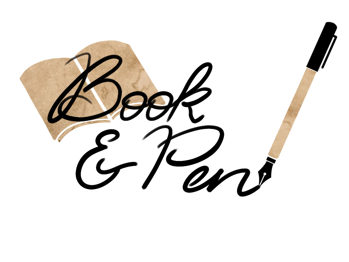
I then tried paring the parchment used in the book to using it on the pen to draw attention to that and balance out the design, and my group decided they liked this version the most, which was then the one that was shown within our presentation. During the presentation, I don't think my logo was well received, as it was recommended I restart completely, and look a little more into iconography, and other logos that uses things like books and pens in the logo, and how they do such.
As I had felt previously that I was struggling to put colour into my logo, I decided this time to instead start by making a colour scheme. I used Coolors to create a five colour palette to be sure I picked colours that worked well together, and I eventually came to one I liked. My main choice within this was to have the red in there. This was due to red being used commonly within the dark academia aesthetic, though usually a more dark red, which is why I have the two tones. The other reason red is good is that it's often used within true crime, and since our game was about solving a crime, I felt as though the red worked perfectly. I chose the yellows to act as parchment tones, as well as these sort of shades also commonly being seen in dark academia colour palettes. I then chose the smoky black as my darker tone, I felt as though this shade fit nicer with the other tones I chose, though it did come out a little more brown than I expected in practice, it ended up looking quite nice.
After doing some research into icons that feature books and/or pens, I created some sketches inspired by a few of them. One issue I ran into was that a lot of the logos featured quills, and, as previously stated, I didn't really feel like the quill look matched the theming of our game, so I was largely limited in choice. In the end, with some helpful guidance, I ended up picking to do the one with the book in the middle of the fountain pen nib. This design was inspired by seeing other designs of people putting other silhouettes within the hole in the fountain pen nib, so I created a design with the open book there. I did try one where there were multiple gaps, and so the line of the fountain pen part going up went into the spine of the book, but this just ended up looking a bit like a battle axe, so I went for the one that had one gap.

I then made this logo within illustrator using the merge shape tool. I used a triangle for the bottom half by curving the edges, then merged it below a trapezium with similar curved edges. I then also joined some shapes together to make the book on a stick and subtracted this from the pen to make my logo outline. Though this was what my sketches showed, I felt as though the icon looked a little empty and needed something more, so I bought it into photoshop to do a little bit of experimentation with some ideas.
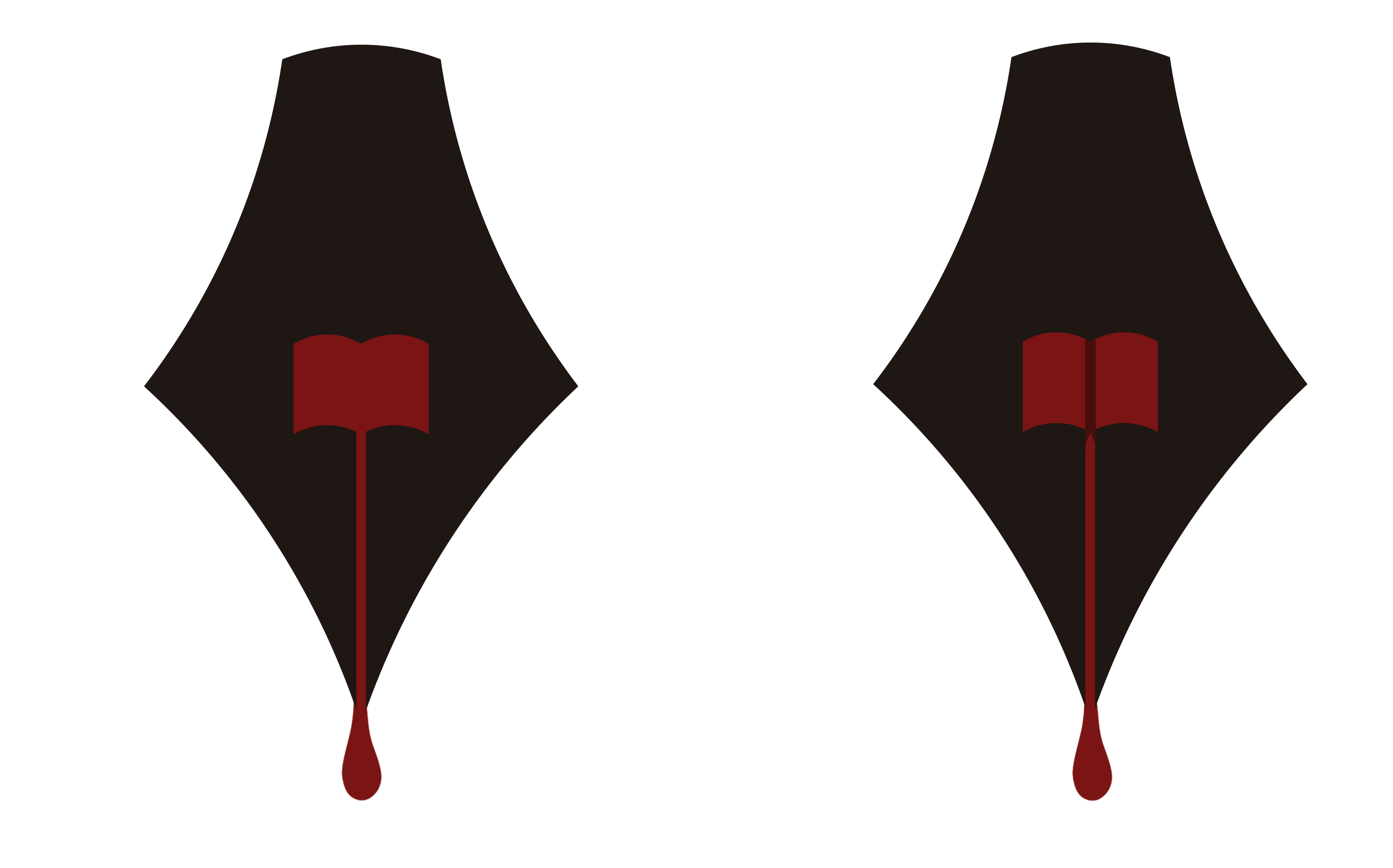
I decided to try and add some detailing to the design to make it a little less flat, and apply some colour from my colour scheme to the logo. The concept was to try and make it look as though the nib had been writing with red ink, and I found that both the third one along was the most faithful to this (in the way that a fountain pen would pick up ink) as well as being the most liked by my group.
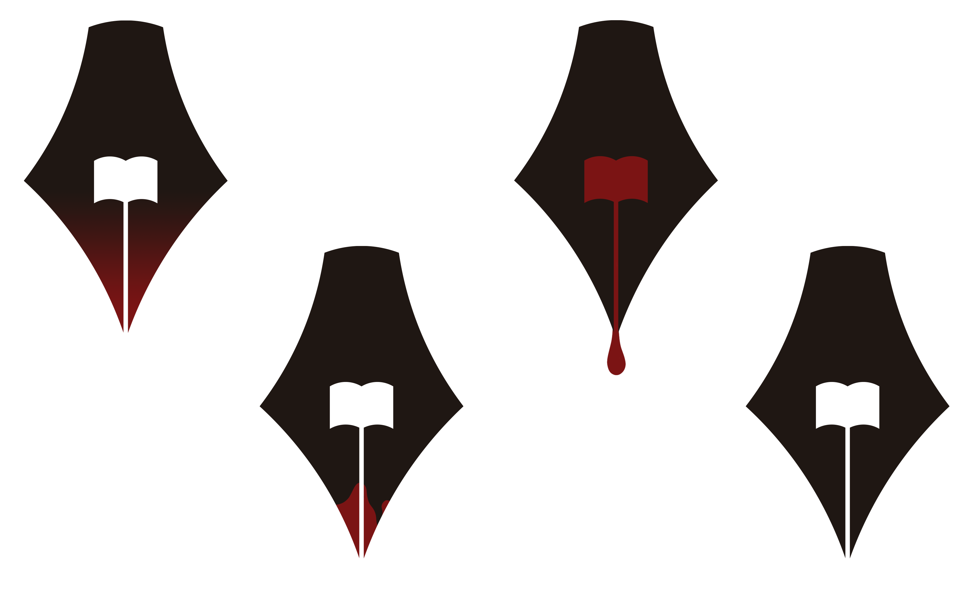
This was then the logo my group decided to go with. Some concerns for this is logo is that, rather than red ink, the red does seem to also symbolise blood. This choice is actually slightly a purposeful one, as though no one actually dies in our missing person case, I felt as though the red dripping seemed to symbolise something more sinister might be occurring. Though of course, it isn't blood, it is red ink for all purposes, but it's a sort of behind what is obviously there. If it's in a pen, it's red ink.
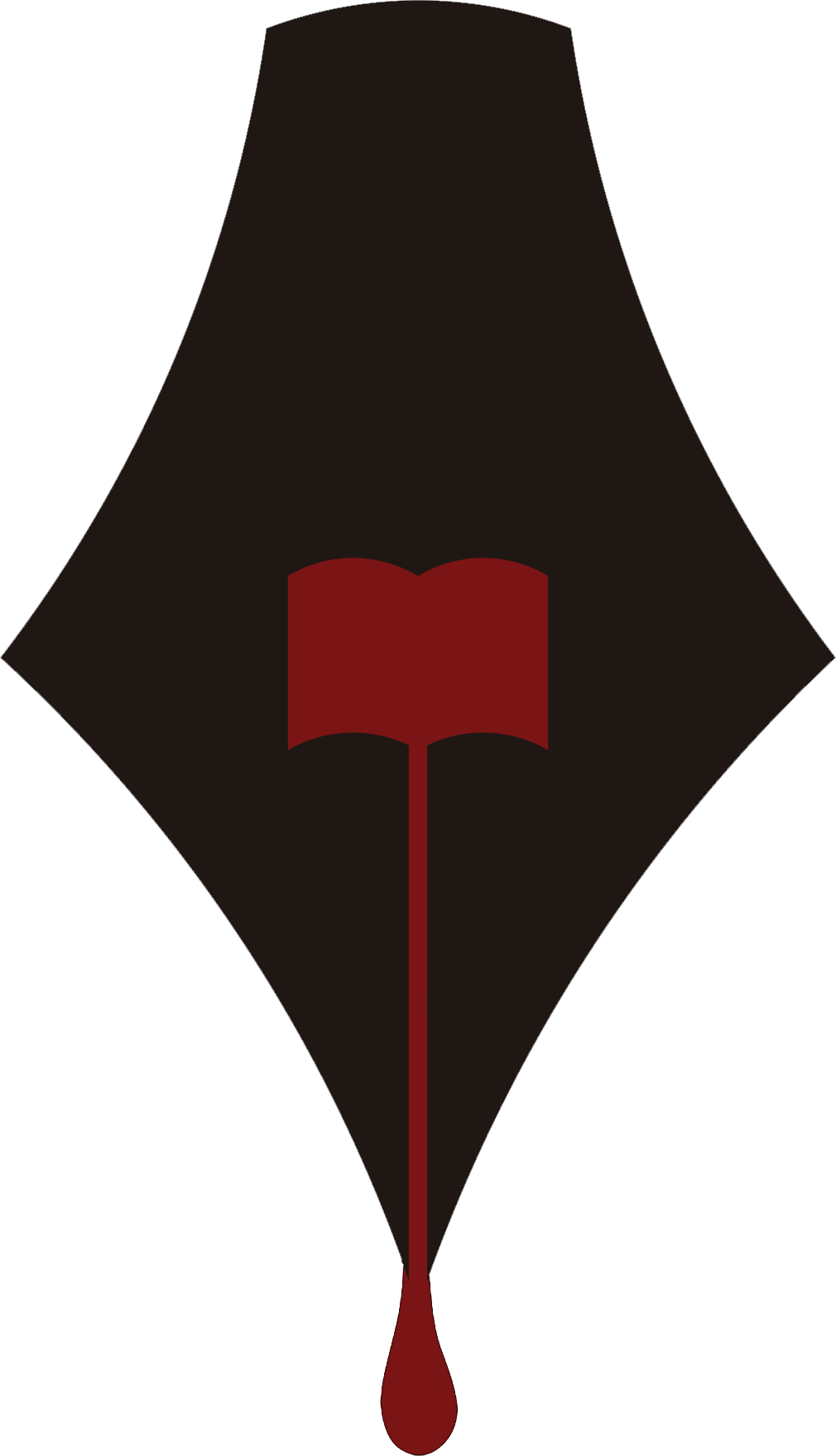
I did then get the idea to add a little detailing to the book. I did feel as though there was a large amount of focus on the pen, but the book was more subtle, which wasn't great because, being a two player game, the two players are meant to be in complete balance. Previously, I had tried to highlight the book by adding a spine, but instead using negative space elements by either having the red only drip down the spine, or having that missing, but this looked a bit odd. I then realised I could use the darker red I had in my colour scheme to highlight the middle portion of the spine. I then shaped the bottom of the dark red so it looked as though it was a bookmark within the open book. The darker red also adds shadow to the middle of the book, which brings more focus onto it as depth in the book. I then showed the new version to my group, which had mixed results, but when showed to a larger audience, the results were quite conclusive that the newer version was preferred.