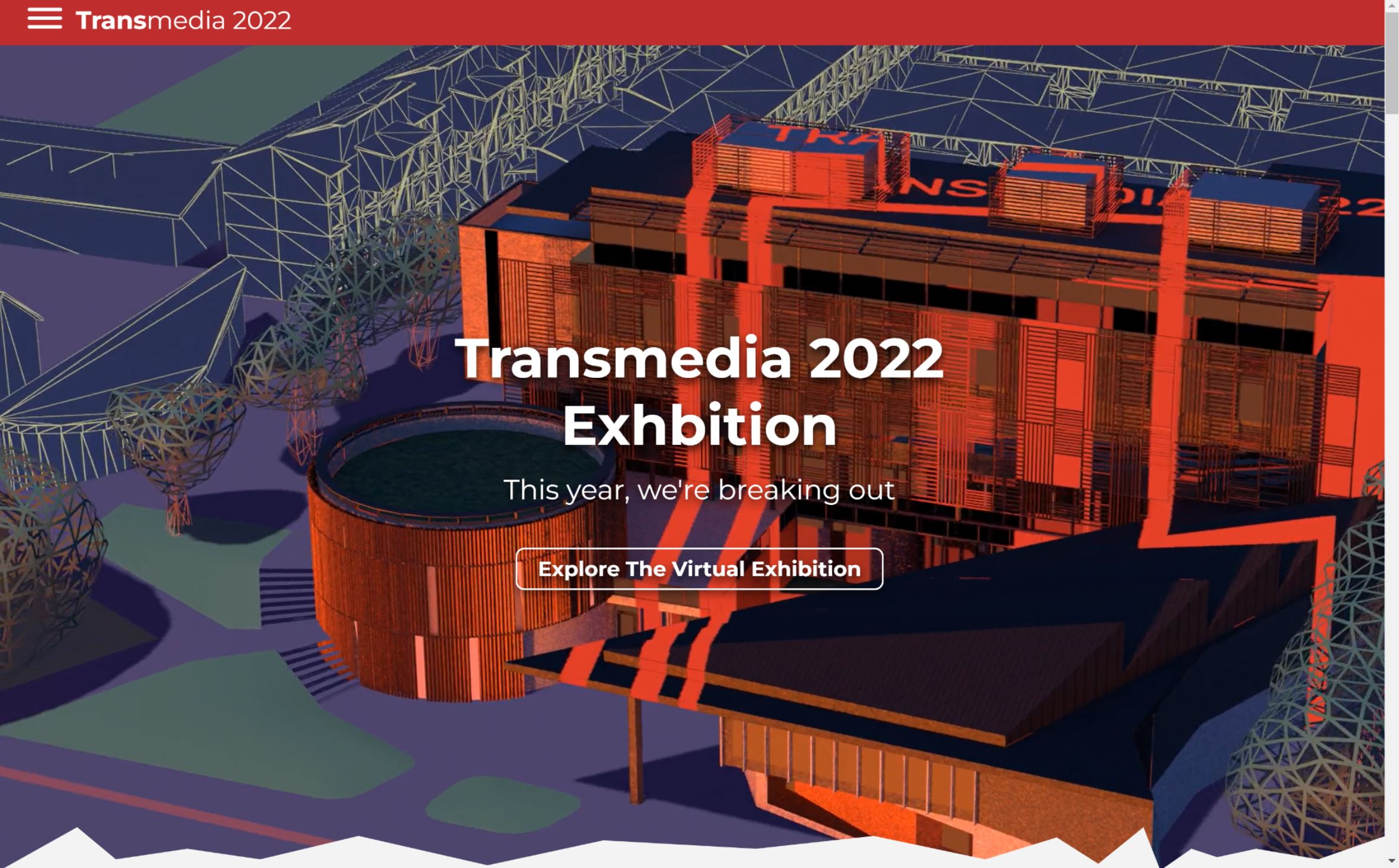
To design the website, I began by researching what content was in last year’s. Unfortunately, the website has now been taken down, but this is the Home Page. This is the focal point of the website, for last year, they had a 3D gif of the west down’s studio made by one of the students.
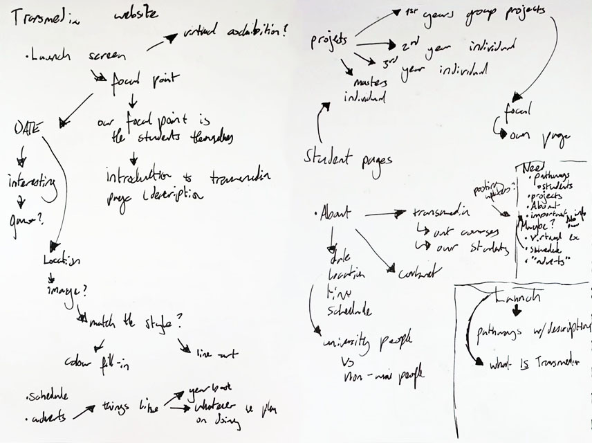
Whilst looking through the 2022 website, I made notes on features of their website that we may need on ours, as well as mapping out some rough navigation for the pages of our website. I wanted the focal point to be the individual pathways, as that seemed to be the centre of our theme.
I began some sketches for the home page. Our group had decided that the navigation would be colour themed. This meant that if you hovered on one of the pathways, the background would change to that colour.
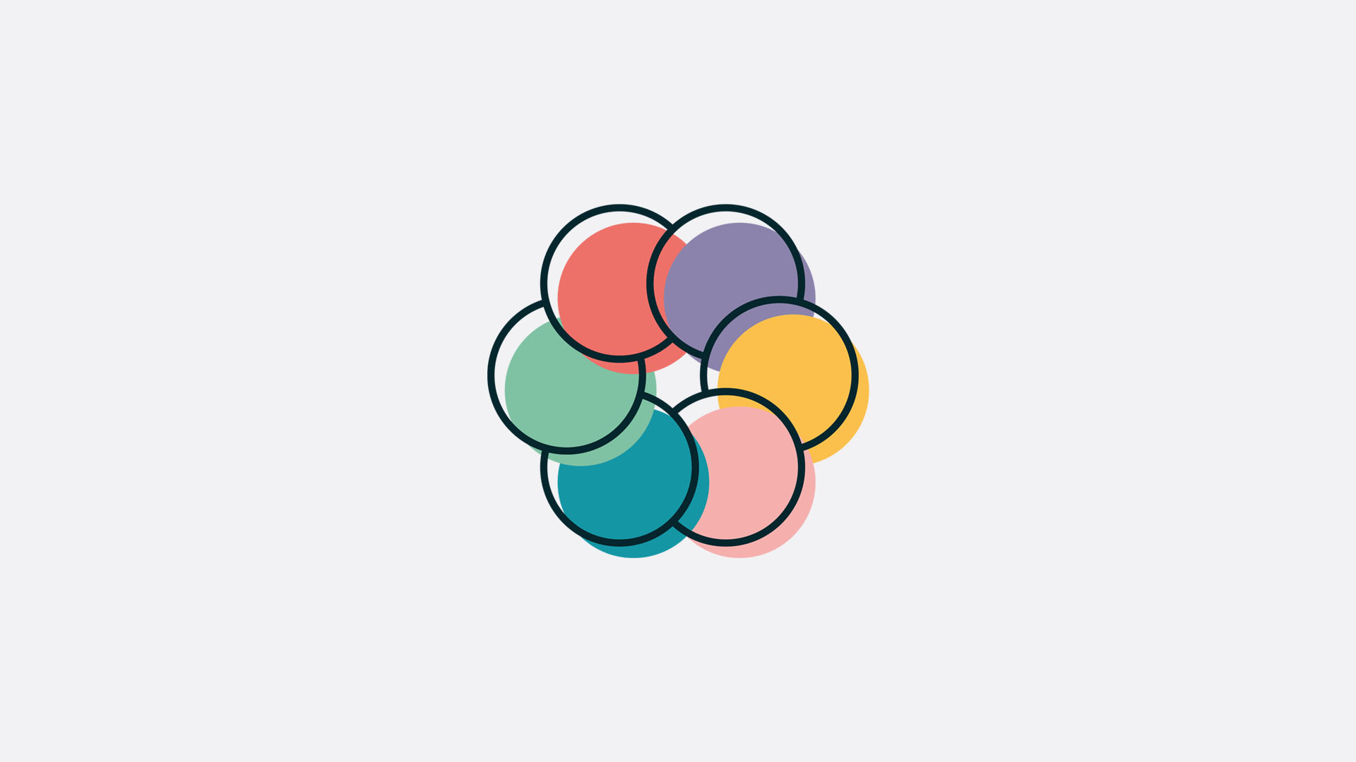
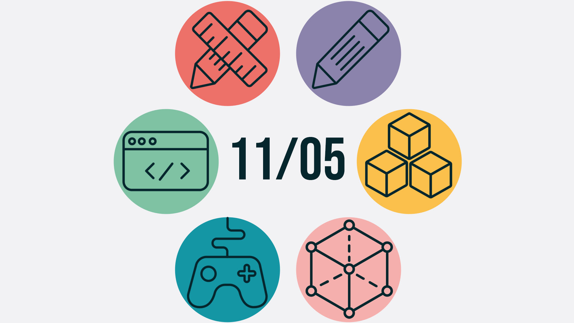
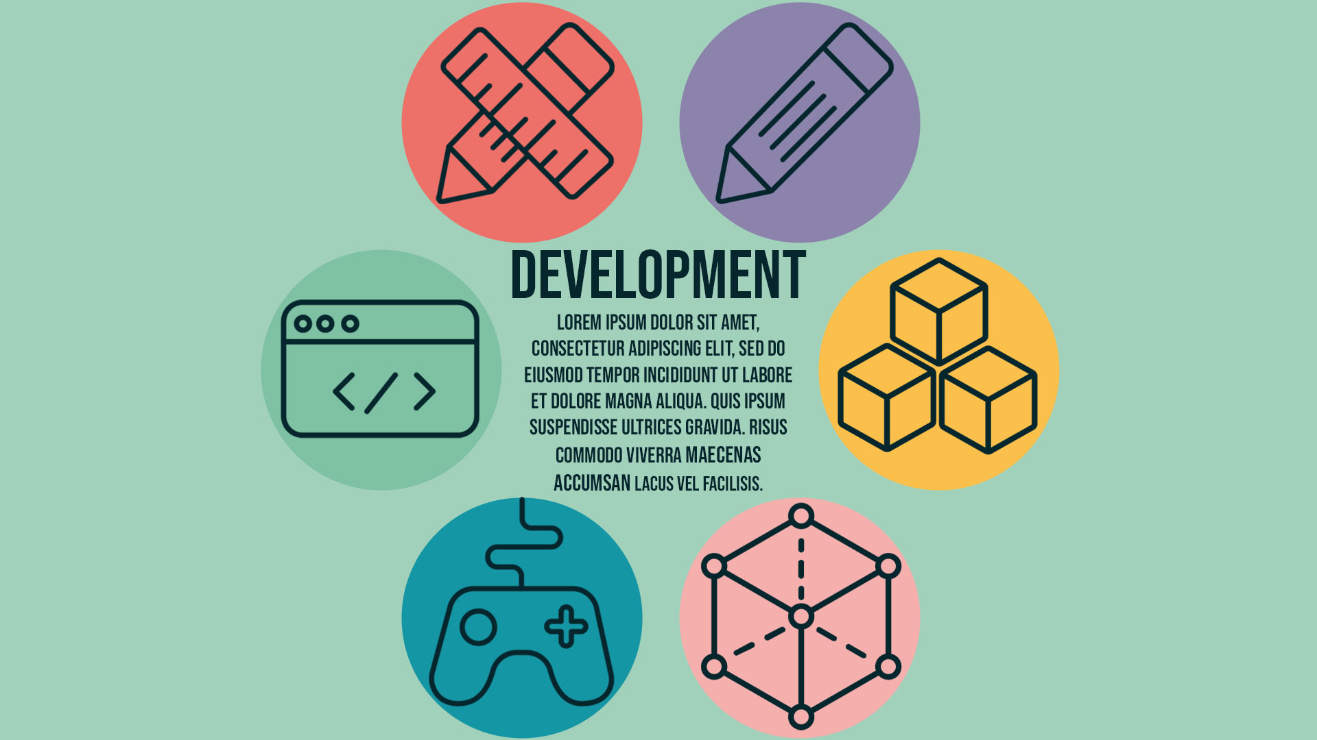
I wanted to have an animation play on the main page, so I storyboarded it starting with the logo which would then spin outwards to reveal six links to the pathways with their icons in the centre of which would sit the date of transmedia, the most important information for users. When you hover over one of the links, the background would change to that colour and their information would display in the middle.
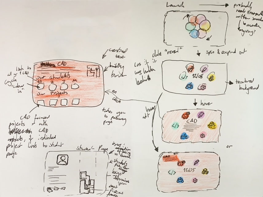
This is a very rough version of what I storyboarded, though this version doesn’t have the animation, it does have the before and after. The third screen also shows what would happen if you were to hover over the development link, for example.
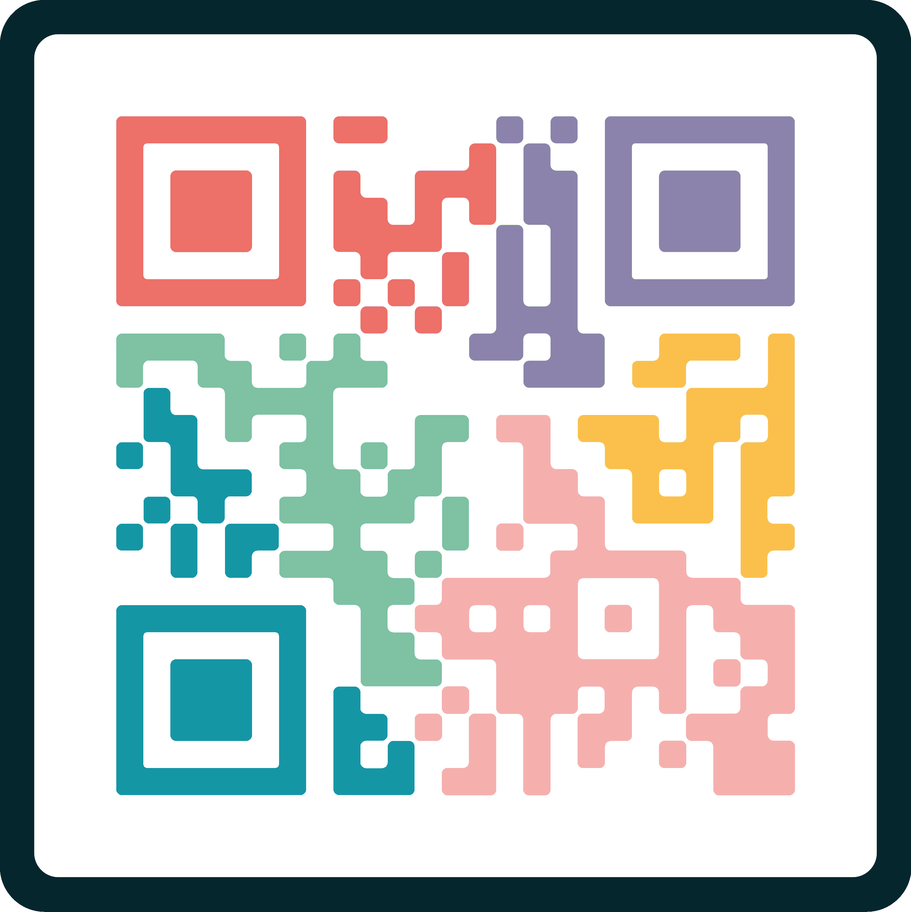
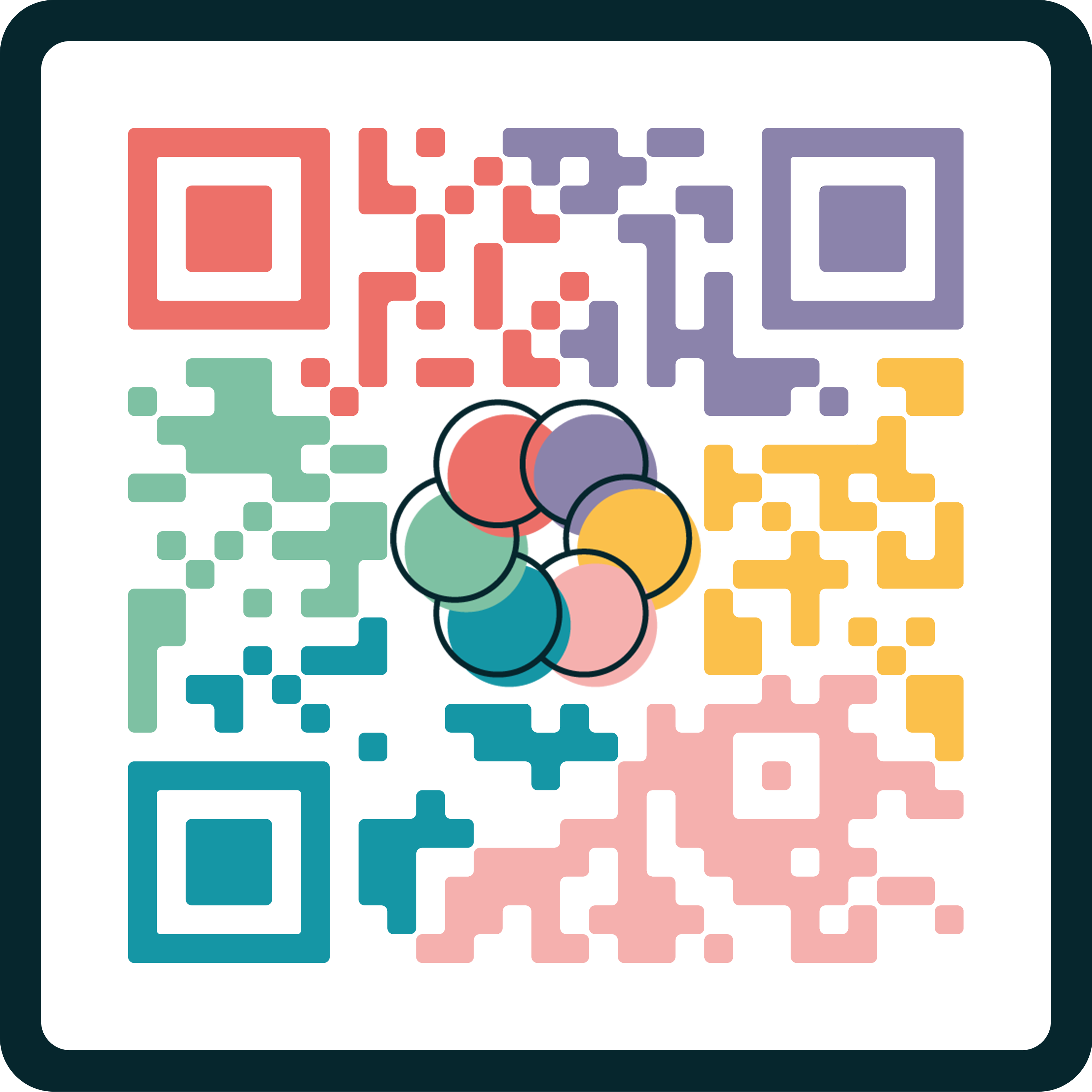
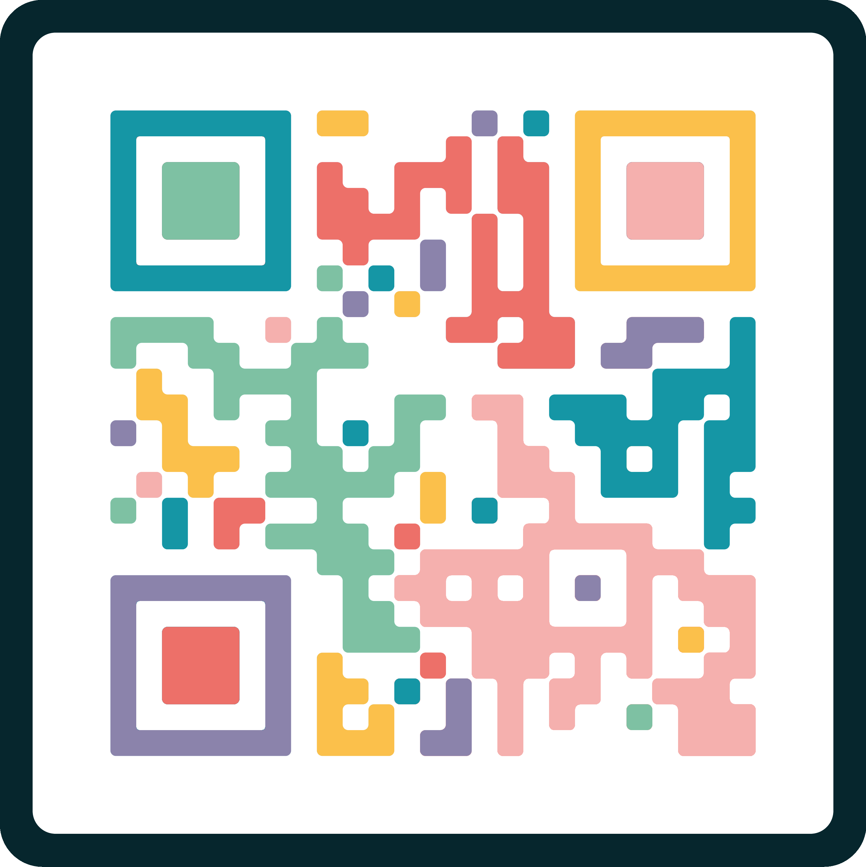
I also created some customised QR codes that link to the website. We never officially decided on the one we would use, but we would only use one variation. The jumbled one is more loyal to the style of the posters and branding, but the organised one does look better. To customise it I rounded the corners and changed the colours to the block style of our posters. It has been tested and does work, but something may be wrong with the website I used, so to be used next year, I would need to make it again in the same style.
Would have like to have made more pages for the website, but unfortunately, I didn't have the time. Due to the their being a game developer in our group, a lot of the website time was spent thinking of game ideas for the website, though this was not my job, I should have spent more time on the website early on so I had a concrete foundation that I could easily build more pages on.
Although, I am glad I did finish the design for the most important page, even if it is missing some elements, like the animation. With the main page down, it will hopefully be easy develop further pages next semester built on the concept of this one, and some other sketches I made.
Even though it's not within my role to develop, I've been informed that website development will begin next semester, so it will be nice to see these concepts be expanded upon.