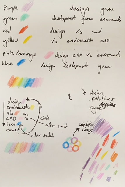
The first task for our theme was to assign which pathway was what colour. Though we each had many contradicting opinions, we eventually happily decided on the following, here are my reasonings for each of them.
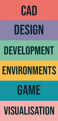
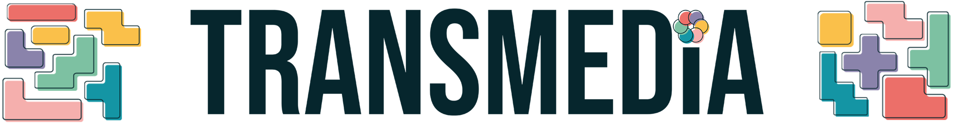
Because the narrative was about the pathways working together, and the colours representing pathways, I wanted the logo to have all six colours in it. I also wanted it to match the art style of the solid colours with offset line art. I started by developing the narrative of the theme of us all working together to how we worked together. Usually on a project, though we all contributed, there was a general order of who worked on it, which I turned into a makeshift cycle of development. After speaking with some group members and peers, we decided that the cycle would be Design > Environments > Visualisation > Game > Development > CAD > Design, so with the associated colours, I was now able to create an order.
After trying some ideas, I liked the way the rings resembled the Olympics logo, as that also represented multiple groups from different backgrounds working together, through the medium of colour. Since the art style was solid colour, I changed the interlocking rings to overlapping circles that would merge colours at the overlap to show teamwork.
When creating the logo, I found that merging colours at random doesn’t yield the best results, and most of the intersections just looked a bit muddy, so I instead opted to go with overlapping circles to show the infinite cycle, as well as visualise one thing leading onto another, like dominoes, because we’re all influencing each other’s work.
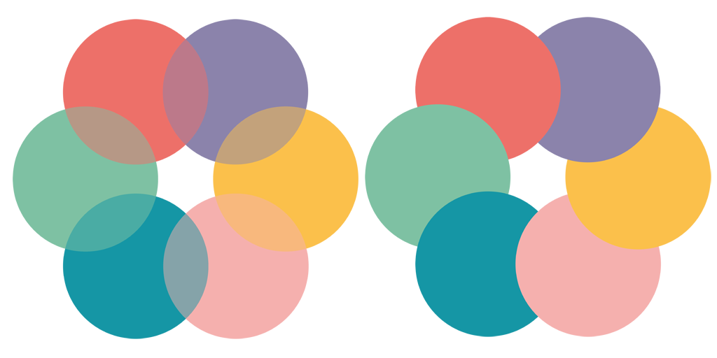
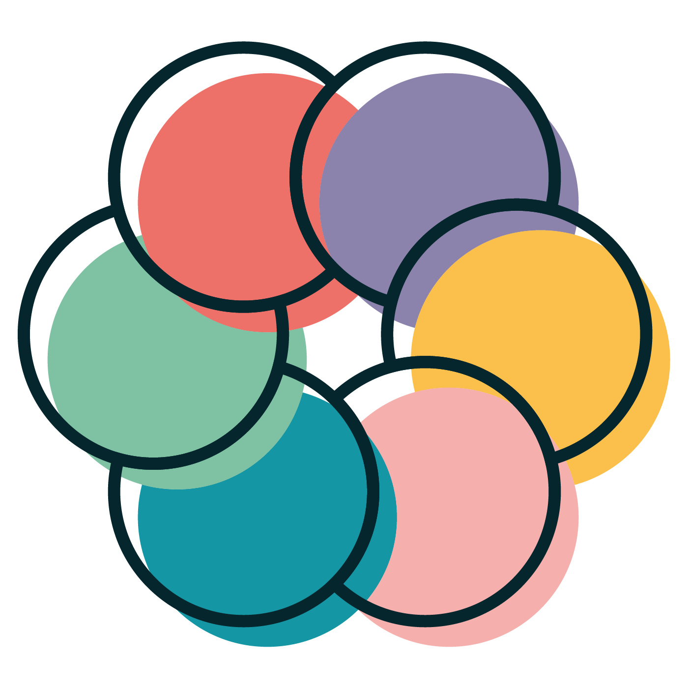
I then added lines to make the logo consistent with our art style, and it was done. I also like that these lines somewhat resemble the Olympic rings that I was simulating before.
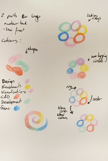
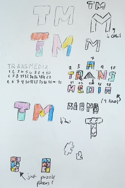
In the presentation, even though I had only presented half of my logo progress, some people had said that they preferred the style another group member had been going for, which was more building block based, and I should go for something like that, or I should use puzzle pieces. I did try this idea in these sketches, but I found either nothing looked right, or my idea didn’t work or balance well. Overall, I just found my group and I preferred our previous version, and none of the new logos carried the same narrative that I had created.
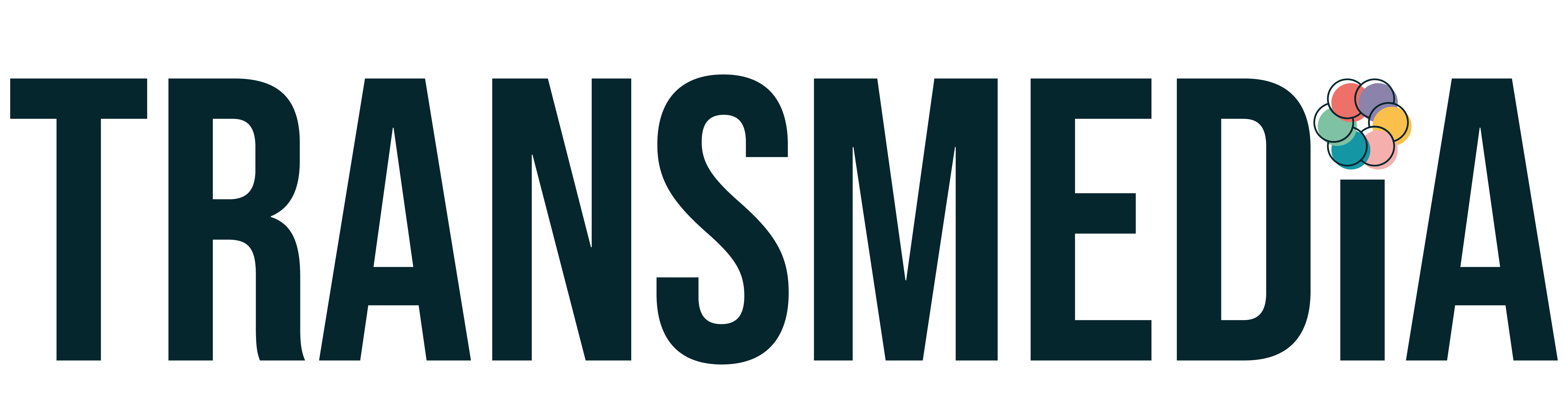
I did also decide to make a logotype, though this version isn’t commonly used in our current designs, it can be used for other things next semester. I used the type from the posters then cut off the top of the I and used the logo to simulate the dot on a lower case i. I think it’s nice and I like the simplicity of it.
Although our group worked well as a team, as shown by our strong concept of the brand identity and narrative, I did find our task delegation was lacking. In most projects last year, I found myself doing near most of the design work, but this was the first time that I had to properly split the work evenly.
This meant, without a clear division, a lot of work I’d planned to do had already been done. In my next group projects, I will be sure to clearly divide tasks between members of my group, especially those with similar roles.
Overall, I like the work I did for this project, but I just wish I had the chance to impact it more.