When deciding how to brand the app, I looked at other self-help apps. Whilst some apps had quite a plain theme, others disguised their more serious use with fun themes like growing a forest or taking care of a pet to complete tasks in your day. To decide the theme, I outlined the USP of my app to be the ability to share your daily experiences with friends, and the ability for them to view yours, in summary it was the communal and social aspect. I associated this idea to the term ‘Social Butterfly’. I also felt butterflies fit the theme well due to their main symbolism being positive change, just as the users of the app will being trying to change themselves for the better, like a butterfly breaking free of a cocoon.
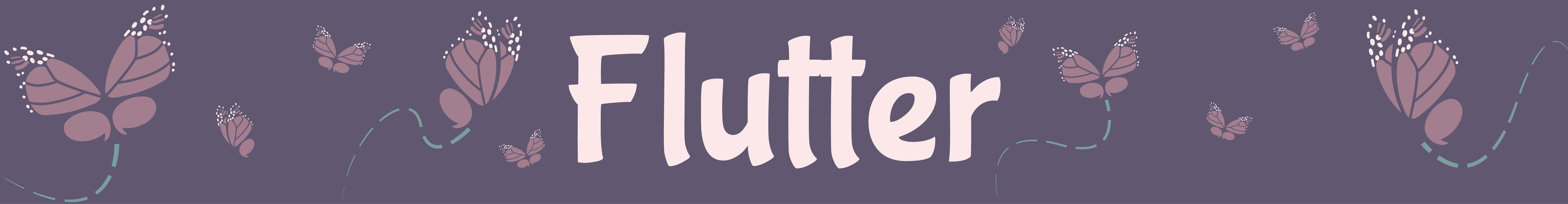
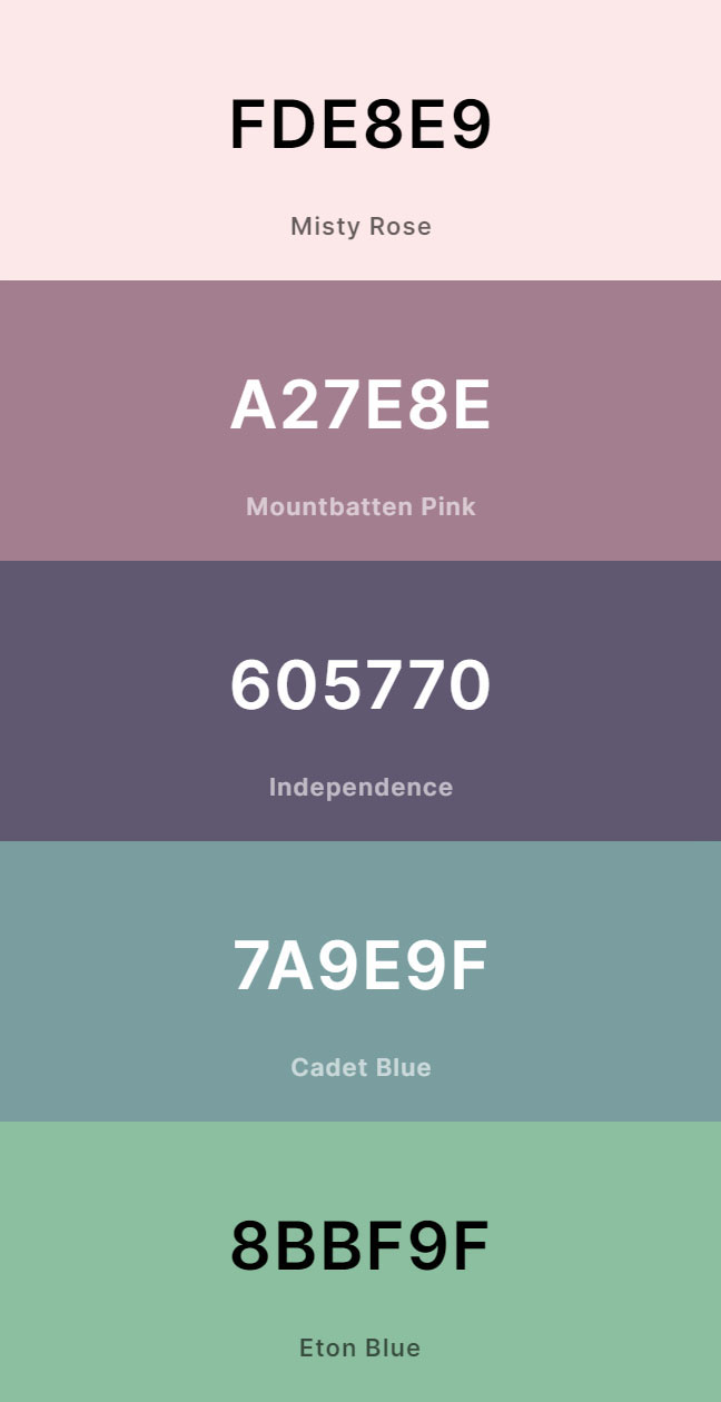
For the colour scheme, I had the image of a very fantastical world in which these butterflies were in as if this were a dream type land, which is why I used purple and pink tones as these colours are uncommonly seen in butterflies, but commonly seen in fantasy butterflies. Furthermore, in dreams, purple butterflies represent change for the better and the strength to help through tough times, which does feature prominently in the app. I then chose some blues and greens as the more traditional mental well-being colours, and also the brighter green to act as a call-to-action button.
Lastly, I chose some fonts for the branding. I chose to use Bubblegum Sans for headers as I felt it was a nice fun font that appealed to my target audience, whilst still looking readable. I also used Oswald for body text, and smaller headers in the text.
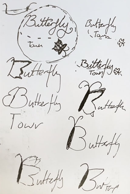
Coming up with a name for my app, I had the name ‘Butterfly Town’ as a placeholder to be able to come up with some logo ideas while I thought of a better name. I considered the name ‘social butterfly’, but this seemed like the name of a social media app or a dating app. The name butterfly town was based on the app working like building a town with your friends (as discussed in assets).
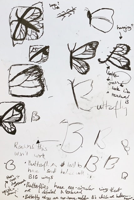
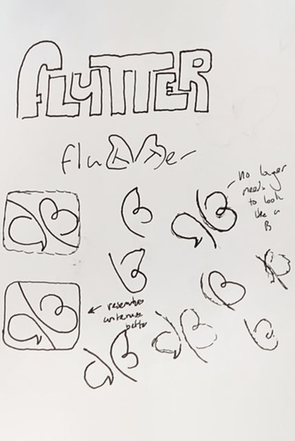
My ideas were very loose, but I quickly grappled onto the idea of the B looking like the wing of a butterfly. I experimented with this concept a lot, but no matter what I did, either the B or the butterfly looked like a child had drawn it. I tried giving the butterfly more detail and making it look more realistic, which still didn’t work, but it led me to studying what different butterfly wings had in common and, further, what made a butterfly wing look like that. I outlined three main rules to follow when drawing the shape of a butterfly wing, all of which contradicted the general structure of the capital letter B.
The first was that butterflies have large wings which generally extend way above the body of the butterfly, which is the stem of the B in this case. My second rule was that their wings are never circular, nor semi-circles like the bowls of a B. Thirdly, the main wing of a butterfly is the top wing, which is why it is a lot larger, whereas with a B, these bowls are either balanced, or are larger on the bottom. With these rules, I was able to see why my sketches looked like they were drawn by children, because these are very common mistakes made by children when drawing butterflies and Bs.
Though I didn’t end up using any of these designs in my final logo, nor did I even keep the name, this research and study greatly impacted my final product, as I was able to see in detail what made a butterfly look the way it did.
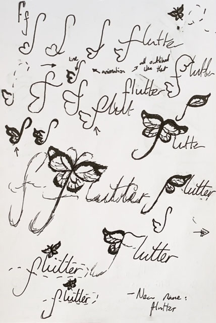
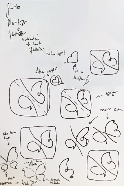
I finally decided on the name flutter for my app. Not only did this continue my butterfly theming, but also incorporated two extra layers of meaning. For one, fluttering is the movement of a butterfly, so for a butterfly to flutter it’s moving forward, similar to a ‘march of progress’ furthering the theming of positive change. The other reason for the name flutter is that it is a term for a group of butterflies, which strengthens the link to the USP of the app being the group aspect of being with your friends.
For these sketches, I didn’t have a clear idea of what I was going for, I was just sketching and trying out a lot of ideas. I began to introduce the idea of incorporating a speech bubble into the logo alongside the butterfly to continue the social aspect of the app, however I found that all of these ideas just didn’t look good to me. Though they were clever with the double meaning, they just didn’t have life to them. In one design, I decided to instead of using the speech bubble to represent a single wing, to have it represent the bottom wing, the smaller one I’d identified before. This worked a lot better as it now looked like a butterfly with the four wings. You can see the sketch I went with in the lower left of the fourth page.
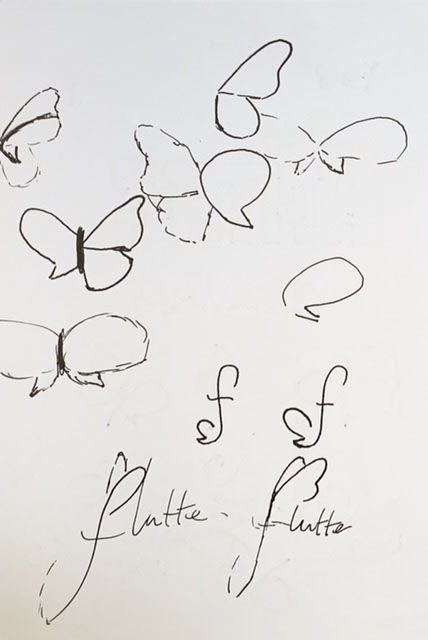
For the shape and pattern of the butterfly, I based it off of a monarch butterfly as these ones were both the most recognisable, and had the most references for details. I started by deciding between the silhouettes of both of my original sketches, but ended up choosing the second one because the bottom wings were more recognisable as speech bubbles. To make it more obvious, I tried using an ellipsis as a wing pattern, but in the end, I felt it was better to see the logo clearly as a butterfly, and then have the double meaning.
When creating the app icon, I used some variations of the logo I made to make some other butterflies, so it was truly a flutter of butterflies, and then used the dotted line to imply the butterfly had flown there. This was also similar to mapping the butterfly’s path of progress. When looking at other apps they usually had either a solid colour background or a gradient, so I went with a blue-green gradient to look like the sky, and to contrast the purple of the butterfly.
Looking back on my progress in developing the logo, I do wish it hadn’t taken so long, as that had meant I wasn’t able to do as much for the project as a lot of my time was spent working on one thing. In review, I am more than happy with how the logo turned out, and I understand that every stage I went through was important to reach the destination that I did, and I don’t think I would have been happy making many deliverables that weren’t up to this quality than making a few things that I was happy with. I do think it is important to find a balance between these two, and I will be sure to keep a more strict plan next time as to what I plan to do, and how much time I give myself on each part.
Some things I wish I’d been able to do within branding in particular was to make a proper brand guideline so that it would be easy for anyone to pick up this project that I’ve done and fully make it into an app, or so that I could easily continue to develop this in future keeping consistent branding, as I would enjoy developing this project further, and even submitting it officially to the RSA. Unfortunately, though, due to the time I did spend doing the logo, I was not able to complete this.
Another thing that stopped me developing work was in the beginning I struggled to come up with an idea of what I wanted to create, though now I feel that hesitation has made it so that the idea I came to is very clear, and it made the concept very solid and expansive.