To decide how my app would function, I researched other self-help apps, and found a specific genre of apps that would use game-like elements to encourage you to fill in parts of the app every day. These things ranged from taking care of something similar to a Tamagotchi, to collecting something, like adding trees to a forest or buildings to a town. By doing this, the apps created a positive reinforcement to caring for yourself by associating it to caring for something else.
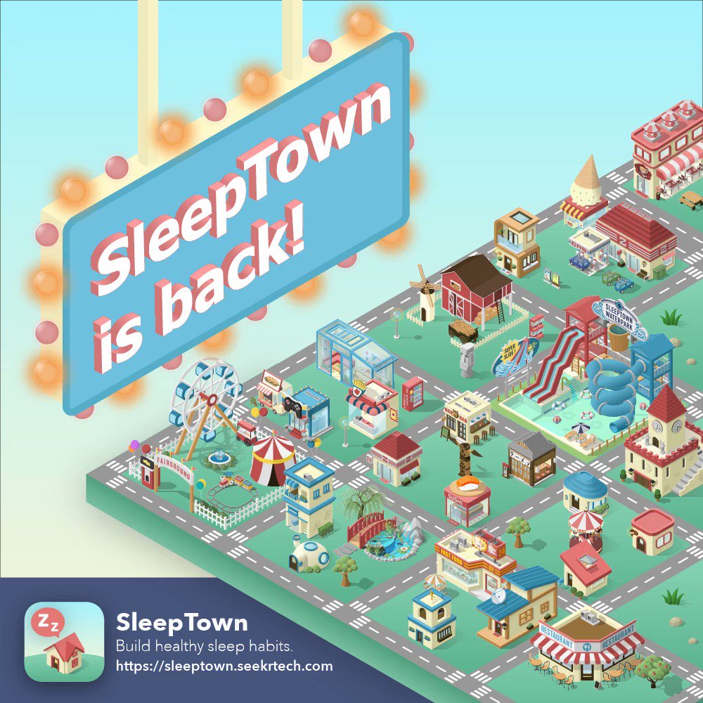
I decided to have similar aspects to these apps, but more engaged rather than a task-reward system. I planned to have a town, similar to the game ‘Sleep Town’ that rewards you for sleeping at regular times, but instead of just collecting buildings, all of the buildings would have certain uses. For example, if your group wanted to work on eating habits, you could build a café that would function for this purpose. The positive reinforcement of the game was that by filling in data for buildings, you would be able to gain points to unlock more buildings, support friends, and unlock customisation, as well as many other uses.
I didn’t want to create too many negatives for not using the app, as then people would just stop using it if it made them sad, but to create a link between the user and the town, if the user didn’t fill in data for the café that day, then people living in the town in the game would start to say things like ‘I’m hungry’ to create the association that you might be feeling if you weren’t eating regularly.
By uploading this information to the app, friends would be able to access it and may be able to offer support without the users needing to ask. Though I did consider the idea for users needing to ‘prove’ that they were filling in real date, for example using location services to determine whether you had left the house to fulfil an exercise goal, I eventually decided I couldn’t do this for every task so it would be inconsistent, and the real check is other people being able to see it, so they would known if you had lied.
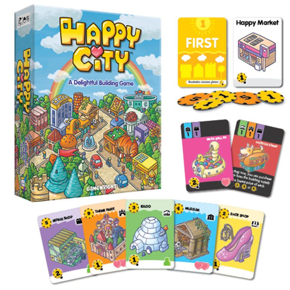
To create the style of the game, I used inspiration from the app ‘Sleep Town’ with that isometric building style. I also looked at the card game ‘Happy City’ because it shared a similar building style, however it was a lot more silly, for example having a bakery that’s just a big croissant. I thought this would be nice to add a lot more style to the game and making it a little more of a light-hearted cute thing to do with friends.
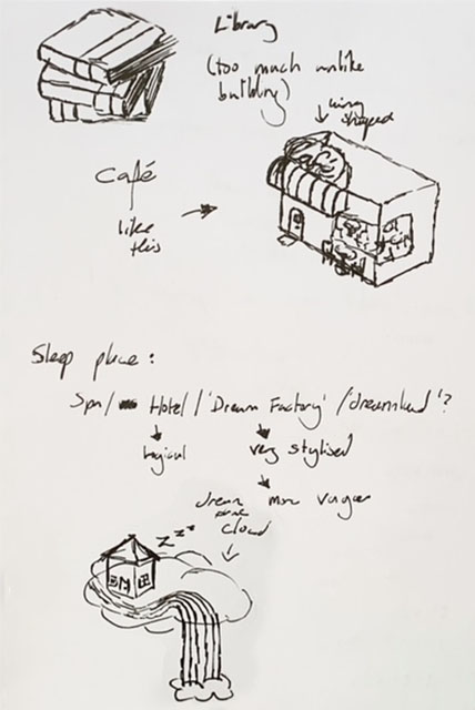
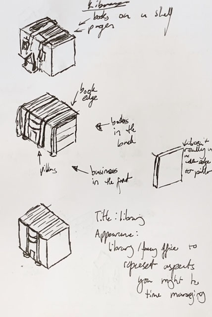
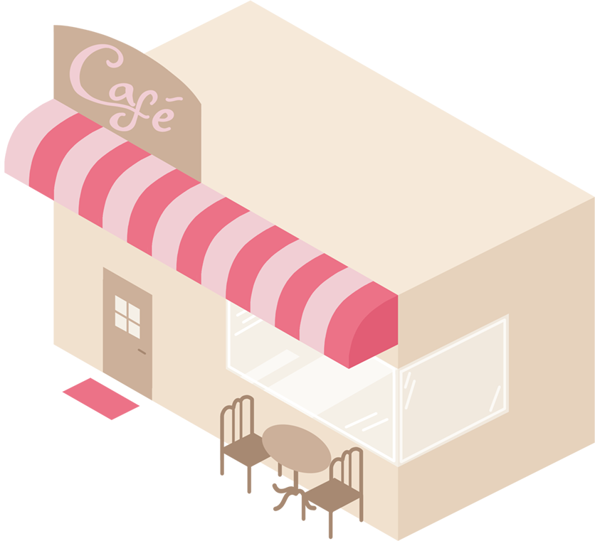
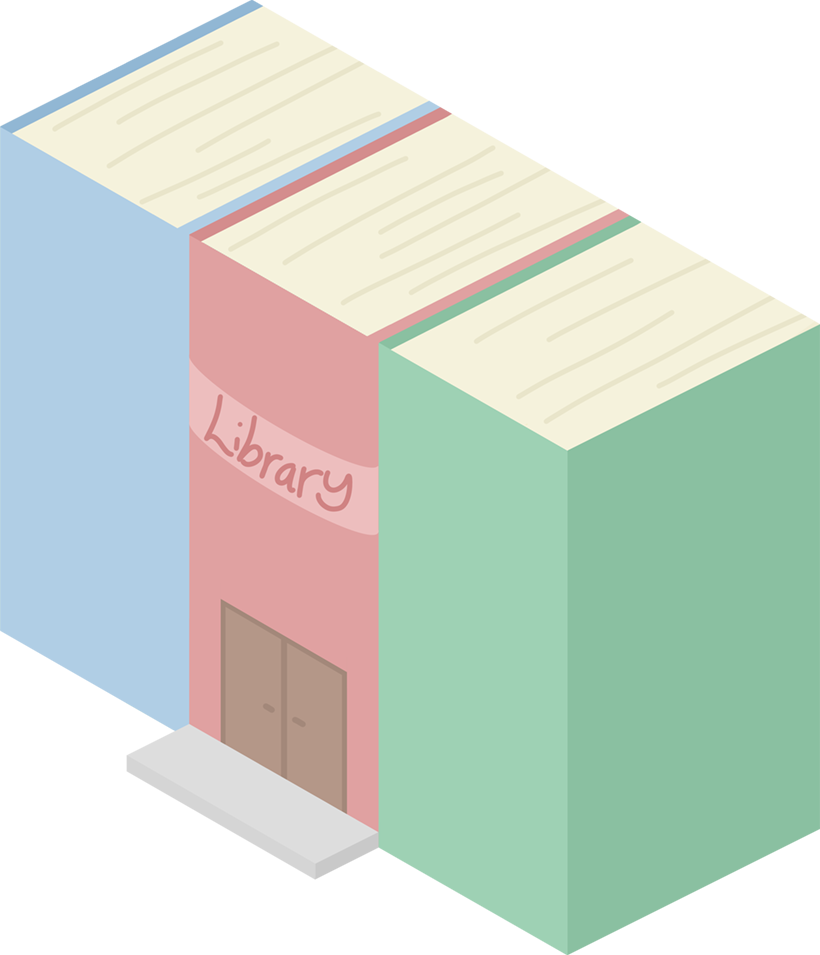
Based on my survey, I had three buildings to make for the three most prominent issues. The first issue was eating habits (both consistency and balanced diets), for this I chose to make a café. Unfortunately, the second issue of time management proved to be a little more difficult to solve. I wanted somewhere someone could balance their work and school life with hobbies, and eventually decided on a library, as people work and study thereAlso, just like hobbies, there are so many different types of books, and many hobbies like reading and writing can be completed at the library.
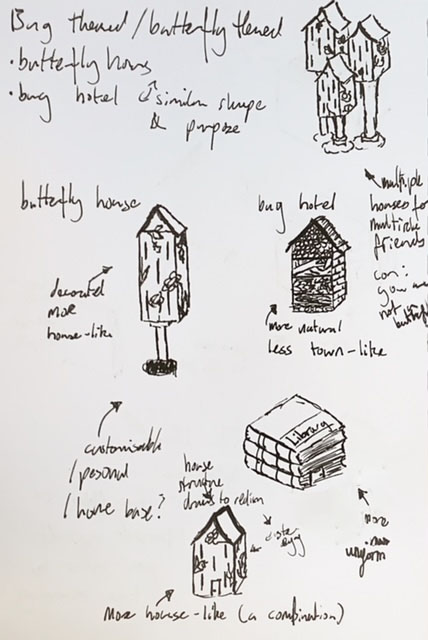
My third issue of sleeping habits, surprisingly, proved to be the most difficult. Whilst of course the idea of a house comes naturally to all of us, as it is where most of us sleep, it didn’t seem right that every player would share the same house. I thought about a hotel, a mattress shop, or a camp, but none of them really seemed right. I then went back to the idea of the butterfly theme and thought about the concept of sleeping in a ‘Bug Hotel’, like the type some would make as a child. This would lean into the Happy City creative building style, but whilst researching bug hotels, I also found something called a ‘Butterfly House’ which are used to help butterflies hibernate. I liked the idea, and eventually ended up turning it into something halfway between a butterfly house and a detached house in a terrace style.
When sketching out the ideas, I also had some issues creating the library, deciding between something like a stack of books building, and a more traditional stone building. I eventually decided to go halfway and have it look like a more traditional building from one angle, and like books from another.
For the isometric style, I used the grid function on Photoshop to create even walls at a consistent angle. It was interesting learning a new style, and I really like the way the café turned out. I chose to use similar pastel colours to the rest of my colour scheme, and I think it looks really cute and matches the rest of my app.
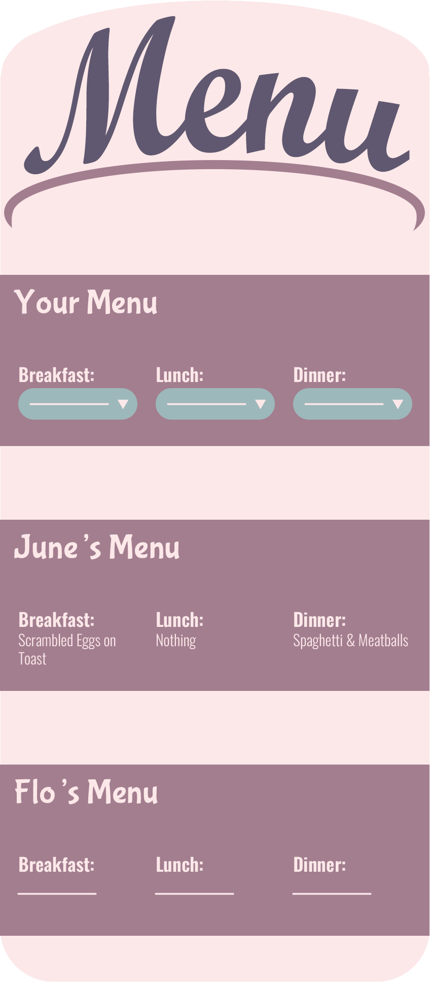
With the menu designs, I wanted them to be immersive and creative, as if you were partaking in a task. For the café, I wanted the concept to be that you were ‘filling in a menu’ so this is my attempt. As my first attempt at menu design, I think it’s alright, though I don’t love it, I’m not sure I had the knowledge to do much better with the vision I had in mind.
The main goal of the café is not only to help people who are on diets, but also those who normalise missing meals. Many people among the young adult generation tend to skip breakfast, and sometimes even lunch, so my goal is to highlight missing this by conistently seeing nothing there.
For all these menu designs, rather than being a whole screen, I plan for them to overlay the background, as many phone games do. This is why they may be seen as not to scale of an entire whone screen, however I did make them with those dimensions.
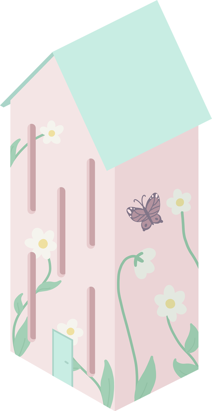
Many butterfly houses I looked at were very bright colours, and painted with flowers and butterflies, so I tried to simulate that with this design. I included a door and removed the pole so it could be easily used as a house, but mainly it fits into the butterfly theme. I really like the way this one turned out with the decoration on it.
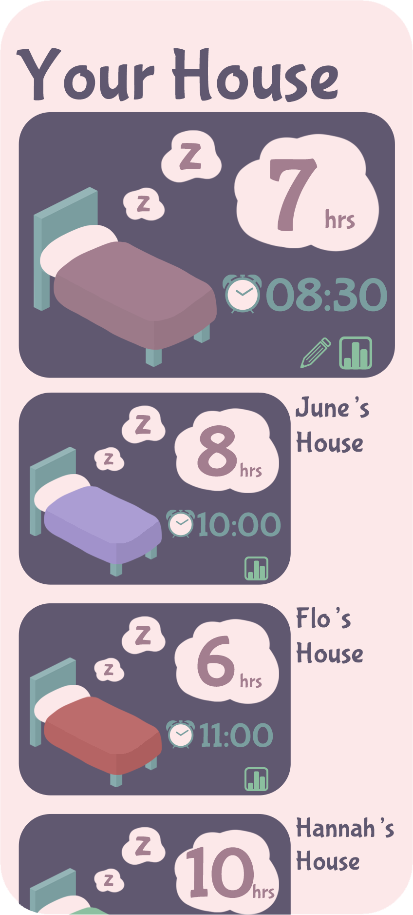
For this design, it allows you to input data about how long you slept, and what time you want to wake up tomorrow, to allow for people to be mindful of keeping you up too late. You can use a statistics button to see how your friends have been sleeping recently, as well as being able to customise your bed.
With the library, I couldn’t get my sketch to work in the way I wanted. As well as that, by making it stone like a fancy museum, it really separated it out from the other two cuter buildings, so I instead went fully into the book theme and added a sign like the label on the spine of a book. Overall, this is my least favourite building, but I do think it still links with the rest of the theme.
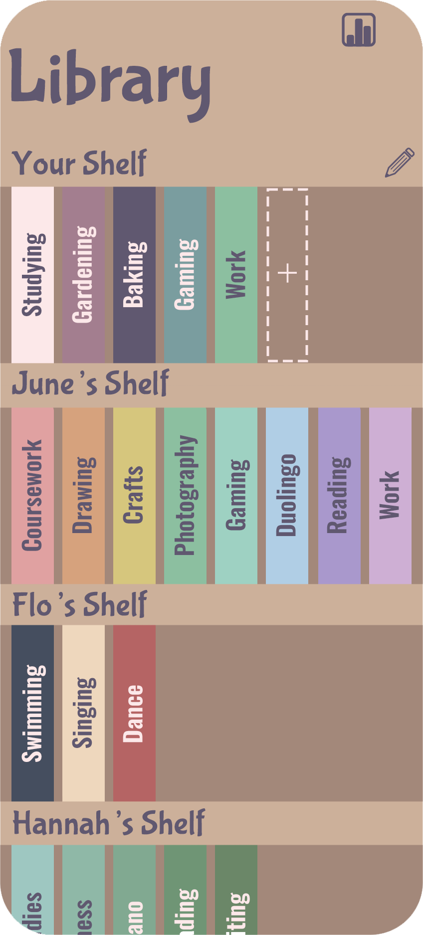
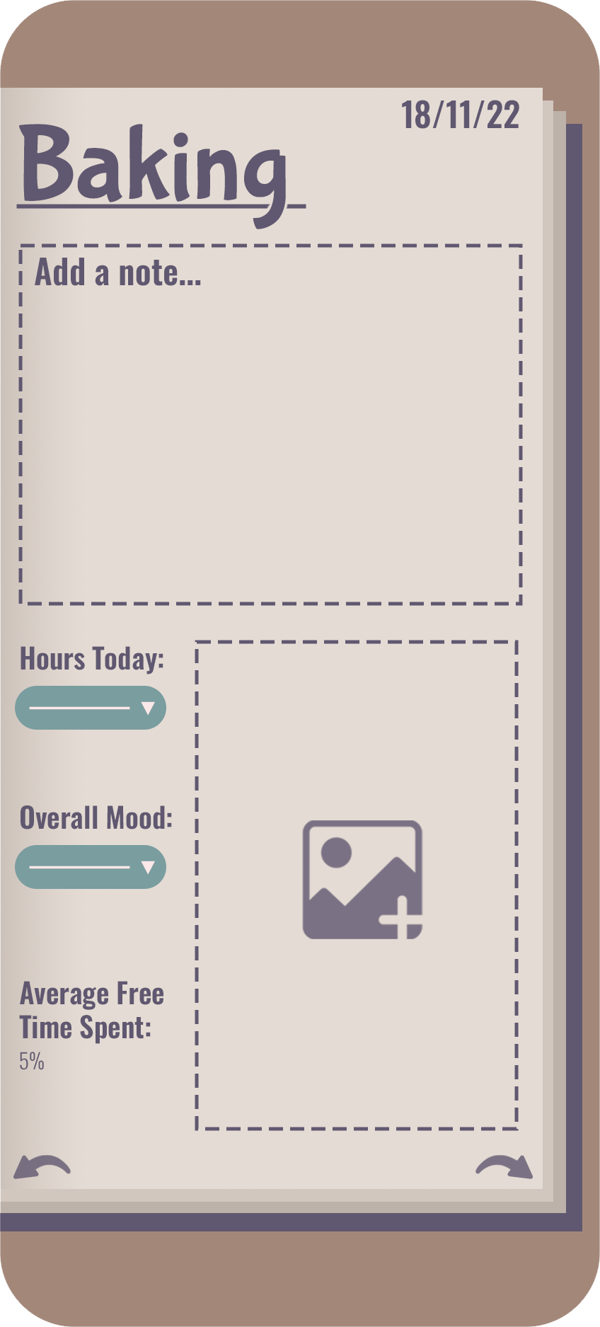
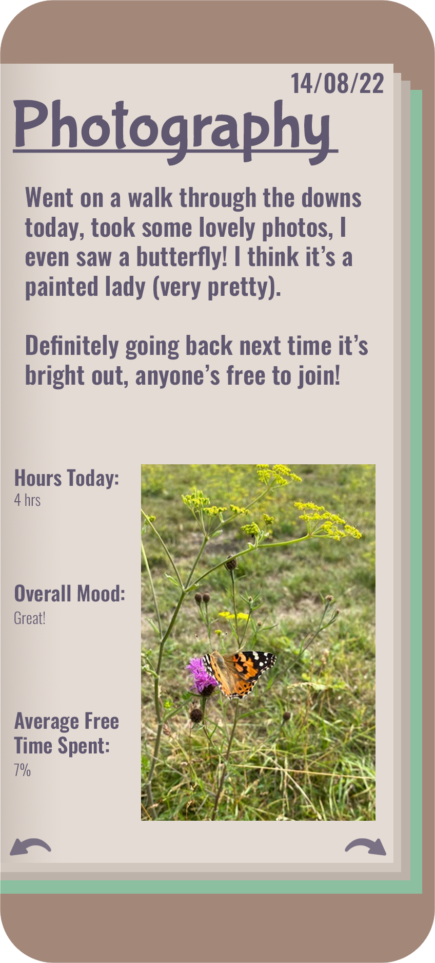
For the library menu, I decided to go with a journaling theme to scrapbook about your day. The books are divided into hobbies, and each person has their own shelf of hobbies. People can read about their friends’ days and see statistics for each other and themselves about how long they’re sending on their hobbies compared with working. Whether they overwork themselves or are not working enough, and where they could improve. Overall, this is my favourite menu design, I love how it turned out, though I understand it’s the most creative, ambitious, and does not fit the style of the other two.
My biggest issue for creating this was balancing consistency with creativity. For the menus, I wanted them to be immersive for the player, but with that I risked sacrificing consistency with menu design. Whilst I did keep a strict format with font size and type with headings and body, my formats and layouts were largely varied, so I could understand a new user finding it hard to use. However, there is visual navigation, because each menu is original, a new player would surely know where they were when they tapped on something.
One of the new skills I learnt was drawing in isometric, which I really enjoyed, though by the end there were definitely some things I would have done differently doing it over.
Whilst I kept a consistent gradient of the lines for the edge, I would have picked a more standard line gradient for some of the walls to be able to easily vary length to the grid.
Some skills I wish I had picked up when doing this project was doing work on task flow and user journeys. Whilst I did look into it briefly, it would have been nice to have learnt to create a working prototype someone could navigate and use by the end.
Overall, I’m happy with the work I created for the project, but I wish I could have done more. In future, I would like to expand this project by making more buildings and features, as I have many unused ideas I was unable to design for so I could not fit in such a smaller scale project.