Although at this point in the project we had not decided what design for the console we were going have, I decided to do some initial research into other controller designs from popular consoles to be able to know what the is popular among audiences. I tried to loom closely into the ergonomics and special functions of each controller, and what was common among each design. To gain a better understanding of the controllers, I sketched them to be able to better pay attention to details, as well as label the diagrams how I wished.
The first controller I looked at was the generic two-handed controller that is most commonly used, however it's most notably known for the Xbox and the PlayStation. A lot of what makes this design popular is the shape of the grip means it's comfortable to be able to hold with two hands, and the buttons are easy to reach with both thumbs. On top of this, with the back trigger buttons, it takes advantage of your otherwise useless index finger to be able to navigate two trigger buttons for each finger. Another benefit of this design is the end result is twelve commonly gaming buttons and two joysticks for movement.
The next design is that of the Nintendo switch, however this design is unique in that the controllers are separable, and each is then able to form a smaller version to be used by separate people, or can form into one larger controller. Overall, it uses the same button mapping as the previous controller, with a little more creativity put into being able to have them split. One criticism of this design, however, is that, when put together, they aren't greatly ergonomic (even with the addition of the grip) and when separated, for most adult hands, they're too small to use for any great length of time.
For the next design, I looked at the Wii controller, however this design completely changed from the previous two, as it is designed to be able to only be used by one hand, so the buttons have been remapped, however it is still able to be used in landscape with two hands for some games. One of the main features for this controller is the sensor, being able to point on the screen, so there aren't as many buttons as the previous two controllers, however it still features quite a few. instead of a joystick, it has a D-Pad, which could be partially due to the timing of it coming out, but also may be largely due to the need for a lightweight design, as the point of this controller is to be waving about a lot, so you don't want too many things sticking out from the design. As well as this, based on the way the hand holds it, it would be quite awkward to try to operate a joystick. Likewise with the previous two, a lot of the navigation is made through the thumb, as there are 3-5 gaming buttons to reach, however only one back button for the index finger, which is a large downgrade from the previous controllers. One thing that the Wii controller did highlight, was a large market for accessories, which made the games played more immersive, however is completely useable without.
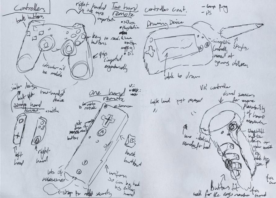
Some more unique controllers I looked at were drawing based controllers. Though also featured on the DS, for the sketch I drew out a LeapFrog. Due to both these devices being portable consoles, they featured screens, though due to this being a mobile device project, I felt these fit best as well, especially if our console wanted to put together the screen and controller. For this release, I found that there were very minimal buttons, though this could be due to the target audience being very young and thus needing to be simplified. The main draw of this device is the attached stylus in which the touch screen can be interacted with, usually for movement based pointing, but also sometimes used for drawing.
The last controller I looked at was a VR controller. The main interest of this design, is that it needs to be completely navigable without sight. For the use of the VR, the controller doesn't need too many buttons anyway, this design has 2 buttons reachable with the thumb along with the joystick, and two trigger buttons which as accessible round the back where the fingers sit. The controller is very ergonomic and is very easily able to sit within the hand to improve it naturally fitting in, and the controller also needs to feature sensors so that it can communicate with the VR. Some controllers have a hover feature, so if you have one finger over a button it will move the hand in game differently than if you were to press it.
I then looked into similarities shared throughout all the designs. Starting with, though obviously all controllers featured buttons, they varied in label. Most had letters, few had numbers or shapes, this will help me be able to know what buttons audiences will recognise the labels of. All controllers I looked at had at least one type of movement device, this was either a D-Pad or a joystick, though the variation of this is at least partially generational. A key element to button layout is the amount of hands the controller is designed for, and if this can vary and how much and often, as this can lead to very varying button mapping, that needs to be most natural and subtle so that the human mind can easily adapt to this. The last thing I decided to keep in mind was that if the controller was the whole device, it would need to feature a screen that could naturally and easily be integrated into the design.
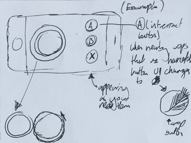
Our group designed a console in which players would be able to put screens together to create a large gaming screen full of people, however this posed an issue; how would controllers work? Since it was multiplayer it couldn't be on the system, and since it was meant to be lightweight for ease of travel, you wouldn't want to be carrying around a bulky controller, so instead we decided the controller would be a mobile app. Not only would this solution fix the previous issue, but it also carried with it many other benefits. For one, this would enable our designs to be adaptable and interactable, so layouts could change based on the game playing. As well as this, buttons can also be adaptable, so if a player would go nearby an interactable object, the UI could show this could be interacted with. For example, the interact button could change to a door when a player passes an entrance to show that they can move through it. Another benefit to this is that by having the controller as a screen, it allows for more customisation, so not only is it easier for production than releasing controller colours, but it can also be changed through a menu, rather than buying a whole new product. Furthermore, this solution also provides practical benefits, such as there being no hardware errors further than the phone itself, which has been an issue with previous controllers, most notable the Nintendo switch joycon drift, and this option also allows us to easily update our app if any potential software issues were to arise.
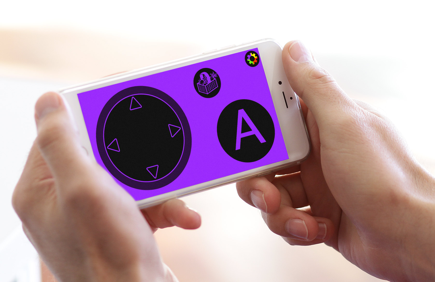
I made an initial design to show how an app for a controller may look inspired by some of the research I did.
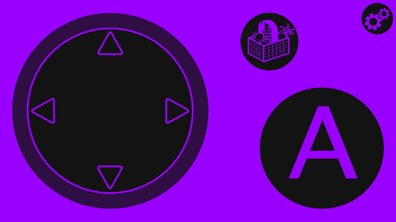
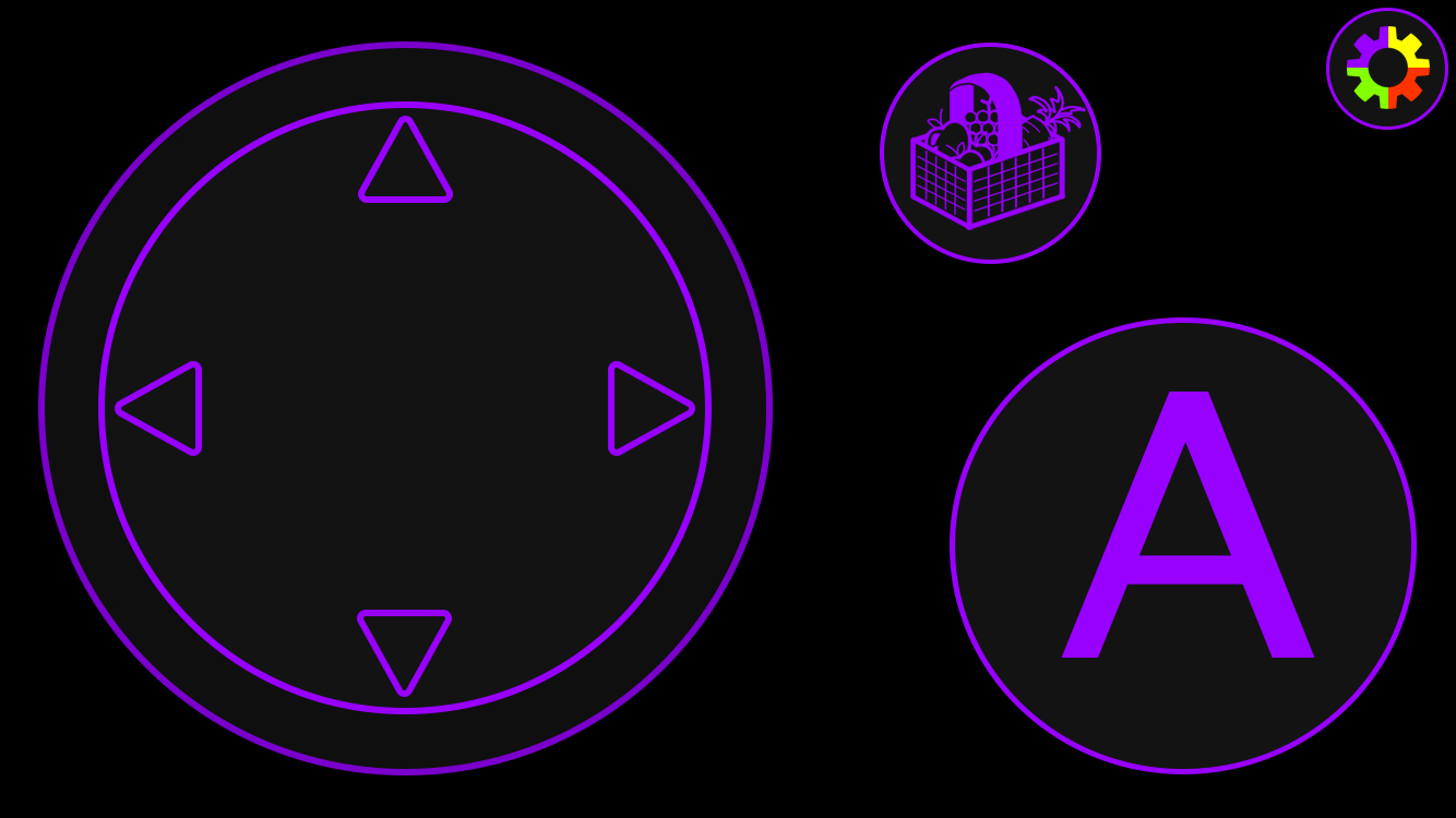
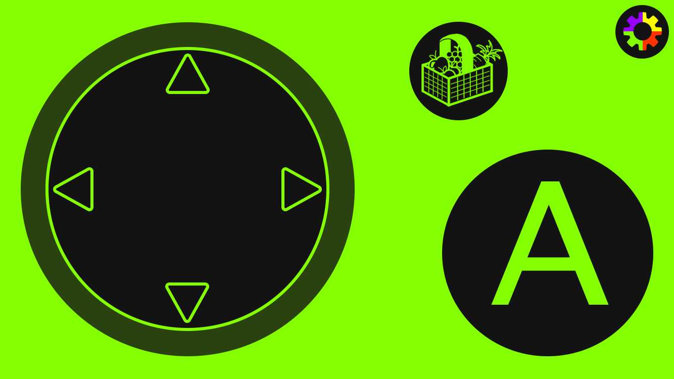
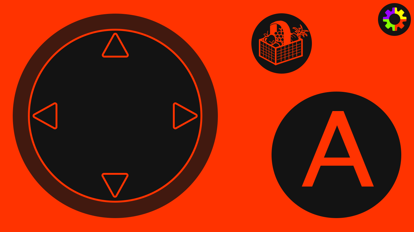
After knowing a little more about what buttons would be needed for our game, I made some more designs which were more applicable to our own console. For the basic design for the controller that would be used in the main hub world of our mini-game focused game, we needed something for movement, an interact button, an AR camera button, an inventory button, and a settings button, so I made some designs that featured these buttons. Although many mobile apps have controllers built into the game, these examples also have the games on the screen, whereas our situation has a console with a separate screen, making these concepts fundamentally different, so I didn't think it wise to look into these examples and used my previous research on controllers to inspire my designs. I put the D-Pad on the left as this is what all other controllers had, and if there were two the movement one would be on the left, so I didn't want to stray too far away from what the player would recognise. I made the movement quite big as this is what the player would be using most of the time, so it needed to be obvious and easy to navigate, rather than having small keys that would be hard to distinguish from when not looking. I then tried some different layouts for how the other buttons could be formatted, but keeping the interact button the largest, as this is what the player would probably be most likely wanting to click. I chose for the interact button to be A, as this was common amongst the controllers I researched, and I wanted it to be obvious to the player what button the click.
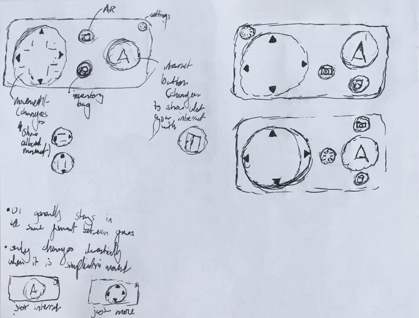
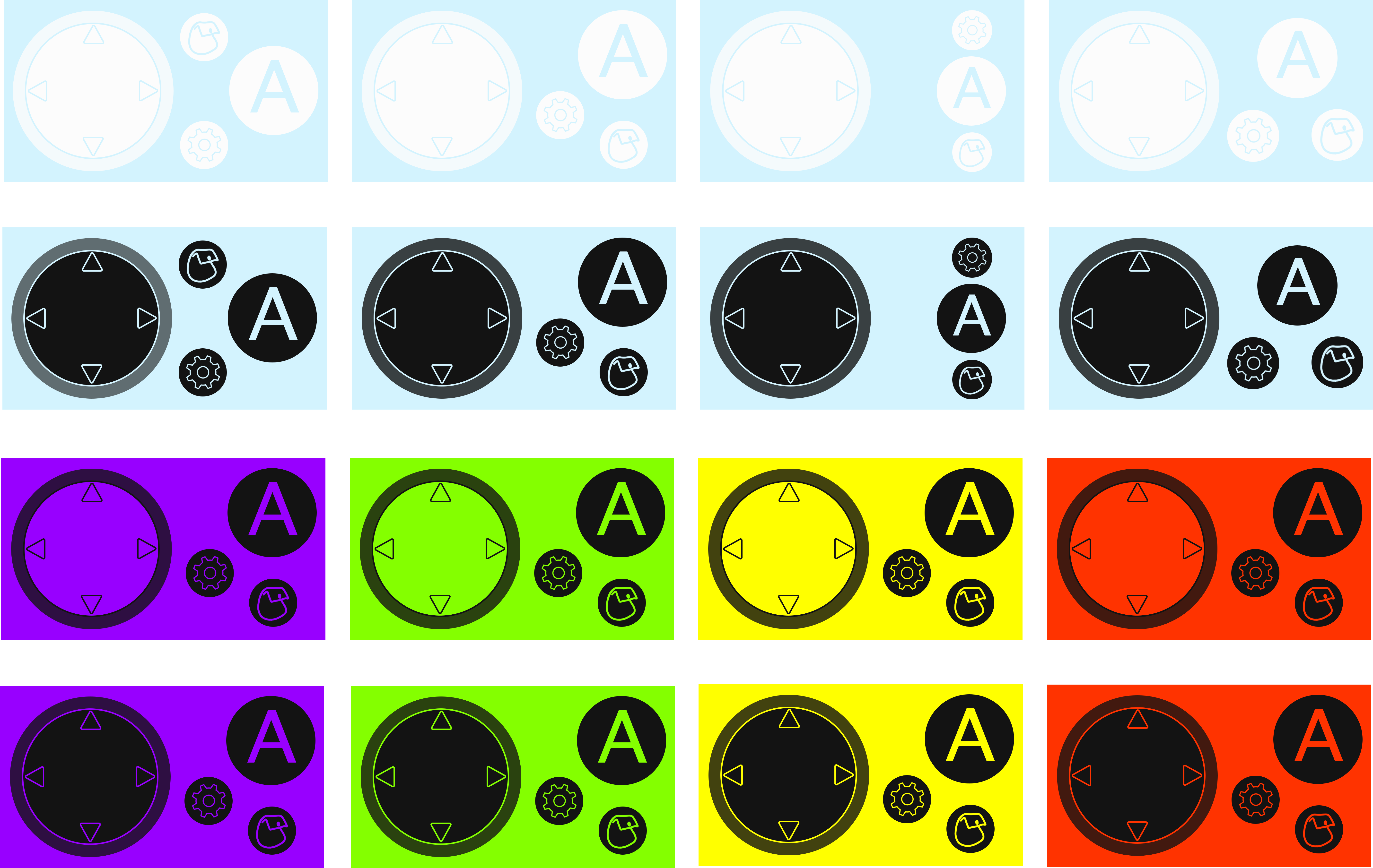
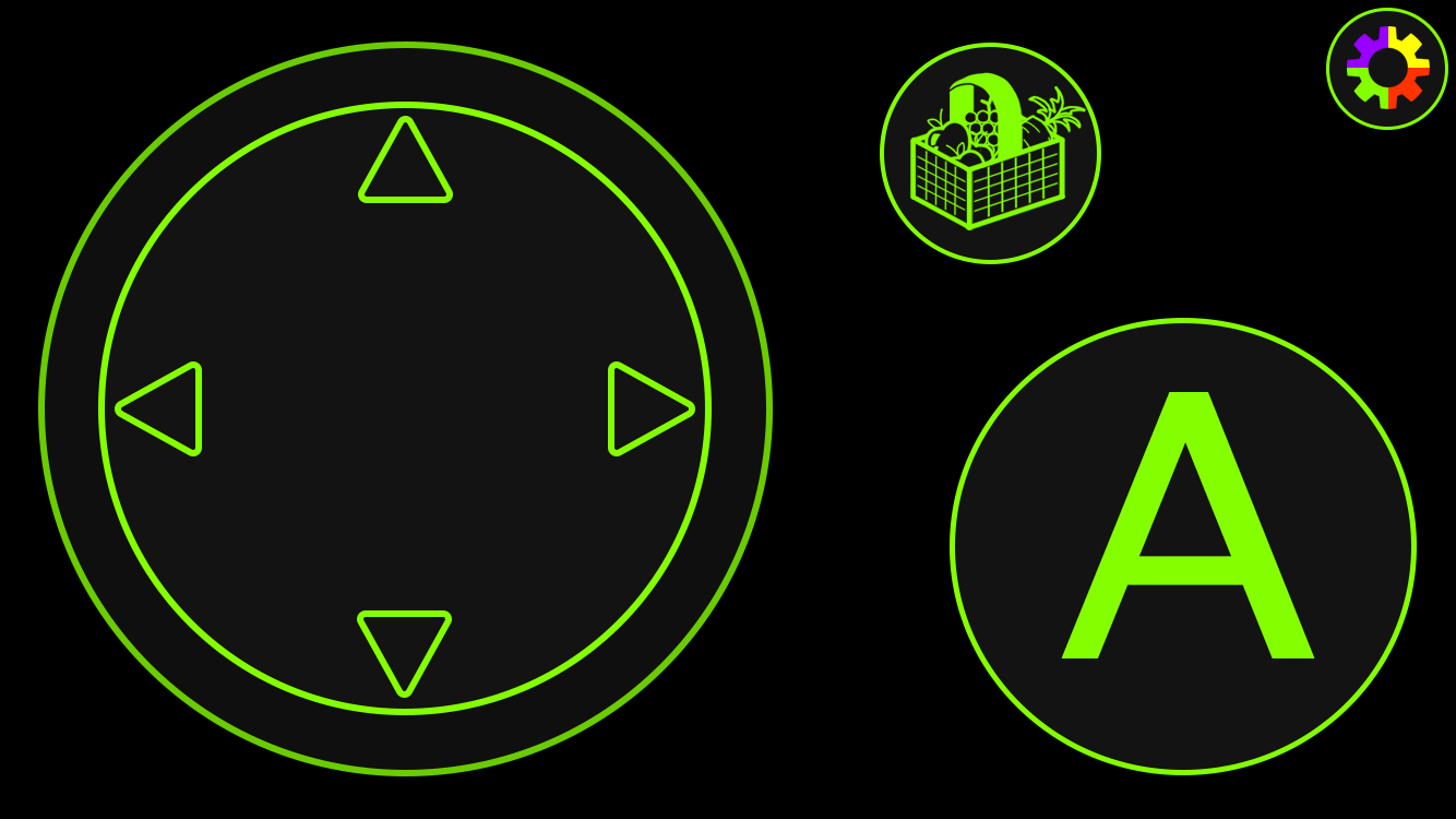
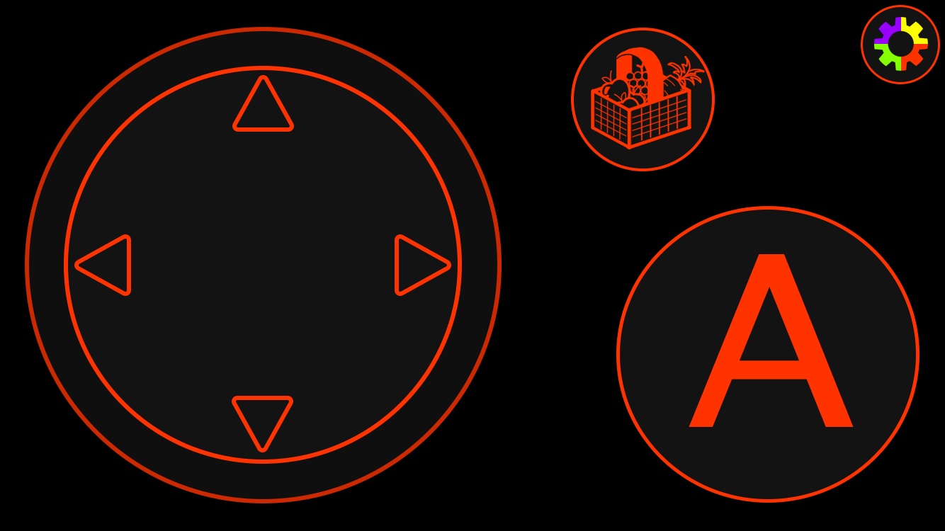
I then made my sketch ideas digital, and tried out some different colour alternatives. Due to the AR camera feature being removed from our idea, I removed this button, so some of my ideas were amended for this change. I also decided to change the D-Pad idea for a joystick design as, whilst it doesn't matter with it being digital, the joystick tends to be used more often in the modern era, and may be more recognisable. It also makes more sense if we needed a game with 360 movement, and all around tends to be the visual that most mobile games used, so I changed this and gave the joystick a bit more room so you it wouldn't be moved off the screen.
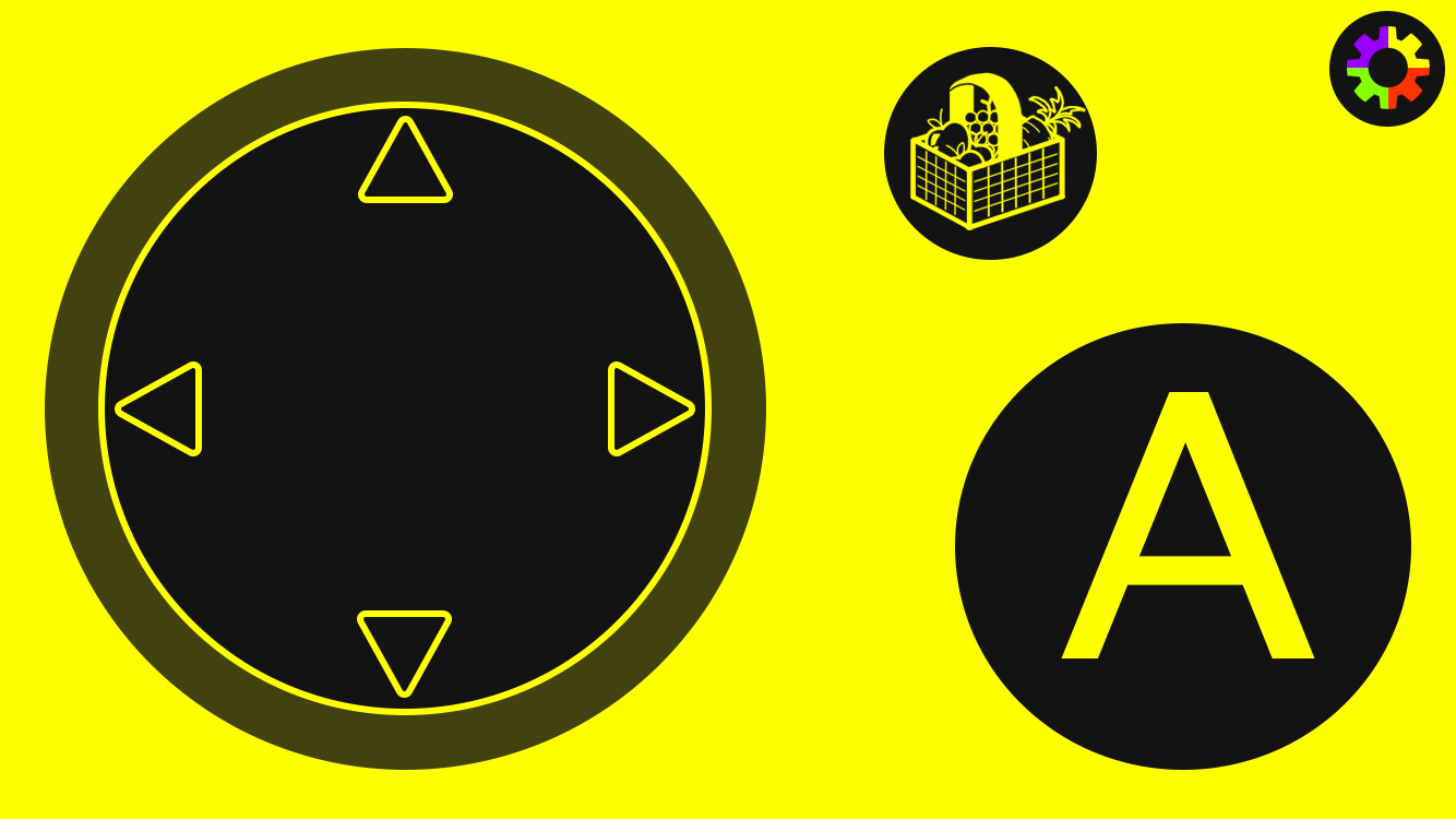
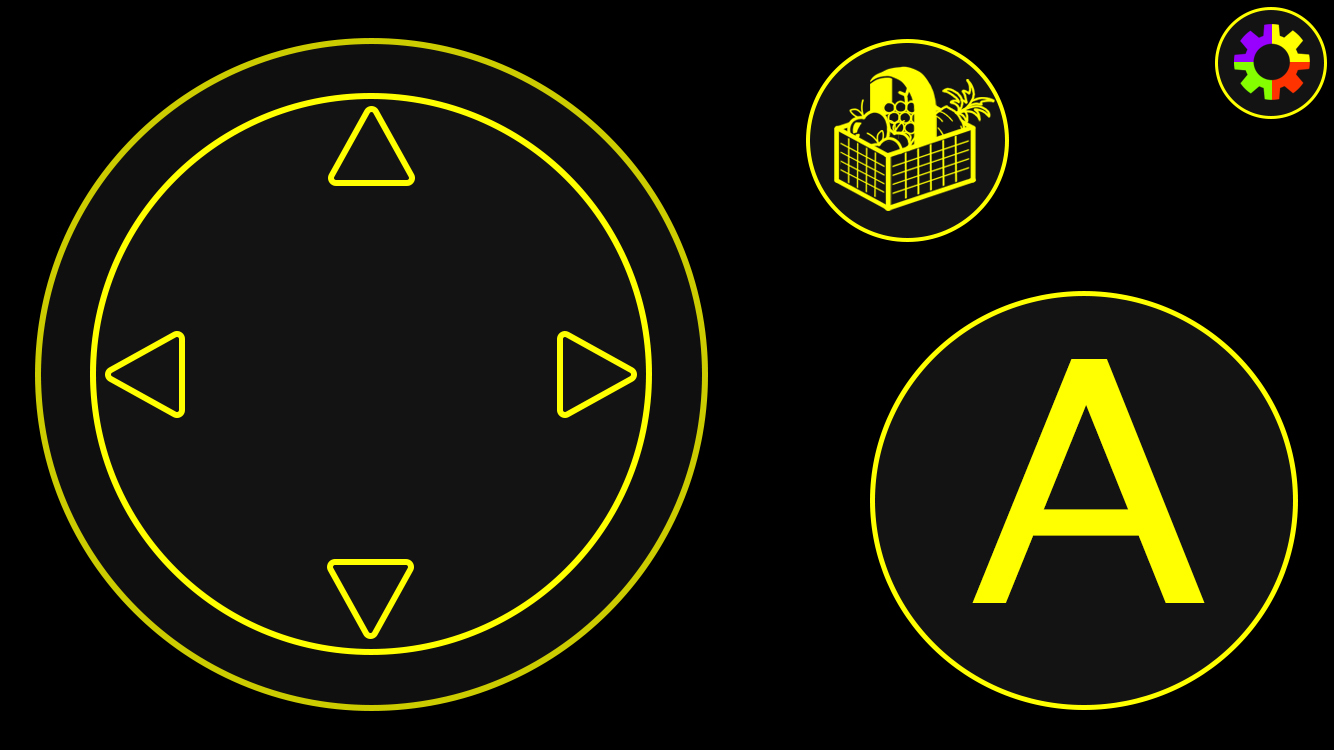
The first row I tried to go for colours based on the sky of the hub world, but felt this didn't contrast enough that you'd be able to see the buttons, so I then tried a dark grey for the buttons on the next row. This colour combination definitely looked better, but I then realised it didn't make sense to associate the colours to the game, as the controller was for the console as a whole. Though there was the option to change the controller colour based on what game you were playing, I wanted to keep the controller feeling as familiar as possible, so that when I altered the layout, there was still recognisable elements, such as colour. My next designs came as an idea from my group, that the controller would change colour based on what console colour you got. There were 4 different console colours we came up with, so I made two alternatives for these versions, and we ended up going with the bottom one as I liked the contrast better for this one. Since the grey I used was the same as the outline for our logo, it also made for a better link for our brand along with the fact that the purple, green, yellow, and red also matched. Our group then decided we liked the button layout that is shown on the coloured designs.
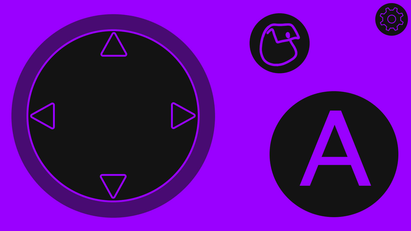
One of my group members did suggest that the interact button seemed to be in an odd place for where one might usually rest their thumb naturally, and that the settings icon should be smaller and out of the way, so I amended the design, and so the end layout for the hub world came out looking like this.
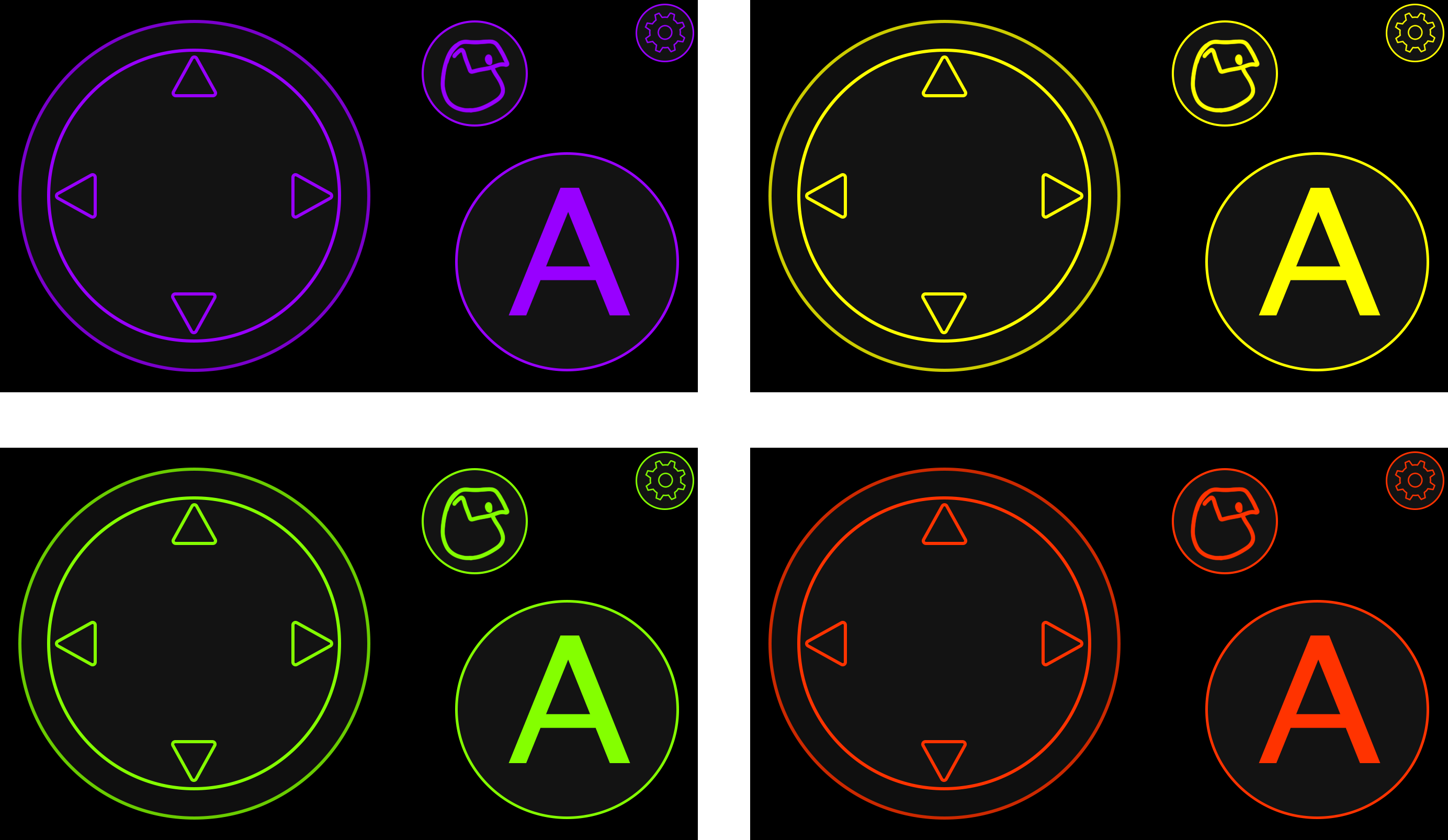
Whilst experimenting with my colour designs, I created some darker versions of the colours I had picked. Though these wouldn't be typically suited toward the younger audience we were aiming at, generally we wanted the console to be like a family system, so adults were welcome to use it. By having our controller be a mobile app, I realised a lot of phones have a dark mode, so I felt as though these designs would be a perfect opportunity to take advantage of that. Not only are these designs more suitable for those of an older audience who aren't as favourable towards the brighter colours, but it also is good for situations were someone would want a dark mode, such as when you're wanting to play in later hours when it's darker out.
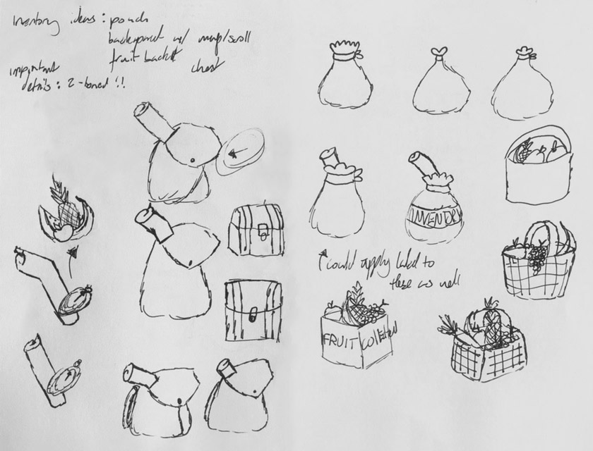
Since the inventory and settings button icons were just placeholders, I needed to make some actual designs to go there. I started by making some sketches of the inventory button to see what I wanted to go there. My first idea was to just go for a slightly more detailed bag of what was there, I went through a few different bag types, and also tried to do a chest as this was what some other games used, but I decided I didn't really like any of these designs. I then did some sketches to show some loose items of what would be within the bag, then considered the actual content of the game. Since the only thing in the hub world that you could interact with was the farm, the only thing that would be in your inventory is fruit and veg, so I made some sketches of that, before trying out a fruit basket, which I felt I liked best and was the most fitting.

I decided to keep the standard design of the cog so that it would easily be recognisable as settings, as that is what people are used to, but I tried some variations to see what worked the best. For this one, I made just a standard cog that was just my basic design.
For this version, I tried a two cog version, like two gears moving together, though it looks nice, I don't think it works well for the circular button format, as there is a little too much empty space.
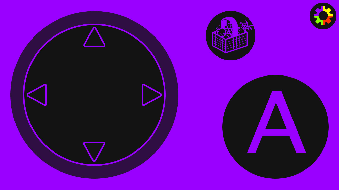
My third design was the outline of the original cog I made, however I put the Snap colours over the top of it so it would tie in better to our brand theming, as well as adding a bit of colour into the design. I feel as though the added colour draws attention to the settings better, as with being small and in the corner you may miss it otherwise, and so this was the variation my group chose. I also included my fruit basket inventory button in these designs.

As I had stated, the controller was made to change layout based on what game was being played, which would usually stay consistent through one game, however the game being made had lots of minigames, so I made some designs for the ones our game devs had created. As with the hub design, all of these layouts would come in the four colours.
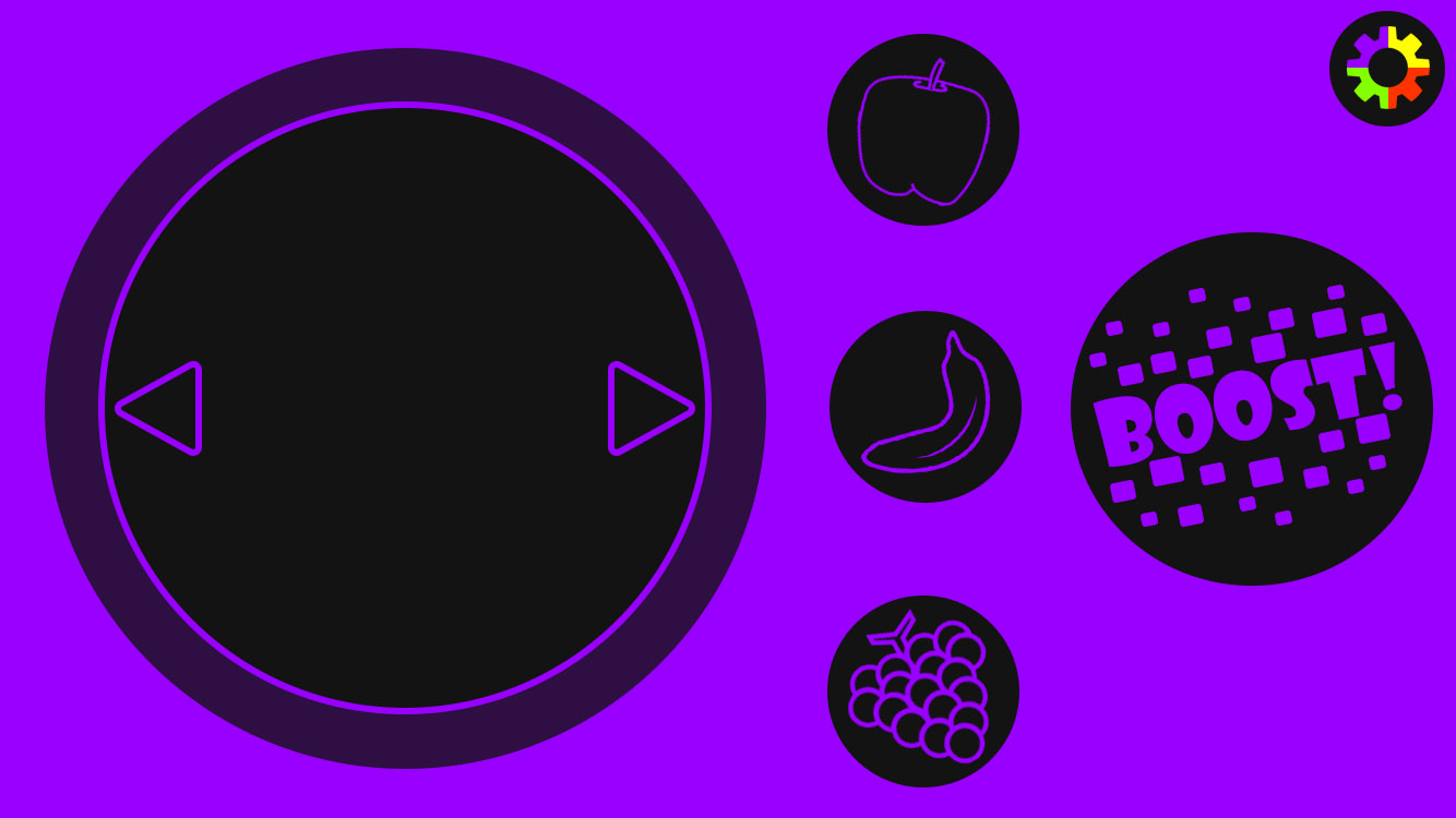
For this game the player was catching fruit in a basket that was falling from the sky, and could use some of their fruit collected to cause a boost mode to activate. The way the game was played the player would have to select which fruits they wanted to use to boost with, which was button based rather than scroll based, so I had to make a button for each fruit that the player could collect, for which I used the designs of the fruits that were in the game so that it was easy to tell which was which. For the boost button itself, I took inspiration from the visual effects of the game, to create an exciting button for the players. The change in the arrows of the joystick shows to the player that they can only move horizontally, as the game needs no up or down movement. Whilst I changed the interact button placement slightly, so I could add extra buttons in a format similar to some of my previous designs, I tried to largely keep the buttons in the same place so the player would be able to naturally keep playing without being confused on where buttons were.
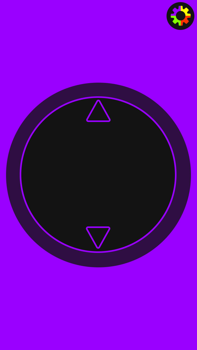
For the tennis game, players just need to move up and down to hit the tennis ball. Since the players don't need to click a button to hit the ball, the game simply needs up and down movement. I considered it much easier to scroll vertically whilst having the phone in portrait, so I altered the design to be in a portrait mode. I then also moved the settings icon so it stayed in the top right corner, so the player would know that the rotation was changed (though they would also probably prompted to rotate their phone).