
This page is dedicated to doing primary research for my Major Research Project about rebranding the charity RNIB, the Royal National Institute for Blind people, which surrounds discussion about recognition in a brand against accessibility, and whether they can work in conjunction. I’m conducting this research to view society’s view and response to rebrands, as well as evaluate the impact of charity brands, and how they compare to my chosen brand.
To better influence my rebrand, I decided to conduct some primary research to best gage public feedback to rebrands. It’s important to gain primary research for a research project so you can ensure that the data is valid, and is also accurate to the variables you wish to measure. By doing a survey, I decided to gain quantitative date on society’s view which was done by purely asking multiple choice questions. Since the survey was only 5 multiple choice questions, it also boosted my response rate, creating a larger sample group, and likely leading to more accurate data. By the end of the research, I was able to gain 38 responses, which I consider to be a good amount to conduct accurate research.
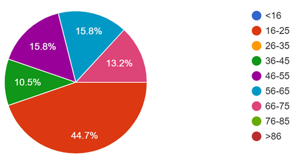
Though I tried to gain varied responses across all age groups, I did unfortunately have a rather high response rate of 16–25-year-olds, which is not proportional to the general population that I was sampling. This was likely due to the fact that I mainly asked people I knew to take the survey, mostly of my own age. Fortunately, this age group only took up 45% of responses, and the other age groups were diverse.
The next two questions I asked served to analyse public response to major rebrands and name changes, and whether companies became more or less recognisable after rebranding. To be accurate to my project, I would have like to purely look at charities, however there were not a sufficient amount of examples to do that.
I tried to use a diverse range of company rebrands that had each taken place at a different height of popularity for the company so I could then use this data to analyse whether this was a good idea for RNIB in its current state, and whether changing its name would be wise.
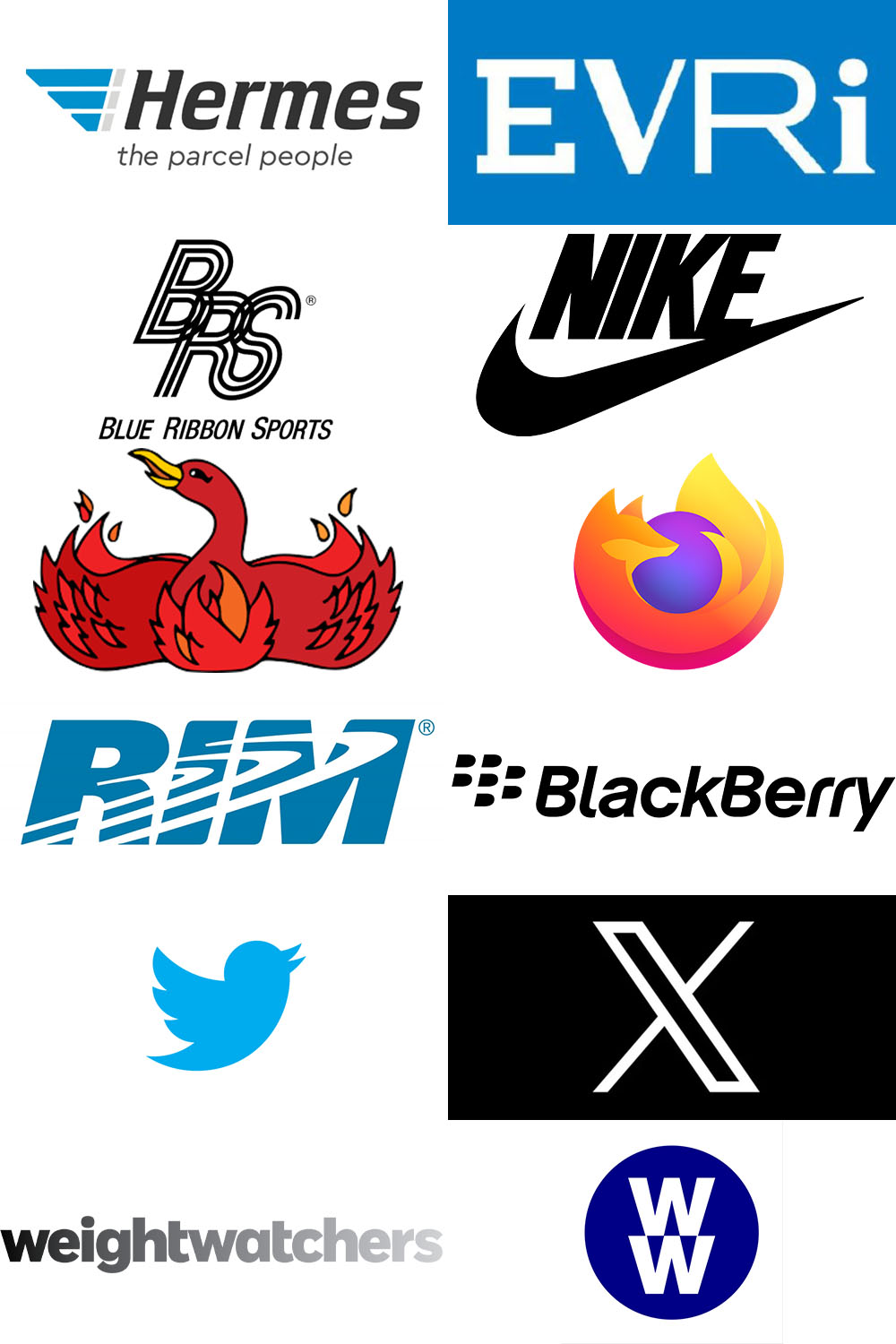
The first company was Hermes that rebranded to Evri in early 2022. People appeared to recognise Hermes, the previous name, more than Evri, though only slightly. Unfortunately, since there’s only a difference of four responses, it’s hard to tell whether most people who knew Evri knew it was Hermes, but not the other way around. Since the company has only been known as Evri for two years, it will be interesting to see how this data may develop over time, but overall, it appears to be inconclusive whether it was successful or unsuccessful.
Next was Nike, that started as Blue Ribbon Sports. According to my research, no one seemed to know this even though they went by that name for 7 years until 1971. I did add this one to see a rebrand at the beginning of a company, that had still been established for a longer period of time, but it appears the company just wasn’t big enough during that time, or had a really successful rebrand campaign. Either way, what we can tell from this is that it is easier to rebrand before a company becomes widely successful.
Looking at the data for Firefox, which used to be known as Phoenix, this appears to be a widely successful rebrand as 82% of people identified as recognising Firefox, whilst only 5% of people recognised Phoenix. Again, however, this may be a case of the company not being established at the point of rebrand.
A similar case with 84% of people recognising Blackberry, the phone company, and only 13% recognising it under its previous name RIM. Some of the respondents who said they recognised RIM, however, were born after the change, so it’s hard to tell the validity of their claims, or if it’s a well-known rebrand after the event.
Twitter rebranding to X in summer of 2023 is another recent rebrand, and though there may not have been enough time for X to have a chance at recognition, it is clear that Twitter is more recognisable as a brand. 97.4% of respondents identified as knowing Twitter, however only 82% of respondents knew about X. This rebrand was very much in the public eye, so it could be one of the reasons X is so recognisable. Any publicity is good publicity.
Lastly, in 2018, Weightwatchers changed its name to WW, and shows a clear downturn in the amount of awareness of the brand. Weightwatchers was a well known brand with 61% of people recognising it, however only 24% of people recognise it under its new name WW. Whilst still keeping their name “in essence”, it really shows how much people don’t recognise it anymore. And, as one of the more recent rebrands, this clearly shows the negative side to a name change in a rebrand.
Looking at the data, it’s easier to see that, as an established company, making a rebrand of such large proportion, such as changing a name, is a big risk, and it’s important to perhaps keep some details of a previous brand to best link to the consumer who they are interacting with.
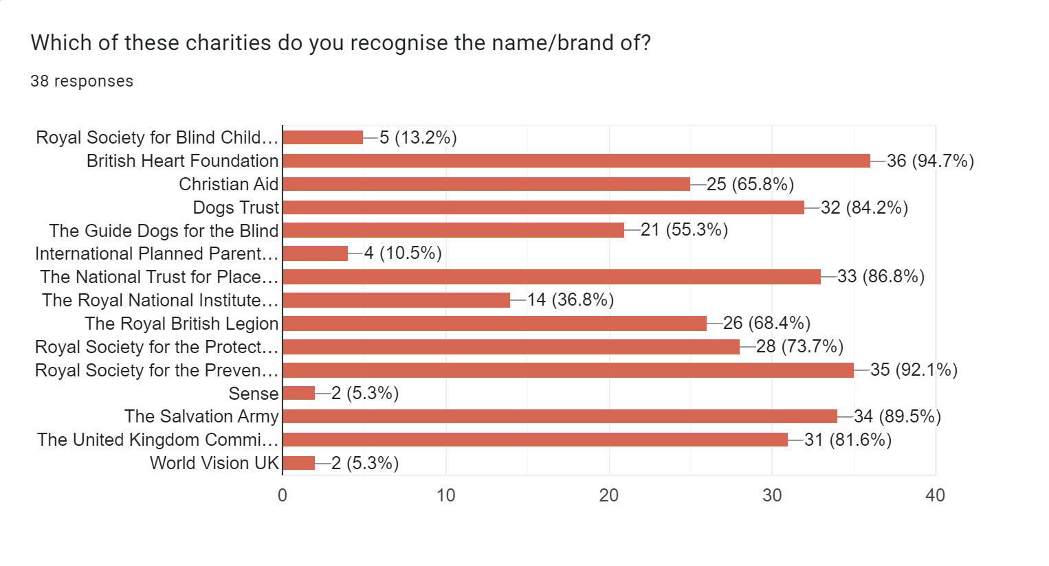
The next question focused on showcasing RNIB’s brand in particular, and how memorable it was. The best way I could quantify this was by taking a number of charities that had a similar income and popularity to RNIB and putting it to the public on how many they recognised. Though some may not have the same amount of advertisement, this seemed the best way to do it. I also added other charities that focused on blindness to see if this was a contributing factor.
RNIB was only recognised by 37% of people, just over a third. Whilst this may seem like a lot, it placed 11th out of 12 for charities in a similar income bracket, beating only the Internation Planned Parenthood Federation. This placement was also not by a small margin. Guide Dogs, who came in 10th, was recognised by 55% of participants. This clearly shows that RNIB’s brand is weak, and whilst it may help a lot of people, it is not recognisable to the general public.
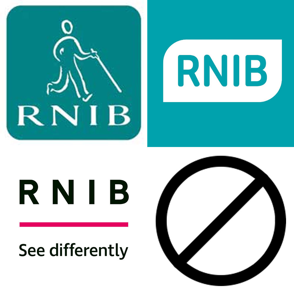
Lastly, I questioned people about which variation of the RNIB logo they recognised most. Whilst 54% of people had never seen any version of the logo before, the next largest, and 30% most identified with the first logo the company had which featured both text and imagery of a person with a walking cane. Whilst problematic, and I can see why the company rebranded, it’s clear to see that some elements of this design should have stayed to better relate to the general public, as with their newest rebrand, the only thing they kept was the name, a very unrecognisable part of the brand, being just nonsensical letters.
I was later approached multiple times by people who assumed the last question had “theoretical logos” and so picked the one they liked the most. Whilst this does skew my data, it is data none the less to show a theoretical preference, rather than being a brand they recognise. Next time I collect data, I will be sure to be a lot clearer in my questions.