
For my proposal, I looked at measuring the impact of successful branding and reviewing how a company can facilitate a successful rebrand, which can be viewed here. In short, I reviewed companies who had been through major rebrands, evaluated their success, and did research to support reasons as to why this may be. Overall, I found that the less a company changed about it’s brand, the more accepted it was by the general public. Of course, a name is the most recognisable part of a brand, but even that can be changed when handled with care, as some elements can be kept the same. I also looked at actions that should be avoided when a company is rebranding, as these can lead to either being entirely forgotten, or being viewed negatively by the public eye. A brand is a consumer’s identity or view of a brand, their only way to identify it. If this is changed, the consumers view of the brand is completely reset, and the brand will have to begin from scratch to form a new relationship with the consumer, as all previous trust was lost.
Using this research, my plan is to rebrand the charity RNIB and guide it through the correct steps to make, and things to avoid changing. This design will then be condensed into a brand guidelines document representing the new brand for the company. This will be my deliverable for the project. RNIB is the Royal National Institute for Blind People and, by using primary research which can be viewed here, I showed that the branding for it is not as recognisable as other charities of a similar popularity, and is also not as recognisable as it used to be with previous brand identities. I also did further research on changing a name as part of a rebrand, and found that many companies that change their name after rising to popularity don’t do as well after rebranding, which suggests that, to have a successful rebrand with this project, I shouldn’t change the name.
I have identified what I believe to be some of the larger issues with the logo when comparing it with both more identifiable charities, and previous logos that are recognisable.
Mainly, I believe that it holds no visual importance. Not only is there no iconography to relate to, but there’s also no personality in the typography. It all seems very corporate, which juxtaposes the emotional value of a charity. I also believe magenta colouration does little to add to the overall design, and instead makes me think of BBC iPlayer. This is not just because of the three main colours being almost identical, but also the line is very similar imagery to what is used on the iPlayer UI. I also see no particular significance to connect with on the magenta, and have found none through research. What I have found, is that the main reason for the charity rebranding is to separate themselves from the imagery of the “man with the white cane” as they didn’t want to only be associated with the blind (Evening Standard, 2012). Another article on the subject sites their new logo as being “easier to read for people with sight conditions” (Anon, 2018) and whilst it is important to improve accessibility, especially regarding a charity focusing on helping those with sight loss, it’s also important to have a recognisable brand.
My objectives when creating my rebrand are to create a more recognisable brand identity including iconography in the logo to stay better in the mind of supporters, create the brand with awareness to sight loss conditions when considering colouration and fonts and any other matter that may apply, and create a logo with a less corporate feel and a more welcoming atmosphere that should extend into the brand itself. In short, I want the brand to be recognisable, accessible, and welcoming.
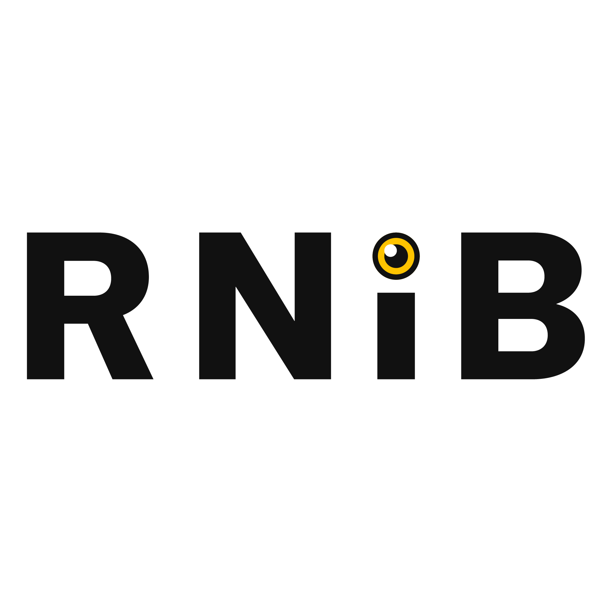
My main issue with the current logo is that it’s proven to be not very recognisable based on my research, as such, this is what I focused on in the initial stages of my development for the logo. Since I’ve decided it would be unwise to change the name, I have opted for more of a “campaign” to better create an link with what the charity does.
As the charity focuses on blindness and sight loss issues, the simplest way to link these is through the use of an eye to represent all the work the charity does. My goal is that the name would be read as ‘R N eye B’ and would slowly become the name of the charity without actually standing for anything. As this is an audible play on words, is it also accessible to those with sight issues without having to read anything. Since the acronym itself isn’t very memorable, by having an identifiable word in there, it can stand out to the audience as something they can link to, and even further with the iconography involved.
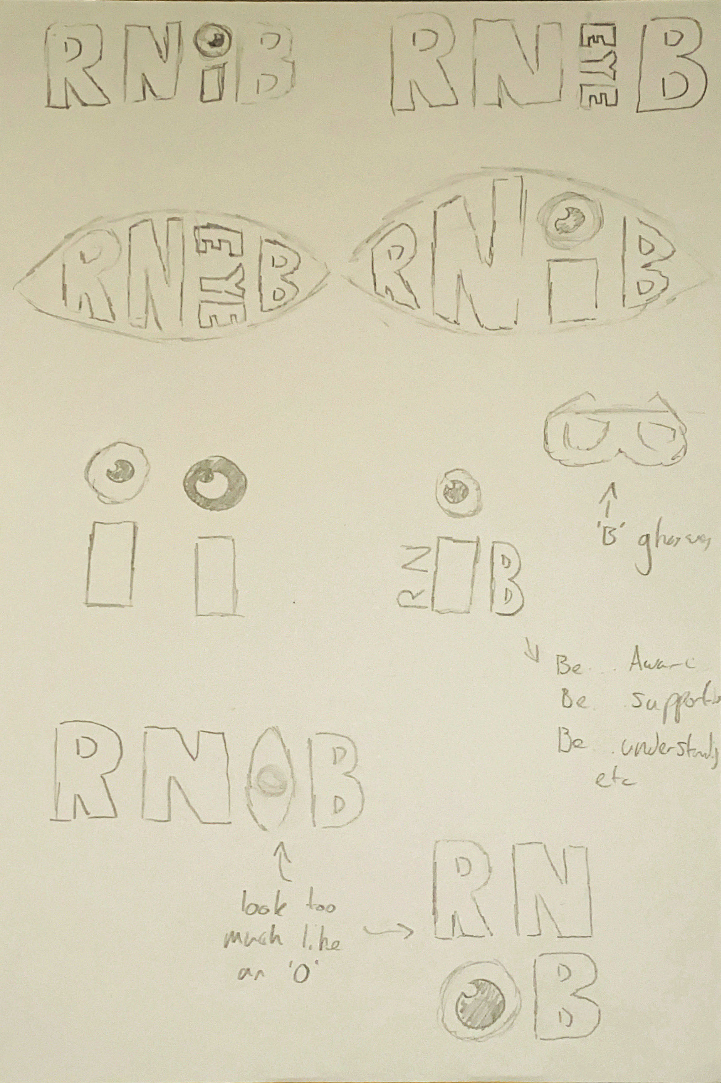
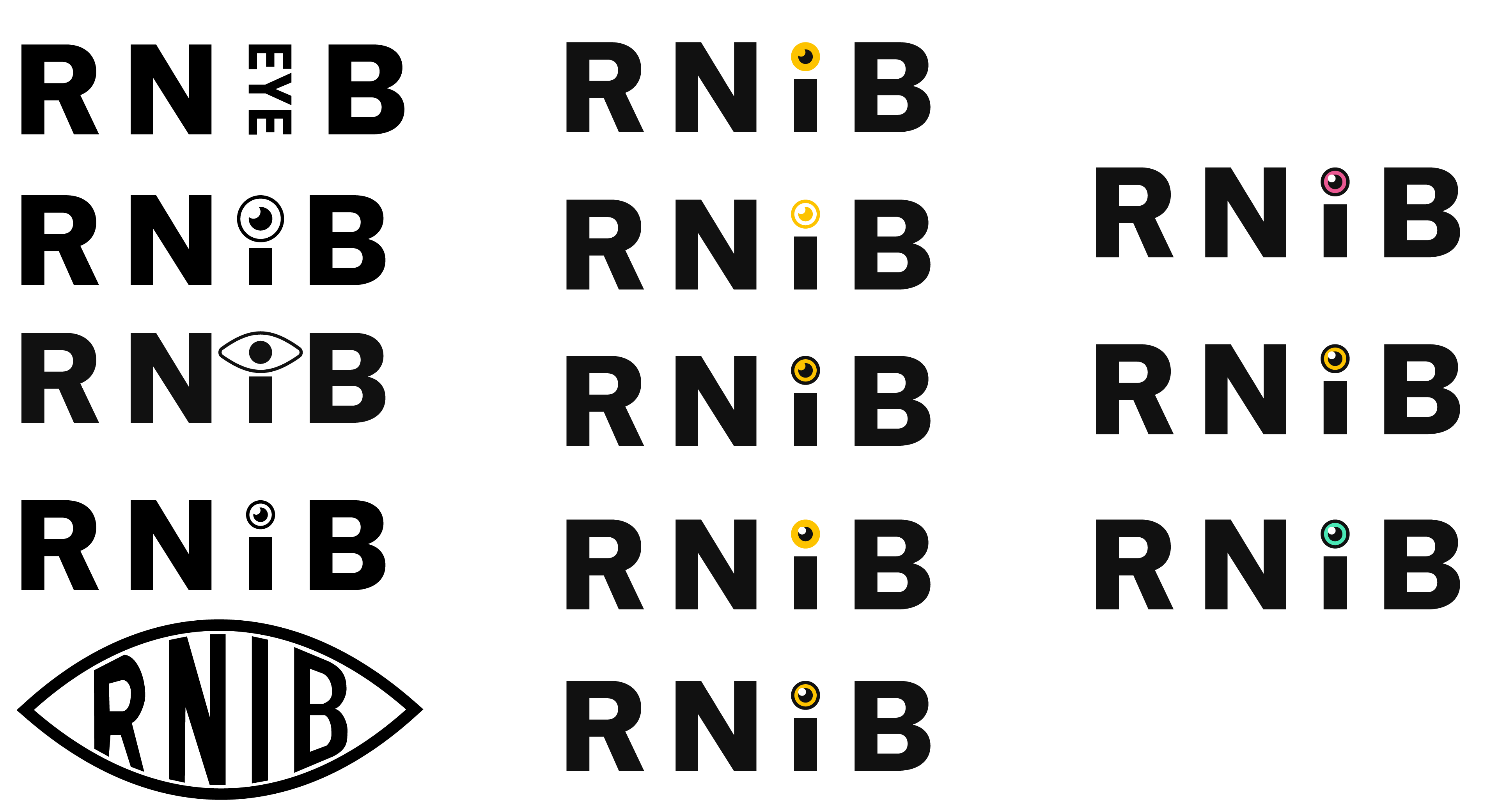
I went through many variations of the logo to be able have the most recognisable version of an eye, as this would be the main iconography used. I liked using the eyeball as the dot of the eye as this created a double meaning both ways, and just worked well, though I do feel the eyeball was looking a little strange. Many of my other variations I felt had issues with readability, and it was hard to tell where someone would draw the line. Initially for this project I had a contact at RNIB, unfortunately they became ill before I could discuss the project with them in depth. If I were to re-do this project, I would ensure that I had a contact who was a sight specialist who could help inform decisions such as these. Whilst I did like the vertical text of the ‘eye’, I felt as though it wouldn't be iconic enough, and looked a little bland.
After picking a design, I was then left with deciding colours. My main three were the pink of the current logo, which was quickly discarded as I was concerned for possible connotations with pink eye, which is not associated with the charity. Next, I had yellow. The yellow provided a feeling of “cheerfulness, optimism, and happiness” (Makara, 2023), which linked to my objective of feeling welcoming, as well as yellow and black being a good colour combination for those with sight loss, even being featured on their own website. The teal served to create a link to previous versions of the RNIB logo, whilst still being bright and fun. It was made to be recognisable by linking to a variation people recognised, as well as being more similar to charity colours people can relate to. In the end, I chose the yellow to deliver the feeling I wanted as well as represent more than just the colour.
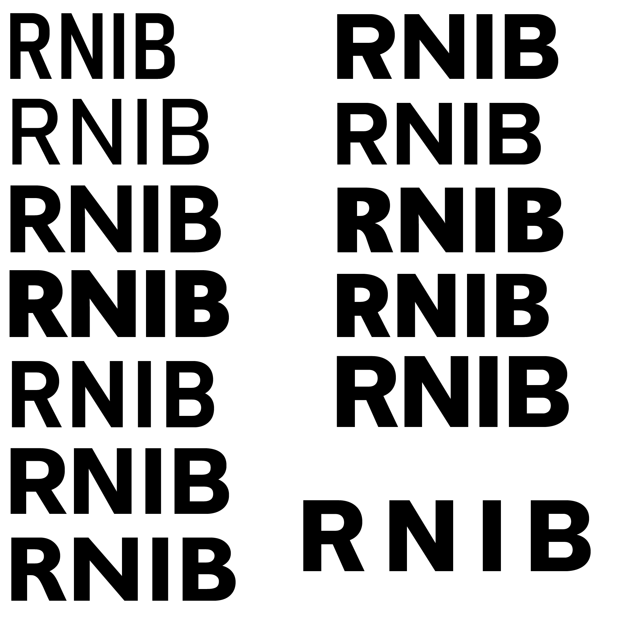
When choosing a font for the logo, I picked a selection of bold and clear fonts to further a message of accessibility. Whilst I wasn’t sure if this was a representation in the current logo or if it was necessary for readability, it’s also important for any logo to be clean, bold, and recognisable from any size or distance. After this, I increased the letter spacing like in the current logo. This is again another instance where, given the chance to do the project again, I would gain contact with someone who could best advise on the accessibility side of this design. Though I am able to design for such, it’s harder when I don’t know the rules, and I don’t know the extent for which some things may need to go to.
In the end, I chose the font ‘Usual’ for the logo as I felt it displayed the letters most cleanly.
When making the design, I also used colours that would allow for high contrast, and ensured that this would be respected, as seen within the brand guidelines I produced.
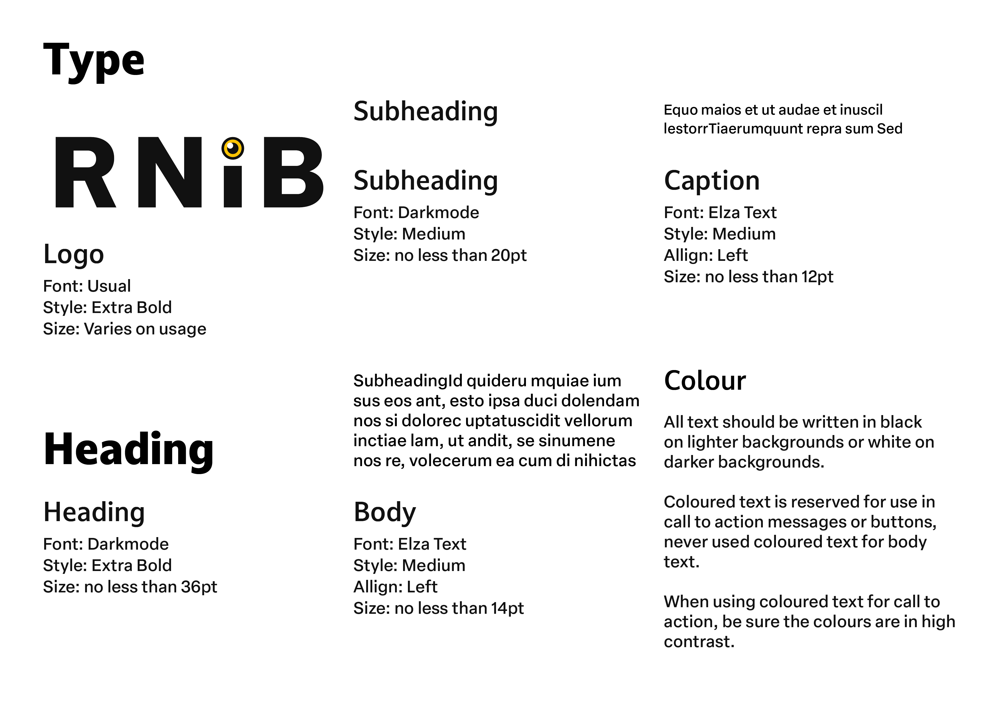
To find the fonts for the logo and text, I used Adobe Fonts and filtered by ‘clean’ to ensure that all the fonts I chose were legible, as well as ensuring that they were sans serif to really make sure people who have trouble reading could have the best experience if they weren't using a screen reader.
I also made sure that each type variation had a minimum font size to both appeal to the common audience visiting the website, and anyone who may need larger text to be able to read. Though there is software nowadays to change this, it is important for the site to be made accessible as well.
When RNIB updated their logo to its current design, though they wanted to spread a message of “[shedding] the perception of RNIB as having a “cold personality”” (Stewart, 2018), the plain text does little to promote a fun feeling. Though the eye icon I have used may seem a little ‘goofy’, it is in line with how the charity want to be perceived, as Stewart goes on to talk about Sophie Castell’s vision and ad campaign using humour to be impactful to the audience.
By using yellow in the logo, and an accent in the branding, the goal is to elicit an “overwhelmingly positive” feeling and emotions of “kindness, warmth, empathy” as outlined to come from yellow by Kevin Kaminyar in an article by Maybray (2023). A lot of the marketing material for RNIB at the moment can be rather sad and distressing, whilst this can work for other charities, it seems odd as the message should be ‘those with blindness and visual impairment are just as capable’ rather than being a sob story to donate money to. The advertisement should be focused around how they can use money to help and support people, as when you have been diagnosed with permanent condition, it’s not nice to have the first message you’re hit with is how it’s going to ruin your life, especially when the RNIB website is a place that people go to to receive information on recent diagnosis. As an example, this image used to be the main image on the home page of the website, based on a tv campaign they ran. It’s not a welcoming feeling for supporters or people in a vulnerable state (RNIB, n.d.).
When creating my brand guidelines, my goal was to create a welcoming atmosphere to comfort anyone who came to the site by using an empathetic language and positive imagery, and avoiding exploiting people for their stories.
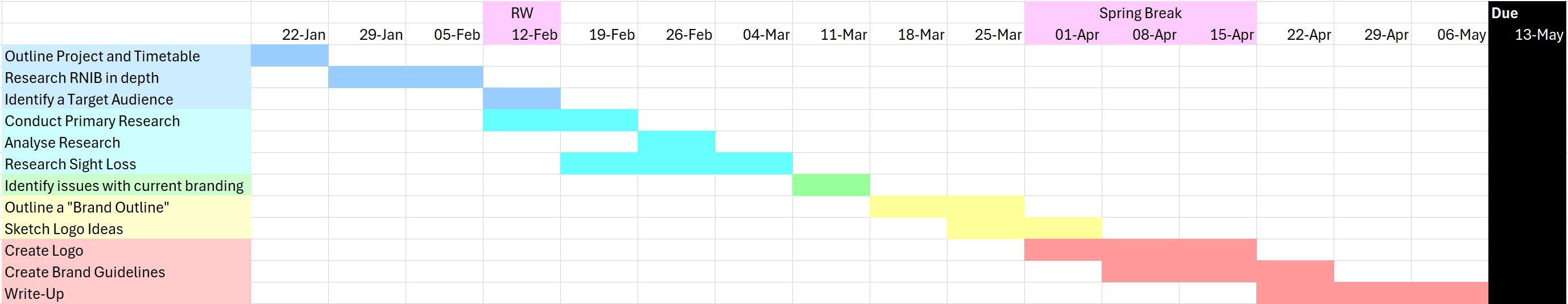
When creating a Gantt Chart for my tasks, I created a list of tasks that I wanted to do and then tried to allot an appropriate amount of time to each task. Though this did leave me working up until the deadline, I did feel I not only had enough time to finish each task, but when some overlapped, this would also gain me time by finishing certain tasks sooner. Unfortunately, due to unforeseen circumstances throughout the term, I was not able to work on the project for a large portion. Though this resulted in the deadline being moved a week, I only had about two weeks to accomplish what I had planned to do over three months.
I tried to do the best I could with the allotted time, however some important details had to be rushed, and some design decisions I wanted to spend more time exploring had to be immediately discarded in the interest of time and completing a finished product. I do feel my final product does achieve the objectives I set out, but I am curious what I could have accomplished for this project in the full time.
Overall, I fully support the design I made, and the message it conveys. Whilst I did have some issues with the design I may not have found the perfect answer to, it does mean if I ever find a client for this project I may re-open it and have someone to confer with regarding questions I may have, or suggestions they have. Throughout the text, I may have made sweeping statements regarding the design, however these were shared by someone who worked closely with RNIB who I was initially going to be in contact with, however they unfortunately fell ill and I was unable to find someone to fill the spot.
Another thing I’d do given the opportunity to work on the project again would be to gain contact with an expert on the subject of sight loss, as this is very important to RNIB’s brand, and something I do not have the answers to, so had to make assumptions based on their current brand. Given someone to talk to, I would be able to make a more creative design, as one thing I regret is I feel this logo design does lack some creative freedom. Although it was nice to work with some restraints as a challenge, it wasn’t fun guessing as to what those restraints may be. Looking at my logo design, I could definitely see it in a professional and corporate environment, and that’s an achievement, as well as feeling accomplished with the brand guidelines I’ve made, as they are the first I’ve done.