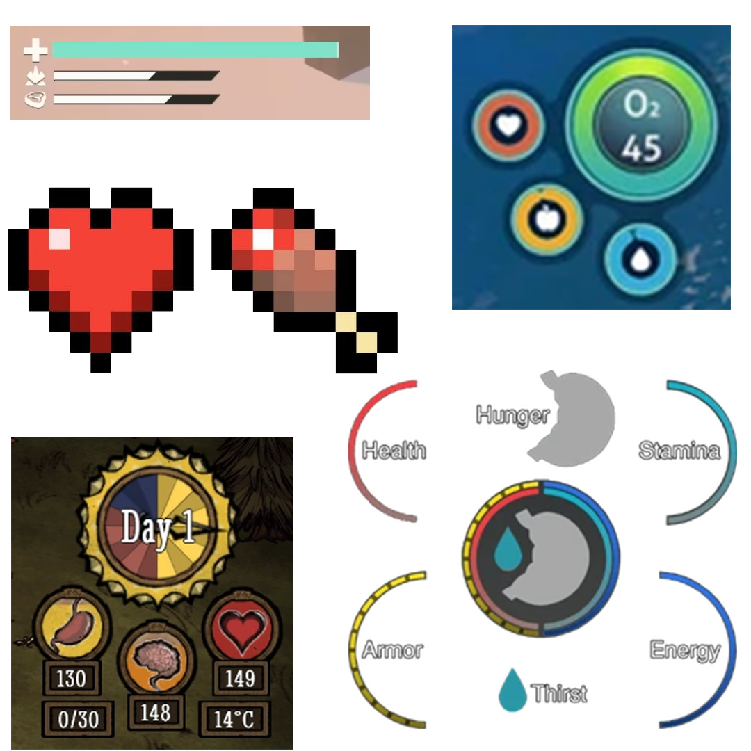
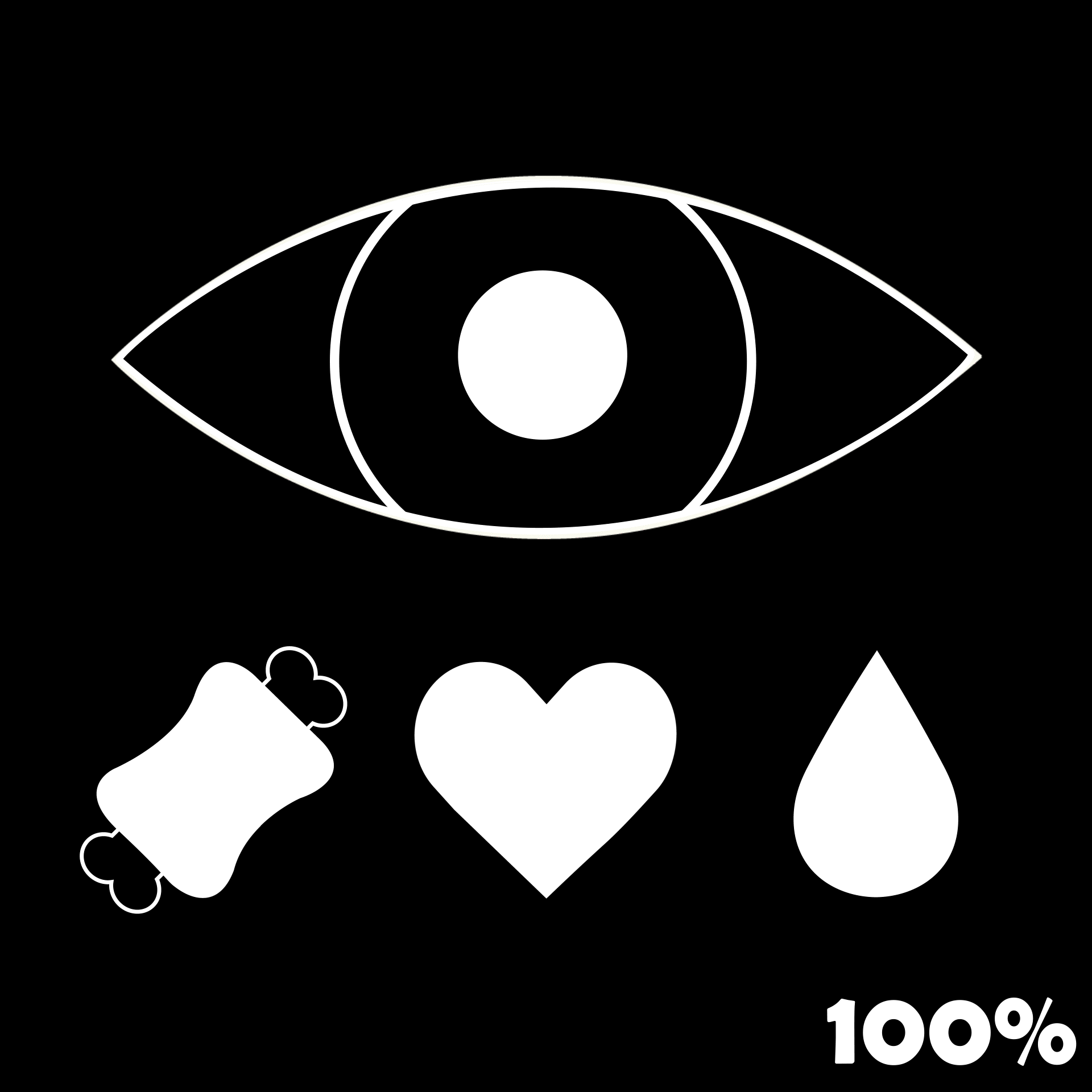
To create the stat icons for the game, I began by researching what other games had used as icons. Not many games had such, as most just used coloured bars, but I feel as though it's easier to see, read, and differentiate if there is an icon there.
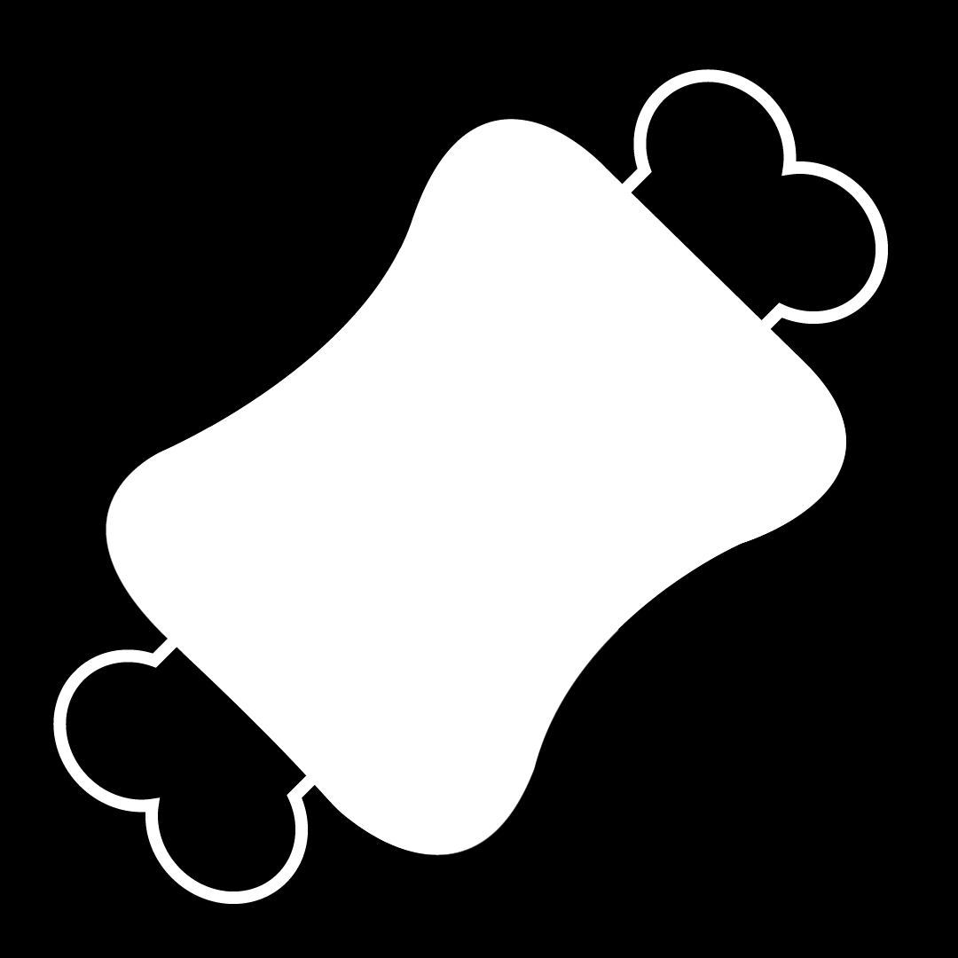
As stated before, sleep isn't a common stat looked at in survival games, but those that did didn't have an icon for this. There seemed to be a common theme throughout with most of these, except for hunger which was split between a stomach or food item. In the end I decided it would be better to have a food item as it was meant to be spooky horror not graphic gothic. Games that used thirst all had a water droplet, and I didn't see logic in changing this, and health is widely known to be a heart, even in 'Don't Starve' which uses a realistic stomach, but a cartoon heart
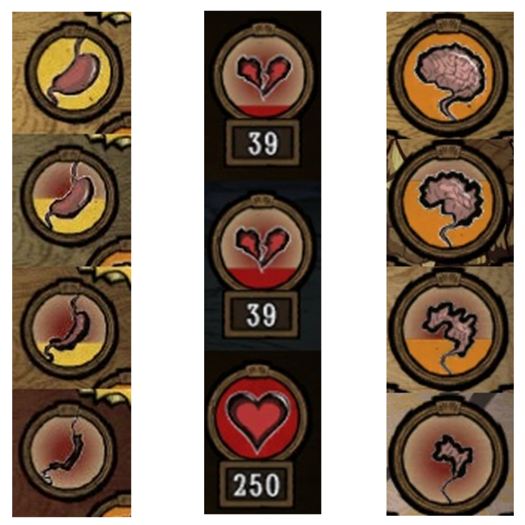
Also in don't starve, as your stats deplete the icon changes as well, I thought this was a nice addition and something I implemented in creating my own variations.
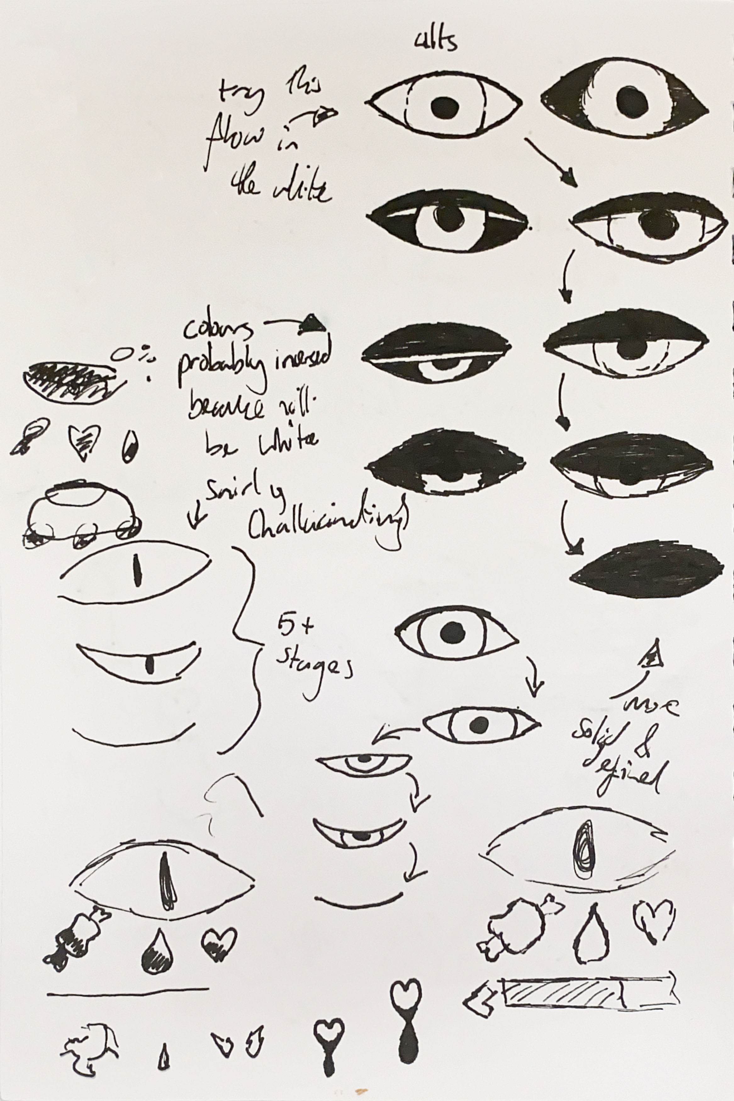
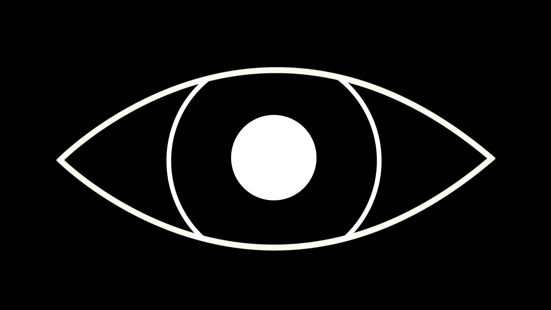
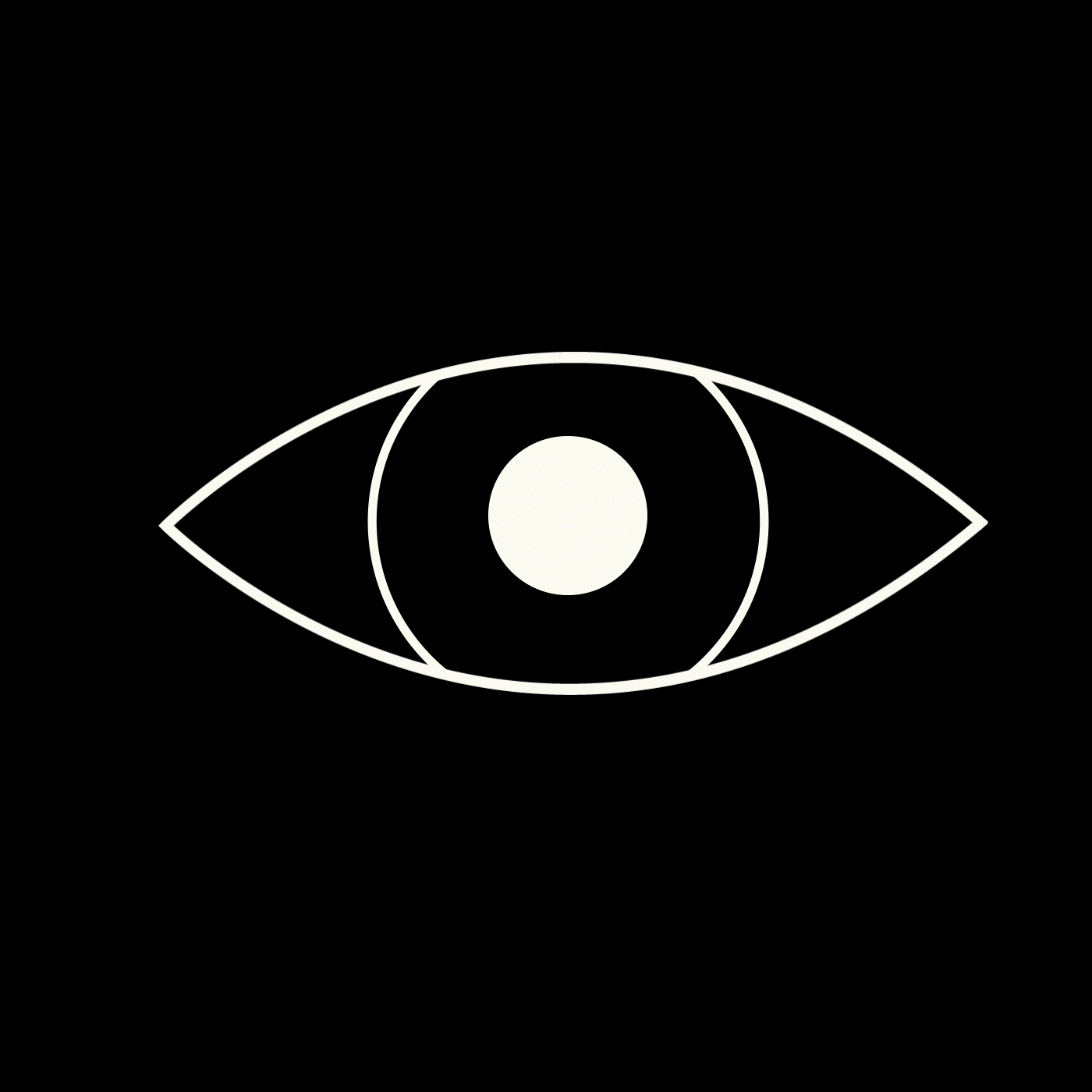
When creating the sleep icon, since I had nothing to go off of, I thought it'd make sense to make it an eye to further link it to the logo and link that to the USP of our game: the sleep (or lack there of) mechanics. The idea was the more tired you would get, instead of being a straight bar, the eye would slowly begin to close. I also looked at how the stats might look formatted together, and decided with sleep being the most important stat, it would be the biggest, and overshadow the other three to form a square.
Instead of the icon changing in stages like in 'Don't Starve', we decided that for a spookier experience it would make more sense for there to be no number to help the player. This meant the transition had to be smooth, rather than segmented.
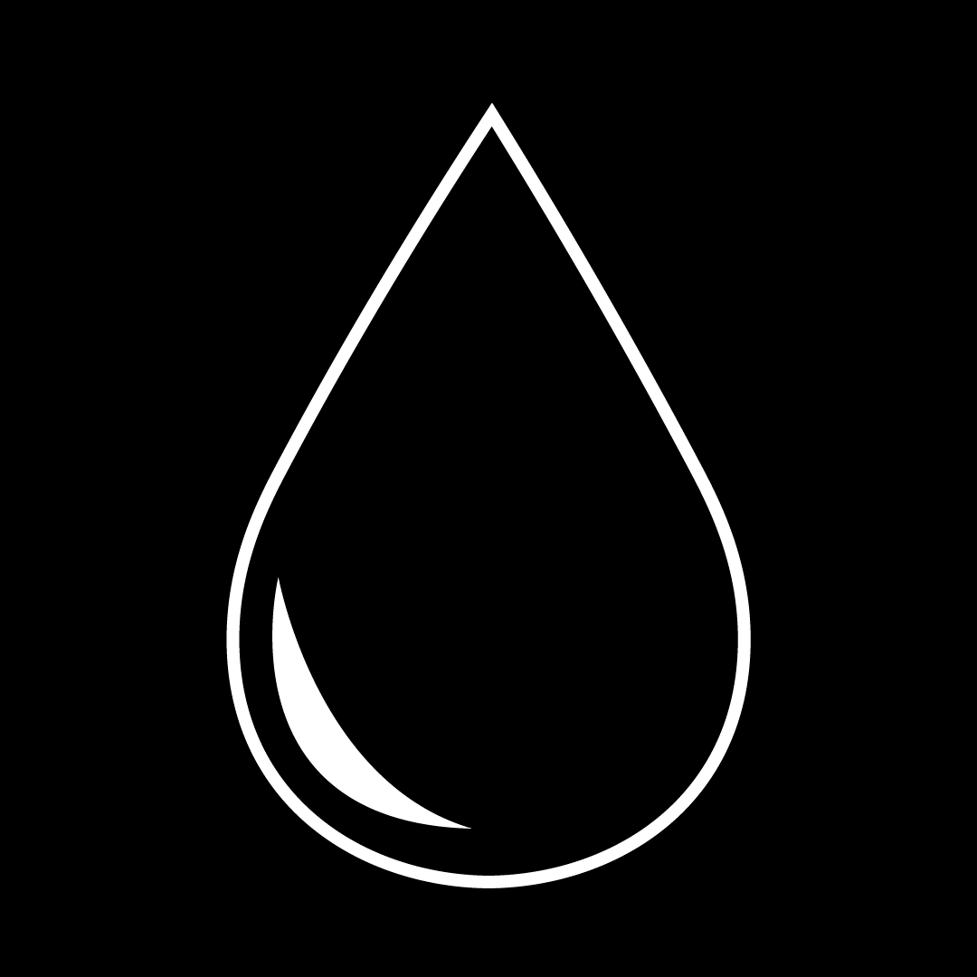
Initially, other than the eye, I'd planned for the other stats to fill up straight forward, but when creating the thirst stat I thought having it be wavy might be a bit interesting. I was worried before it might distract from the purpose, but through experimentation I think it works well.
The food icon was the hardest to do creatively. I didn't think the idea of it depreciating through food bites would work before, and when I tried it, it didn't. In my first attempt, the food bites were taken at random places on the bone, and I realised this was hard to read if you're quickly looking at stats. Instead, I changed it to still fill up from the bottom, so it's easier to tell percentage wise how much hunger you're on. Even if this is not how you would eat food, I think this looks a lot better.
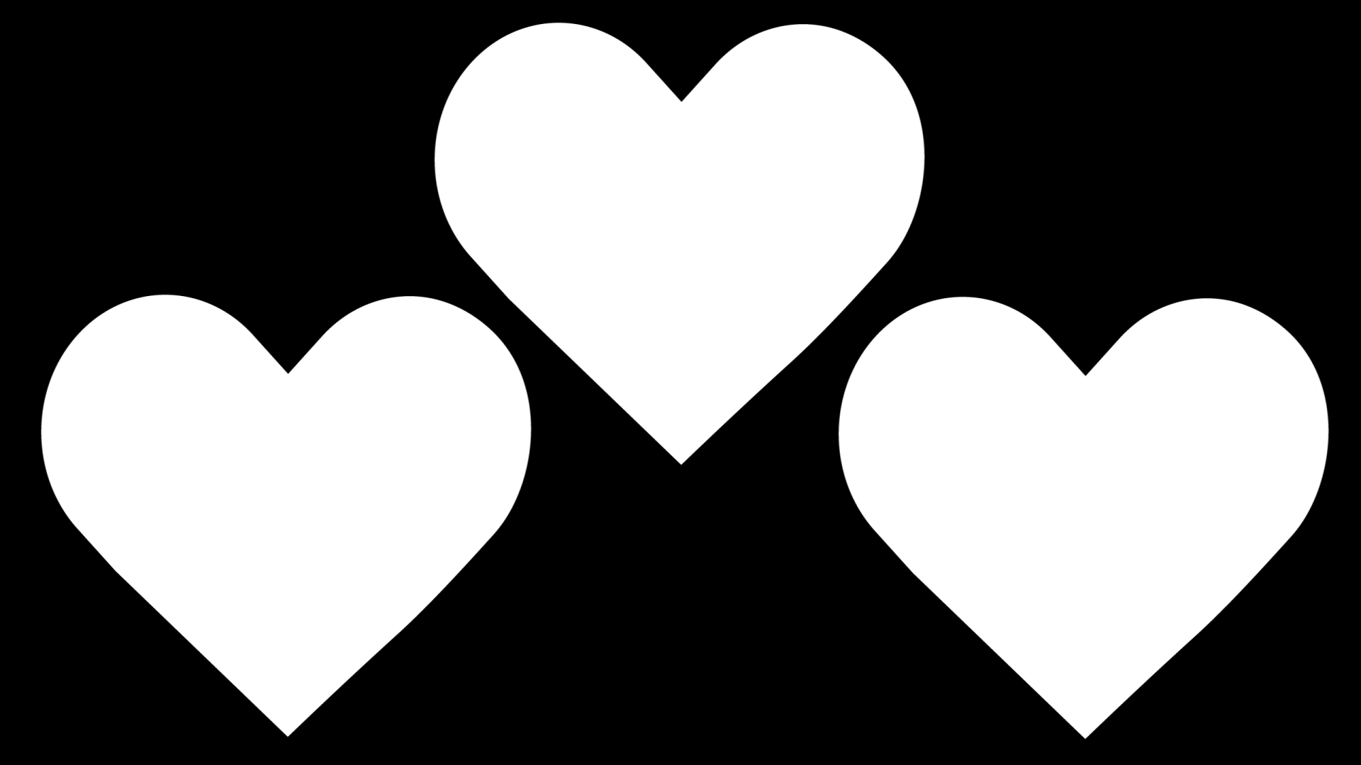
I struggled slightly trying to pick something creative to do for the heart that also was easy to read without numbers. In the end, my group chose the standard (middle) one.
This is a final version of what all the stats would look like in the game when formatted together. Though in the game they wouldn't be synchronised, and there wouldn't be a helpful label indicating the percentage they were on, this is just for ease of viewing.
Though it never got finished, this is how I'd imagine the UI to look in game, and how I'd style it if we took the project further. This textured style did however influence my branding throughout.
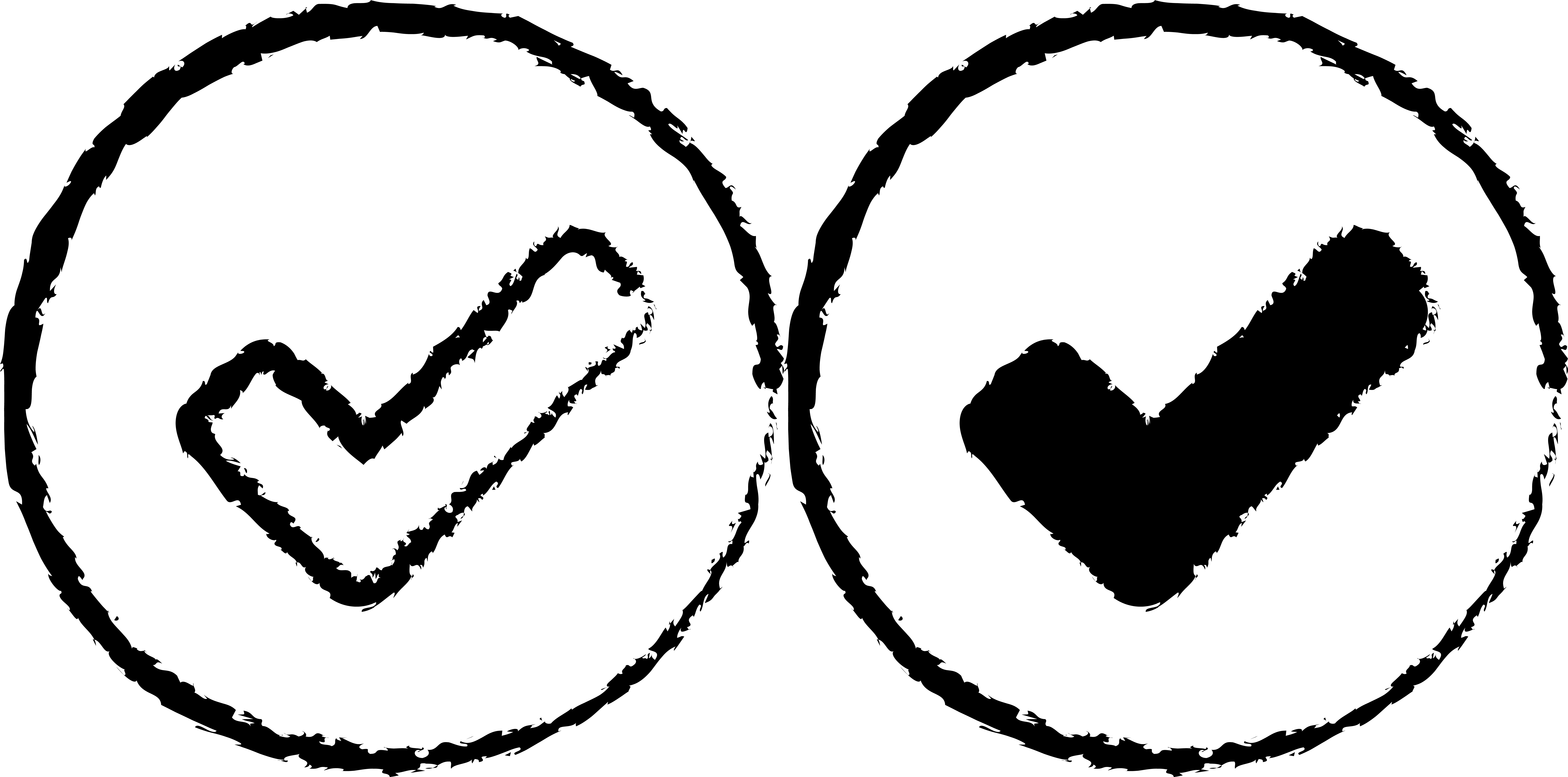
These were some check marks I'd made for the UI when selecting a character. I didn't know which looked best, so I made two variations for my group to decide between.
When I was creating the logo animation, I created a variant on the beginning section that looped. I realised this would make for a nice animation to play when the game is loading.