I started by trying to think of a name for our game. Along with my mind map, I did research into the stages of sleep deprivation, which lead to some interesting names. I put the words I'd found into two different sections of those that were synonyms for being without sleep, and those that were related to having hallucinations. Eventually our group narrowed it down to three we liked. The first name, 'Insomnia', was so good we were surprised there was no game already named as such, however there were many game related things revolving around insomnia, such as the gaming festival, and it being the subtitle for other games. The second name was 'Deprivation' which we liked because, though it's main connotation is with 'Sleep Deprivation', the USP of our game, but the players are also deprived of many things such as food, water, warmth, so we felt it worked well as a survival game name. Our third choice was 'Hysteria' as this was linked to the idea of hallucinating things that aren't there, the main feature of our game.
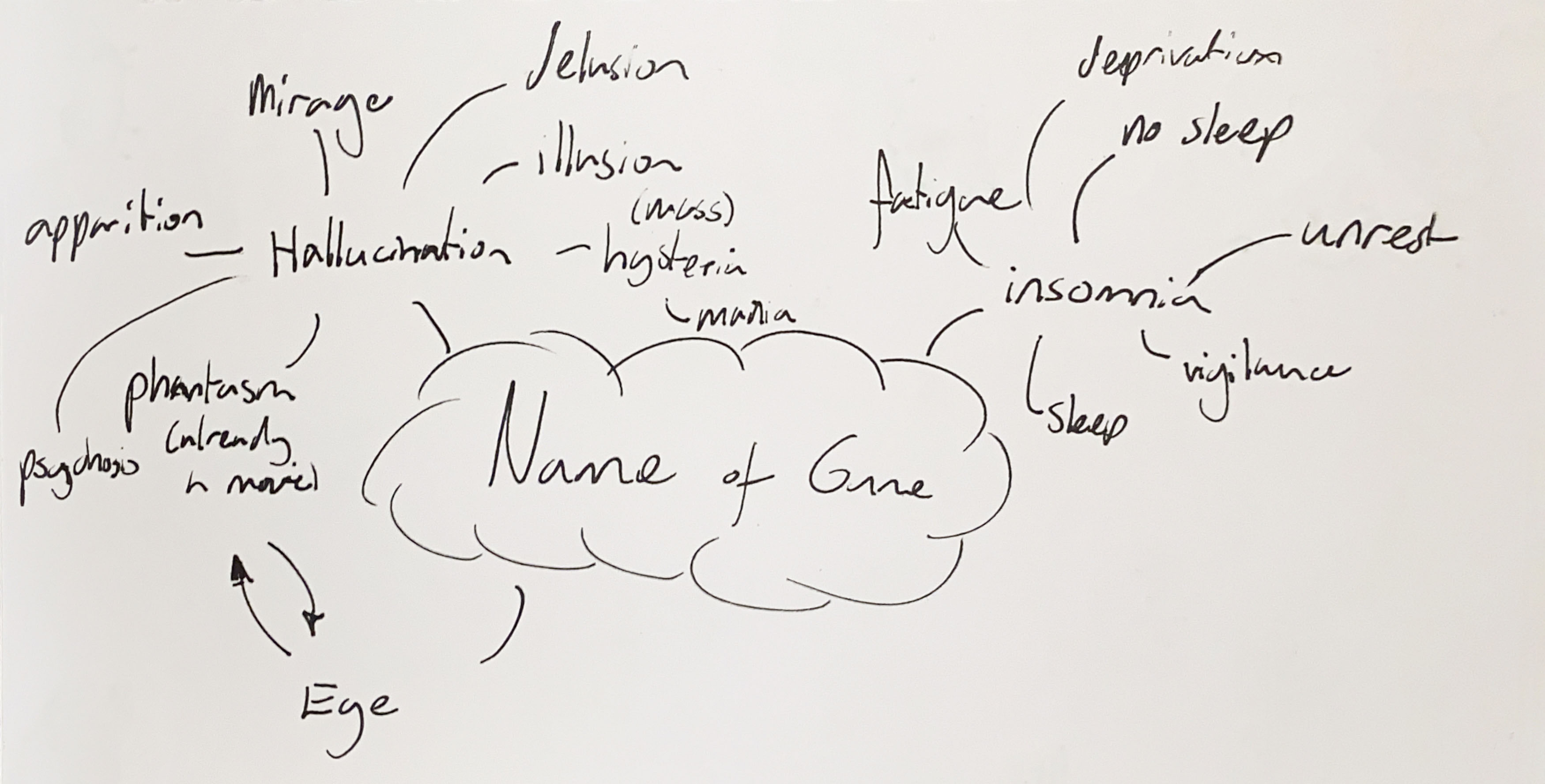
Hysteria also linked to mass hysteria events which is where people experience illness symptoms such as anxiety, mania, and shared hallucinations without infectious cause. Some well known Mass Hysterias are the witch trials, and the dancing plague. Mass Hysteria also linked well to our theme as this was a multiplayer, so it would accurately describe what our players would be feeling
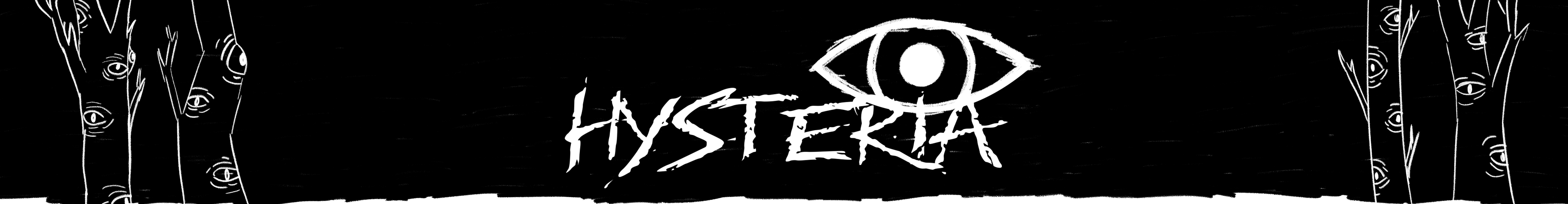
In the end, though we liked both, we decided to go with 'Hysteria' as it gave a more exciting and tense feel to the game, rather than 'Deprivation' which sounded like a grindy survival game.
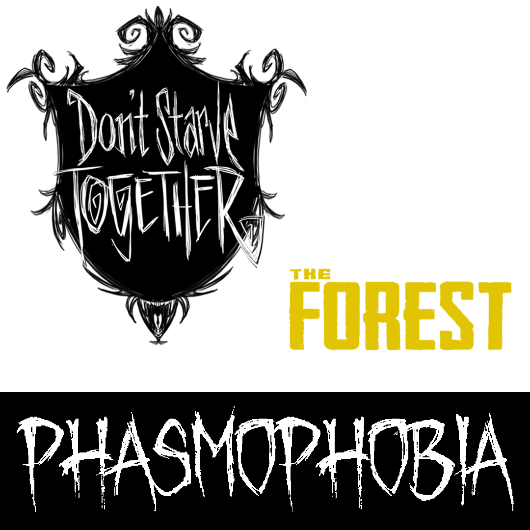
I started by looking at the logos for games that were in a similar genre to the one we were creating. 'The Forest' and 'Don't Starve' are both eerie survival games, and I included 'Phasmophobia' because it matched the theming I was going for with the game being a spooky multiplayer game. Most of these logos were text heavy, reflecting the themes of the game. The type in 'Don't Starve' is quite gothic and 'Phasmophobia' has a tense horror feel, so I felt like I wanted to lean more into that.
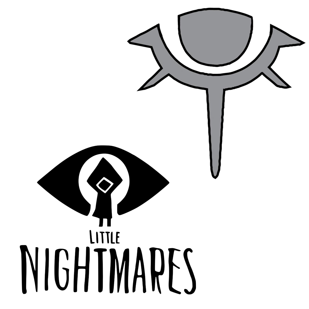
To give the logo a more iconic look, I wanted to add an eye to it to go with the sleep theme, so I also looked into games with eye iconography. The first example is for the game 'The Blackout Club'. I wanted to look at this example as it showed the extent at how minimalist an eye could look. I quite liked the simplistic look of the 'Little Nightmares' eye and I liked the solid white of it to stand out more.
When sketching out ideas, I was between the idea of having a drowsy eye because the game is about getting tired, and having a more awake eye. In the end the fully open eye won out as this reflected more of a theme of tension, shock, and fear that we wanted from the game, in the same way that we chose 'Hysteria' over 'Deprivation' as a name for the game. I sketched many realistic eyes to try to figure out what important features of the eye to keep to make sure it read properly as an eye. Though most of my sketches were just of how the eye would look, I did do some versions with text, and my group decided they liked the version where the eye pupil made the dot above the eye, and the eye overshadowed the logo. They also preferred the version with the more scratchy and rough text.
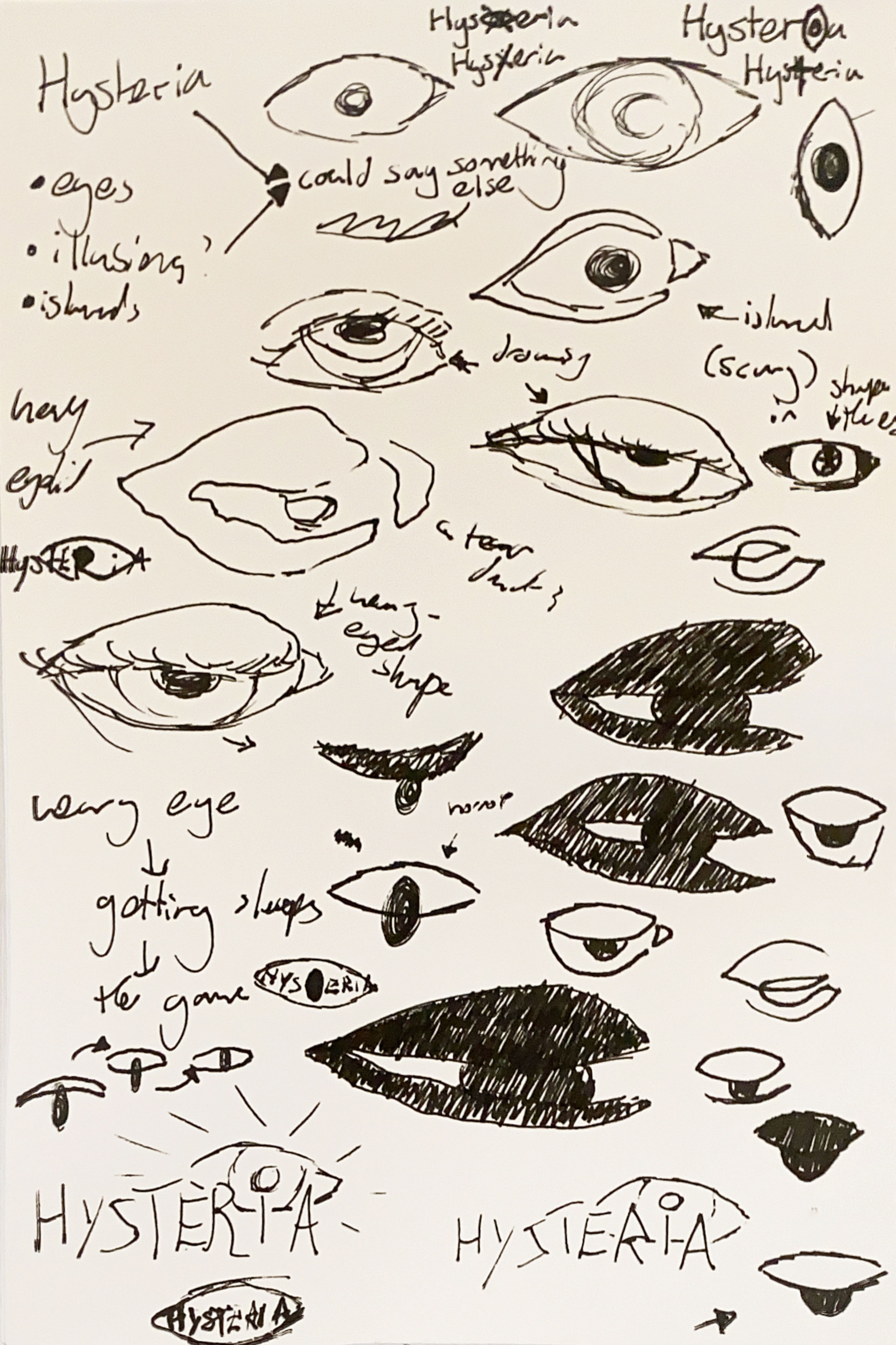
For my font choice, I wanted something rough and sketchy to further the theme of tension and mild fear. This font is 'BMX Radical' and I think it does well to be horror font to show a scary game.
I also decided to keep the branding black and white like a lot of the examples I looked at, as I this works well with the game theme.
When I added the eye icon I created, I realised it didn't look right because of the variation in stroke texture. To fix this, I added some texture to the line with a brush tool, however this would create some inconsistencies because I couldn't use this design in the animation as I was already halfway through creating it. I also removed the original eye to see what it would look like, and I thought it looked really cool, but I definitely wouldn't be able to animate this, and I do think the second slide matches the genre a little more.
To add more interest and depth to the logo, we thought it might be nice to try to animate the eye. I also thought this would work well as it would give me an opportunity to develop my skills in After Effects further.
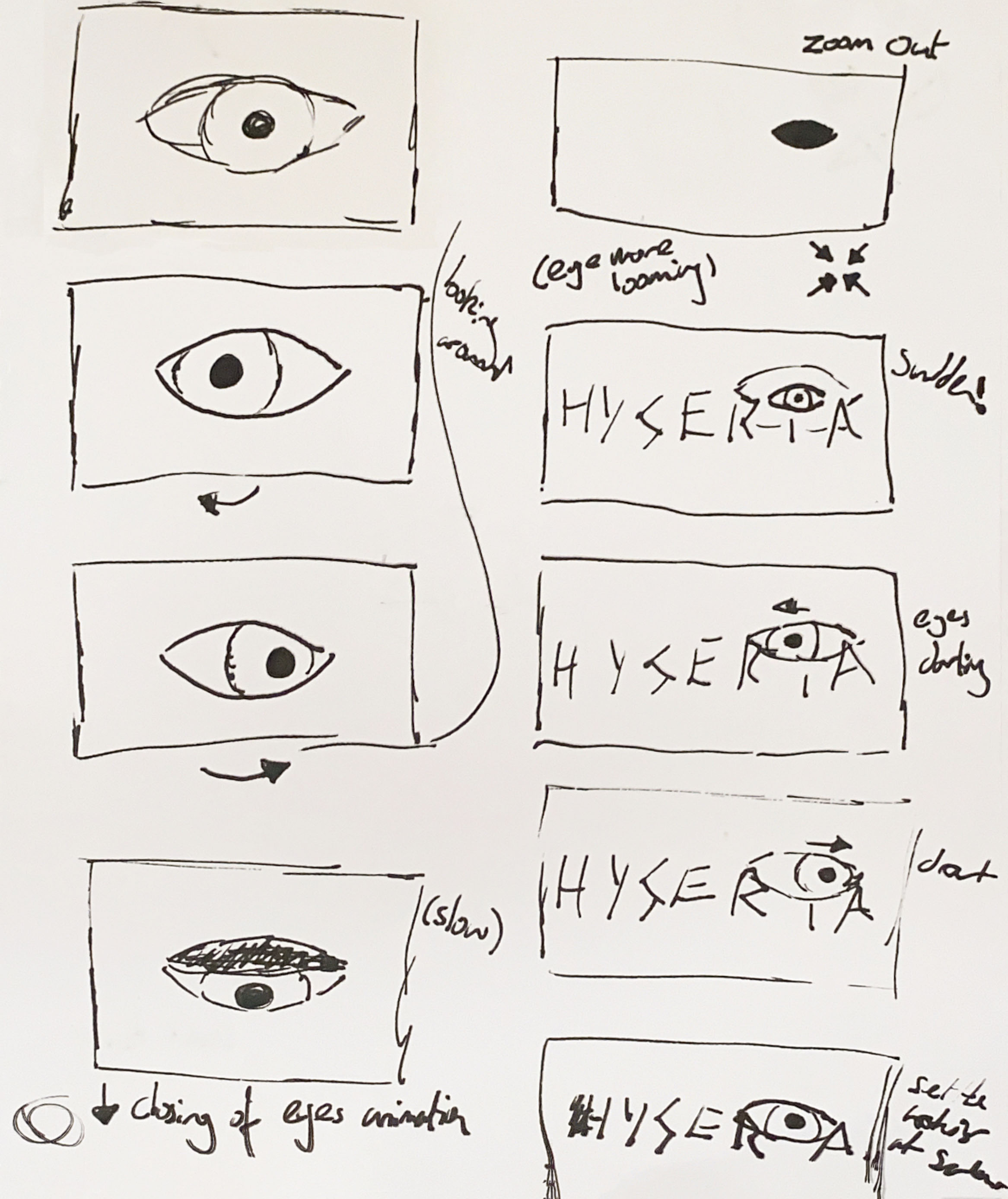
I hadn't used after effects since first year so I had to re-learn a lot of it. I used tutorials to learn how to animate an eye (www.youtube.com, 2020) and have the text shake (www.youtube.com, 2016) which helped the work not look like an amateur.
I tried my best to implement the new eye, but as I had already began animating this before I finished the logo, it was hard to do, so settled with just having the edge textured. I don't think it looks too bad, and given more time I would fix this, but I also don't see an easy way I could have the eyelid be textured and move. If I had more time, I'd also be certain to add audio to this animation, as this was always my intention, but I ran out of time. I think this would have added a lot of shock value that the logo needed.
When trying to animate this, I also had issues staying true to my storyboard. I couldn't figure out a way for the screen to look like it had "zoomed out" so that the eye could appear bigger from the beginning, however I quite like how it's turned out staying the same scale and position throughout. Another thing I had to change was the end eye looking around. I couldn't make the movements look that sharp and darting, and it overall looked a little odd, so I took the decision to cut the end portion, especially because, for a logo animation, it may have been dragging on. I feel the current version ends at a good time.