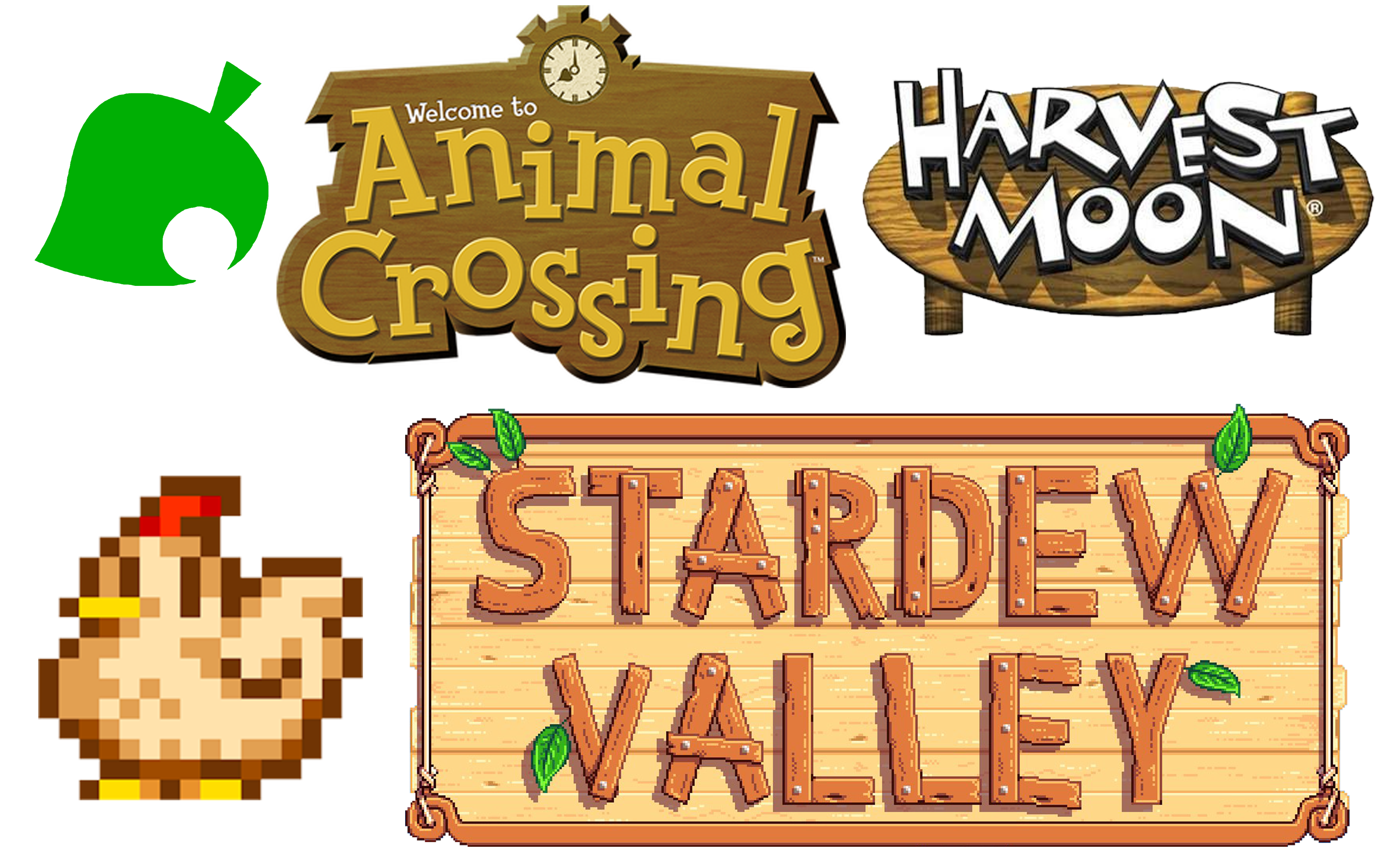
I started the logo creation process by researching into other farming game logos. I looked at the logos for Harvest Moon, Animal Crossing, and Stardew Valley, and I found that the logos for these games were heavily text based, and, as well as this, all featured wooded textures, so I kept those things in mind when I started creating my logo for the game.
However, I decided to start by making an image-based logo as most of the games I looked at had a smaller ‘icon’ like logo that would be used for smaller taskbar and desktop-based logos. For example, Animal Crossing has its iconic leaf, and Stardew Valley uses a chicken from the game as this logo.
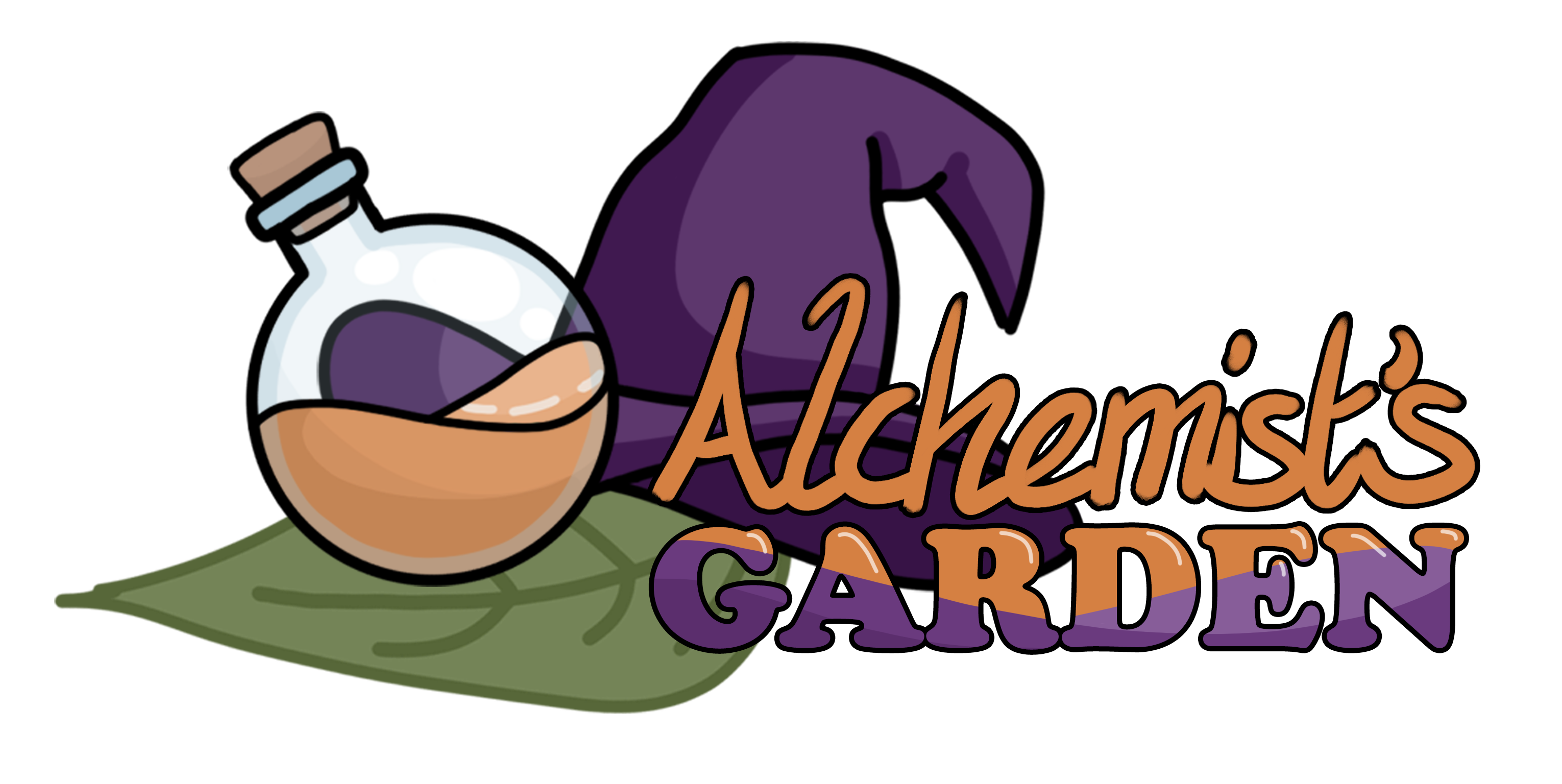
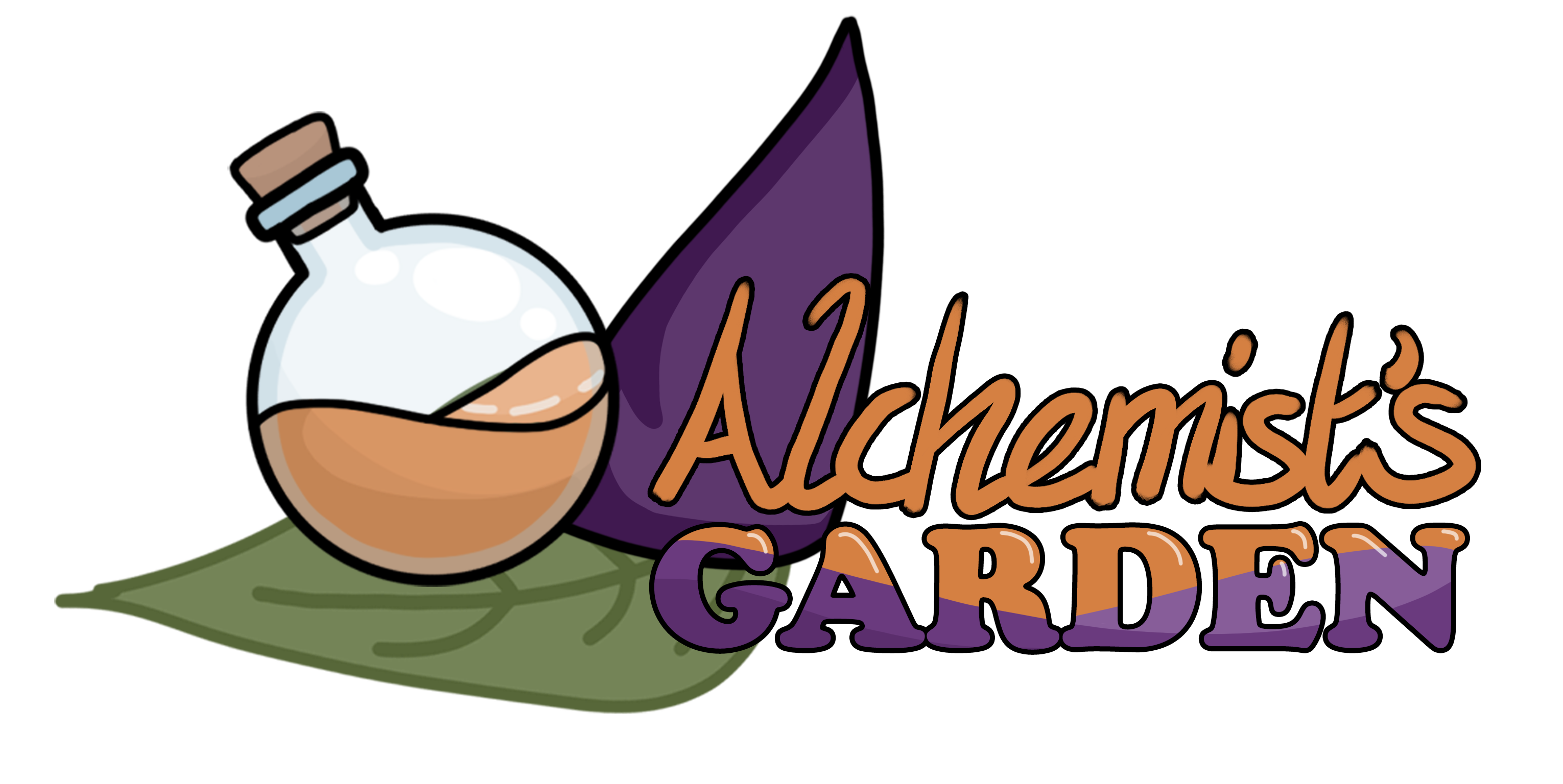
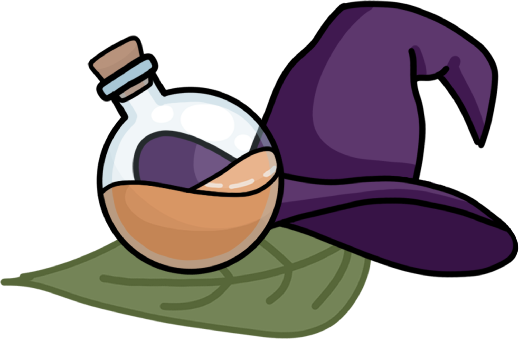
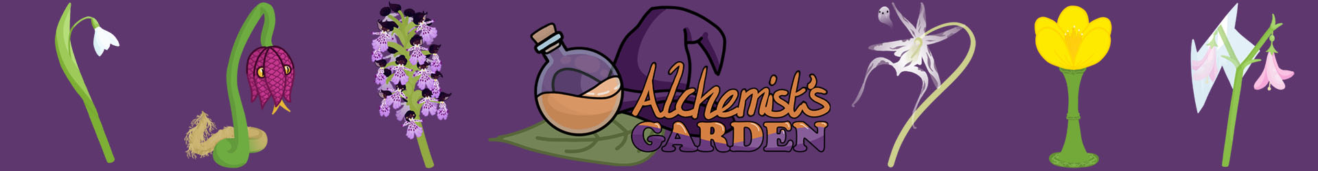
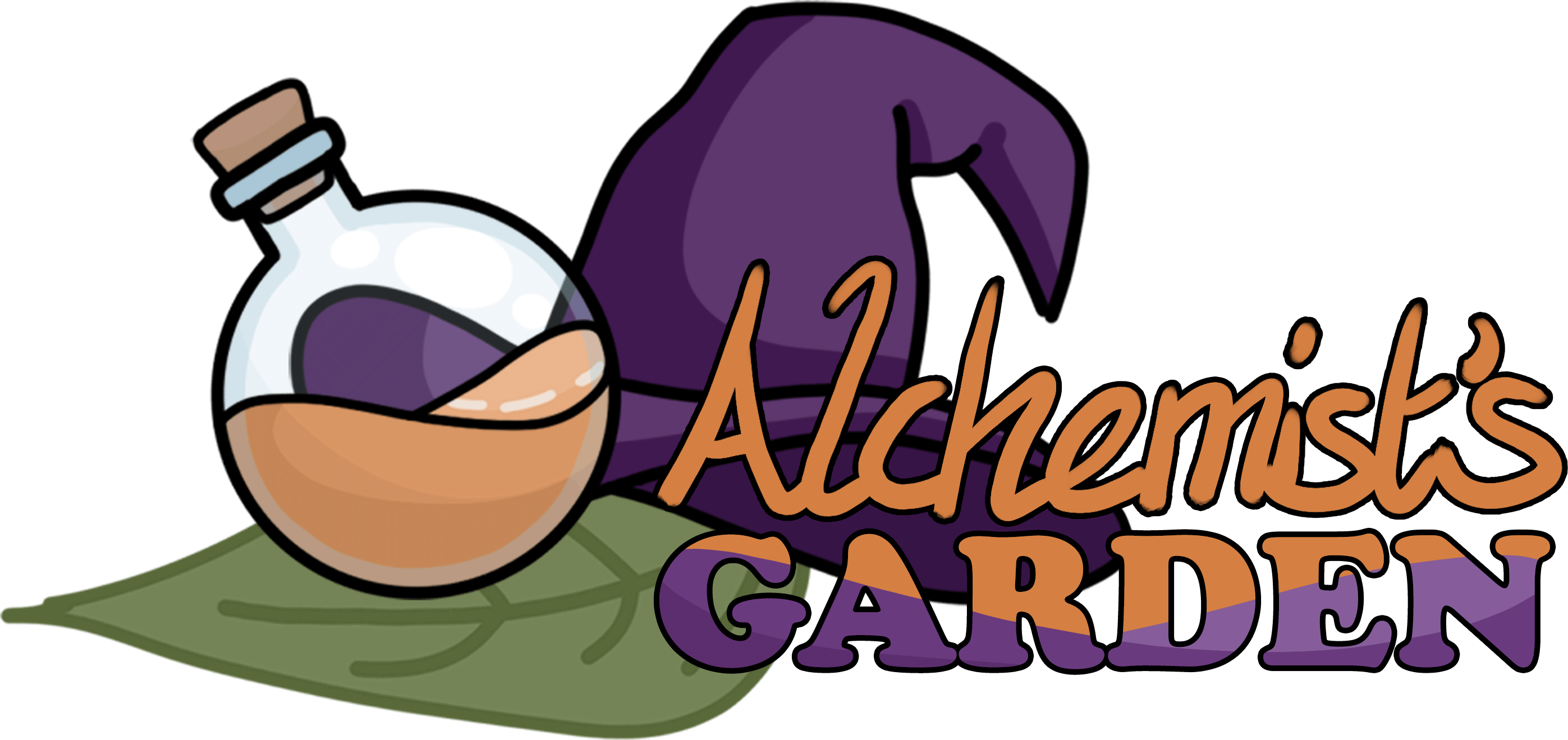
I decided I wanted to include some key imagery to link to our game, and so I chose to have a potion in the logo to represent the alchemy aspect of the game of brewing potions, a wizard/witchy hat to have a bit of key characterisation for our main character in the logo, as well as to show in the logo that it was a game about magic, and then I also felt the third key aspect of the game was the farming aspect, so I included a leaf in the design to show a more natural portion. As well as this, the leaf also shows the game has a more natural, and furthermore environmental aspect to the game, which is key to the game brief.
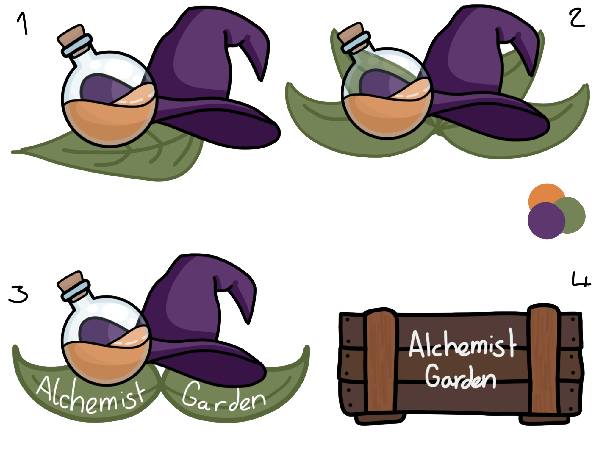
First, I picked a colour scheme to use. I started with picking a purple, as I thought this greatly represent the magic of the game as this is generally the colour depicted to be magical, as well as in colour theory it’s linked to creativity, and I felt that if you’re mixing and making different types of potions it was quite a creative thing to do. I then chose an earthly green as, for one, the game would have a lot of plants so green would be useful to be a central part of the colour scheme, and secondly the colour is seen to be calming, and most people consider farming games to be a way to relax the mind, so I picked green to be a calming colour in the logo. I then picked orange as the last colour in the colour scheme for the logo as it then completed a triadic colour scheme of secondary colours and was shown to be a needed brighter colour in the logo that made it ‘pop’ a bit more.
In my first two designs I took my three illustrated elements of the design and tried layering them in ways that looked quite nice, and I first came up with the first design, and then tried making a more symmetrical design like the second one.
With my next two logos I tried leaning into the more type-based designs like the logos I’d looked at for my research (the type of course being a temporary placeholder). The third design just being of similar assets to the first design, but with a more key type design, and the fourth design taking a completely different turn, and not only being inspired by some UI designs made by one of our other designers, but also the wooded aspect of the crate being linked to the previous logos I’d looked at.
I presented the designs to my team, and they decided they liked the first and third design best, but in the end, we went with the first design because it was more beneficial to use as an icon.
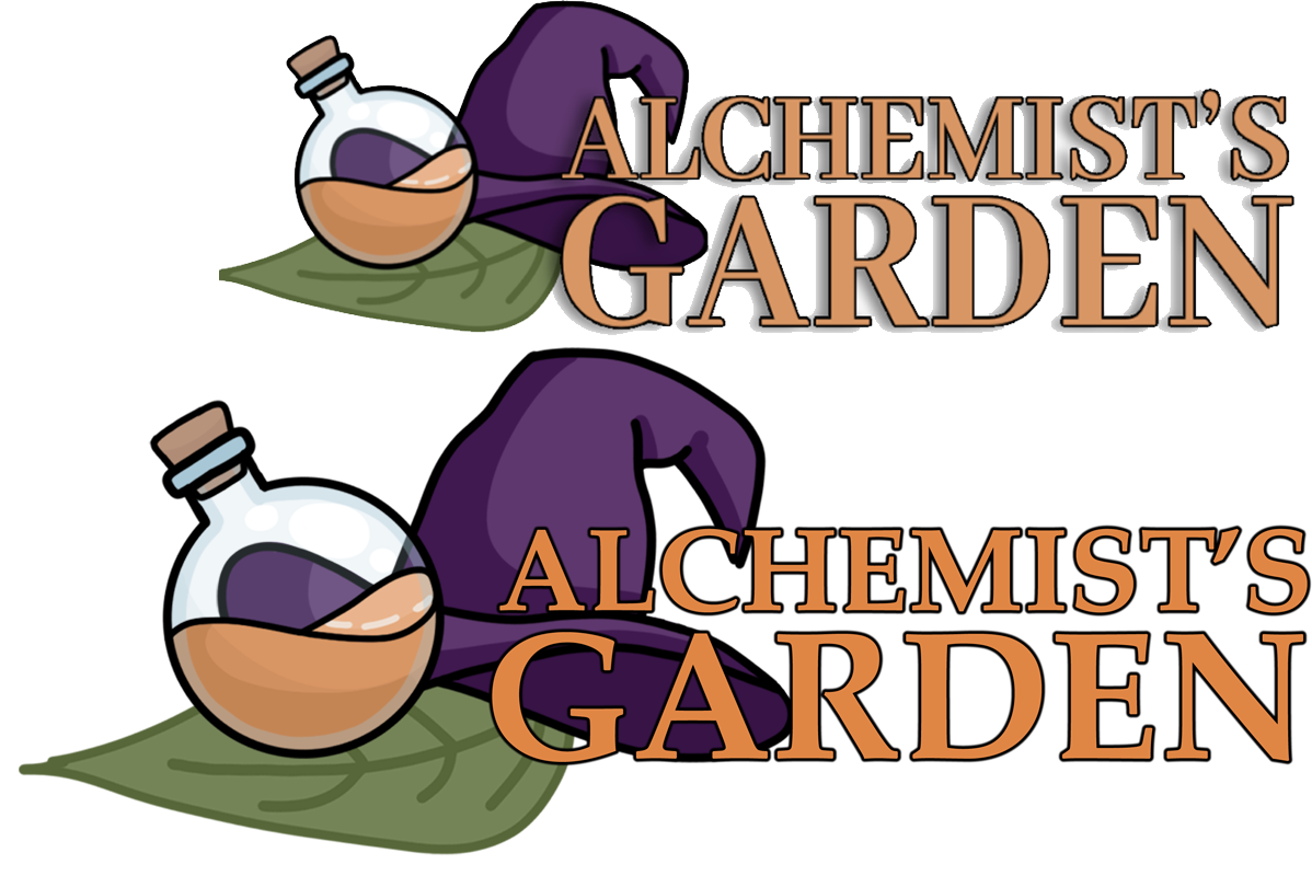
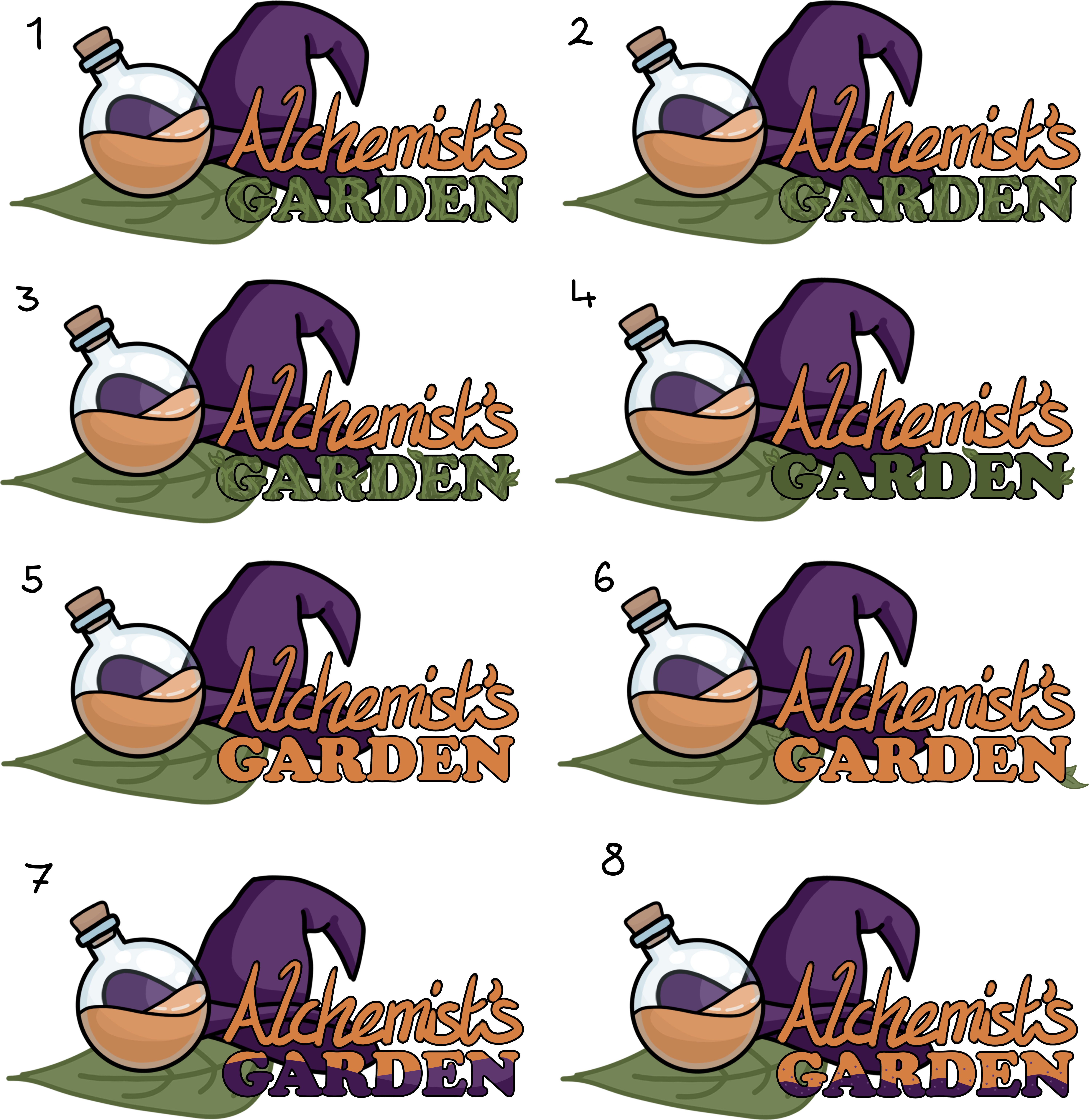
After I made the icon logos, someone else on the project made a concept for how the text would look on the logo (top), which the group said they really liked, so I took that concept and used a similar font but changed the layout and colour slightly (bottom), but the group said they preferred the original.
When we presented the logo, we received feedback that the type on the logo didn’t look great, and that we should perhaps use a script font similar to what’s used on gardening and seed packets so that it related back to that. Other feedback received suggested that some of my previous designs had more potential to work better as a logo, though they did think the current icon worked well. They also suggested a 3D logo could look good, with all the logo items in a box, so I took all these ideas into consideration.
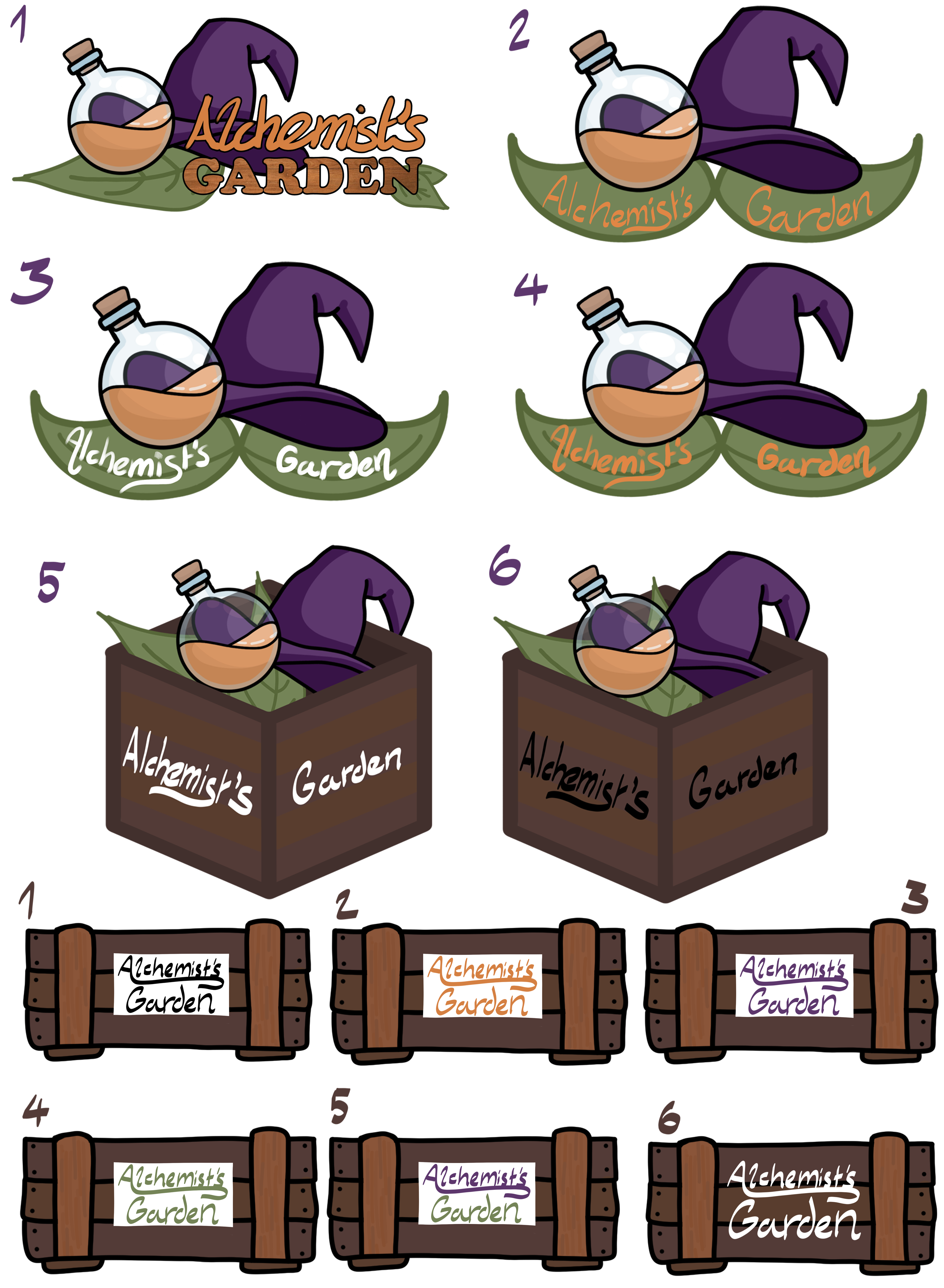
My first design was an alteration with of the original but instead replacing the original serif font with a contrast between some lettering, and a slab serif font. I think this works well to both lean into a fancier theme with the letting but also works well as a bold logo with the slab serif. I also tried to use a wooded texture on the text, to lean into the theme of wood with the farming logos that I’d researched. I also added some leaves to the text to make the text a little more decorative, because I’d considered one of the problems from before was the text wasn’t interesting enough.
The next three logos were slight alterations based on the group’s second choice for a logo design, but with a script font instead of a placeholder. I tried to use the details on the leaf as a baseline for the lettering I’d used on the logos, and also offered a variety of variations so that people could see the design in different colours and styles to better choose from.
Designs five and six were made to be guides for if we were to make a 3D logo like suggested. It would just be made of assets that would be put in the game anyway, but I wanted to illustrate how box would be shown at an isometric angle, and the type would be written on the two different sides of the box. I also offered two different text colours of the type for variation on what could be used.
The next six designs were then made to just be colour alterations of the previous wooded crate design. I made the first five with white ‘labels’ on them, similar to how the UI was designed, and also served to make the text a lot clearer. But I also included a design without the white box to just show a design on how that would look.
The next six designs were then made to just be colour alterations of the previous wooded crate design. I made the first five with white ‘labels’ on them, similar to how the UI was designed, and also served to make the text a lot clearer. But I also included a design without the white box to just show a design on how that would look.
When I showed the designs to my group they said they continued to like the first one the best, so I then showed this design to one of the lecturers who said that the stroke on the type wasn’t consistent enough, and if I was going for a wooded texture, I should go for something a bit more stylised, so I took this into consideration and made a set of more designs, just altering the type.
My first task was to make the lettering a little more consistent in stroke size, so I did that first then made sure all of my designs had this new alteration.
The first three designs I made were based on the lettering looking a bit like vines, and in the third design I added some leaves to make the type stand out a bit more. I think these designs were nice, but with how busy the texture was, it made it a little more difficult to stand out. My next design I just took the previous designs and put them on a plain green background, I think this one works well, but a little plain. And since these designs sat partially on the leaf, the green designs didn’t really stand out as much as I would have liked.
With logos five and six, I just tried using a plain orange, since I hoped that would stand out better than the green and gave design six some decorative leaves to make the type more interesting. I think these designs stand out more than the green vine ones, but all-round still look a little plain.
When I came to making the seventh and eighth logo, I took to trying to make it look as if the type was filled with a liquid of some type, like a potion to allude to the alchemy aspect of the game. The first design was similar to how I’d made the original potion bottle, to help strengthen the fact that it’s a liquid. The second design I tried to give it a bit more of a bubble focused design, like a bubbly potion.
The feedback I got from my group is that they didn’t think the vines really worked in the type, and they liked seventh design, but the colour was too dark. When I asked someone outside the project their thoughts on the seventh logo, they hadn’t recognised the type was meant to look like it had liquid within it, so I also took that into consideration when making my next iteration of logos.
For all these designs I picked a lighter shade of purple and I think this worked better than using the exact same shades as the hat, as not only did it make it stand out a lot more, but also because the designs were largely made up of shadow prior, so this change made them a lot brighter.
To make the liquid slightly more readable as such, I tried using different shapes, like making it wavier, or giving it a top-down appearance. I also tried adding some shine as if the type were a bottle, and the last variation I tried was shading the liquid. There were two different shading approaches I used, one was shading of the liquid itself and the other was shading the letters to imply they were each separate containers, but in the end, I opted for using the liquid shadow as the liquid was always carried over all the letters, so it wouldn’t make sense for it to be each in a separate container. I then made a gif to show all the slight alterations next to each other, since I thought it was a little hard to see some of the changes when next to each other.
After the group all decided on our final design for the logo (top) we found an issue. Based on feedback given in our last presentation, we had to change the design of the main character, and this included the hat. Due to the hat of the character now being brimless and more similar to a wizard or a gnome hat, it had created a problem with the logo now not fitting. To fix this issue, I tried changing the hat design to be more faithful to the current design (bottom).
By changing the shape of the hat, I found that this completely ruined the balance of the logo, as previously the brim served to draw all the elements of the design together, without the brim the logo just sort of looked like a bunch of elements clumped on top of each other. The second problem with changing the hat design on the logo was that it no longer reads as a wizard hat. I believe this to be because the hat isn’t displayed upon a head, this lack of context means the audience may fail to recognise what this is.
In the end I took the decision to revert to the previous design with the old hat that looked a lot better. Realistically, though the hat did represent the character in our game, it’s purpose, more importantly, served as an icon in the logo to show to the audience that the game is about magic, and wizard craft, and if the new hat doesn’t read well enough as a magical hat, then it’s not good for it to be in the logo.