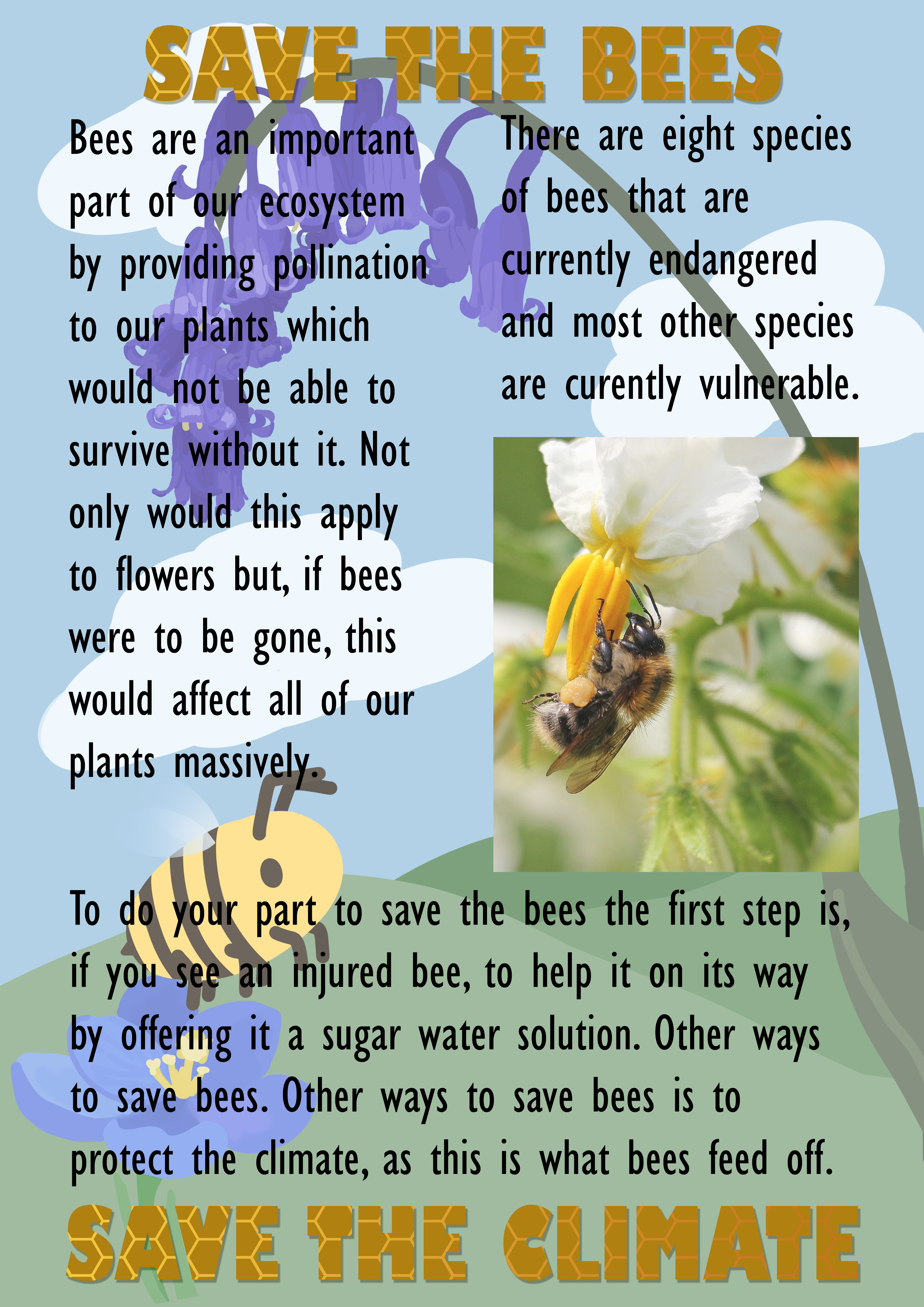
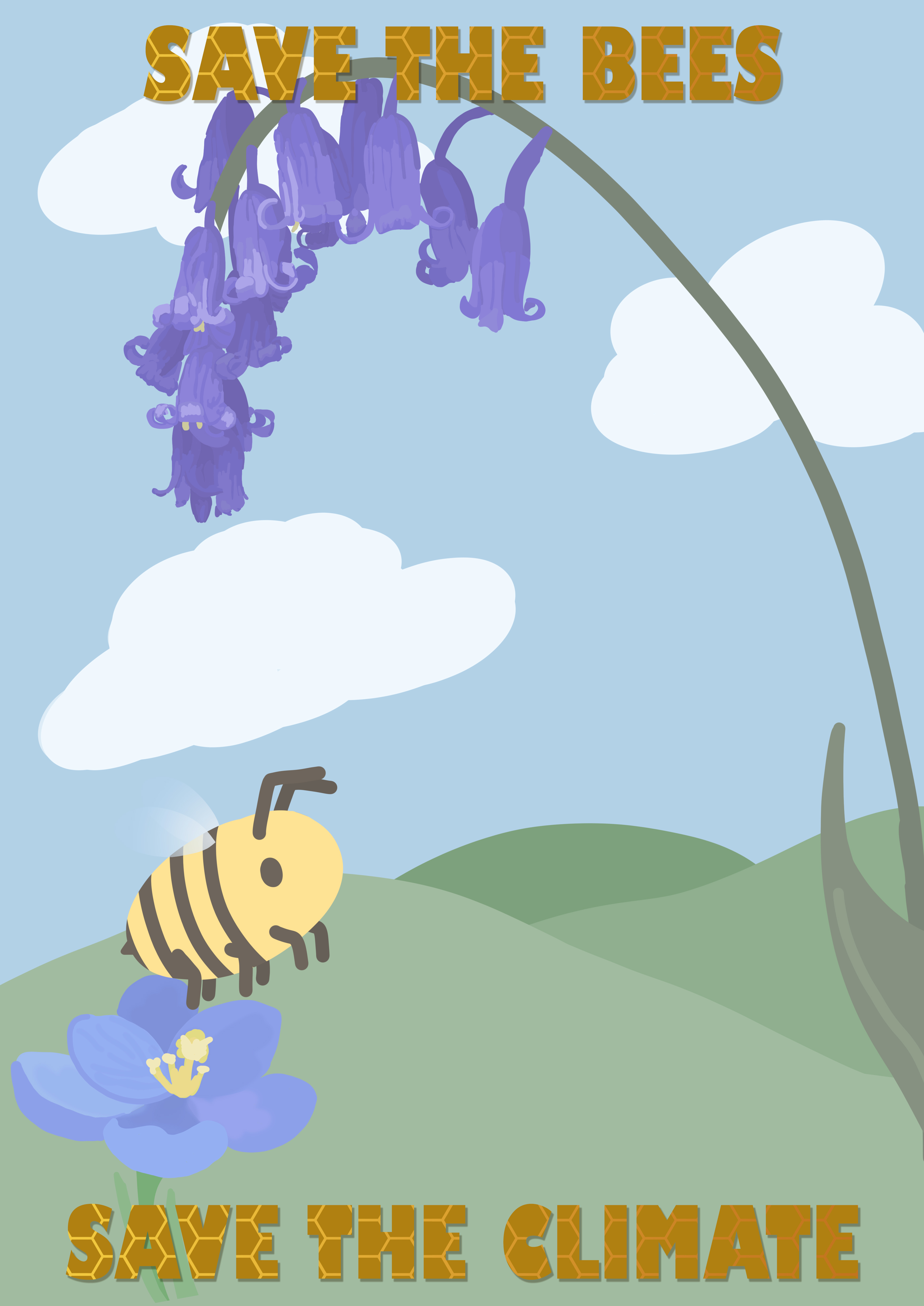
For this task, I decided to talk about bees. Bees are an important part of saving the climate as a whole, so I wanted this to be the key point of my poster.
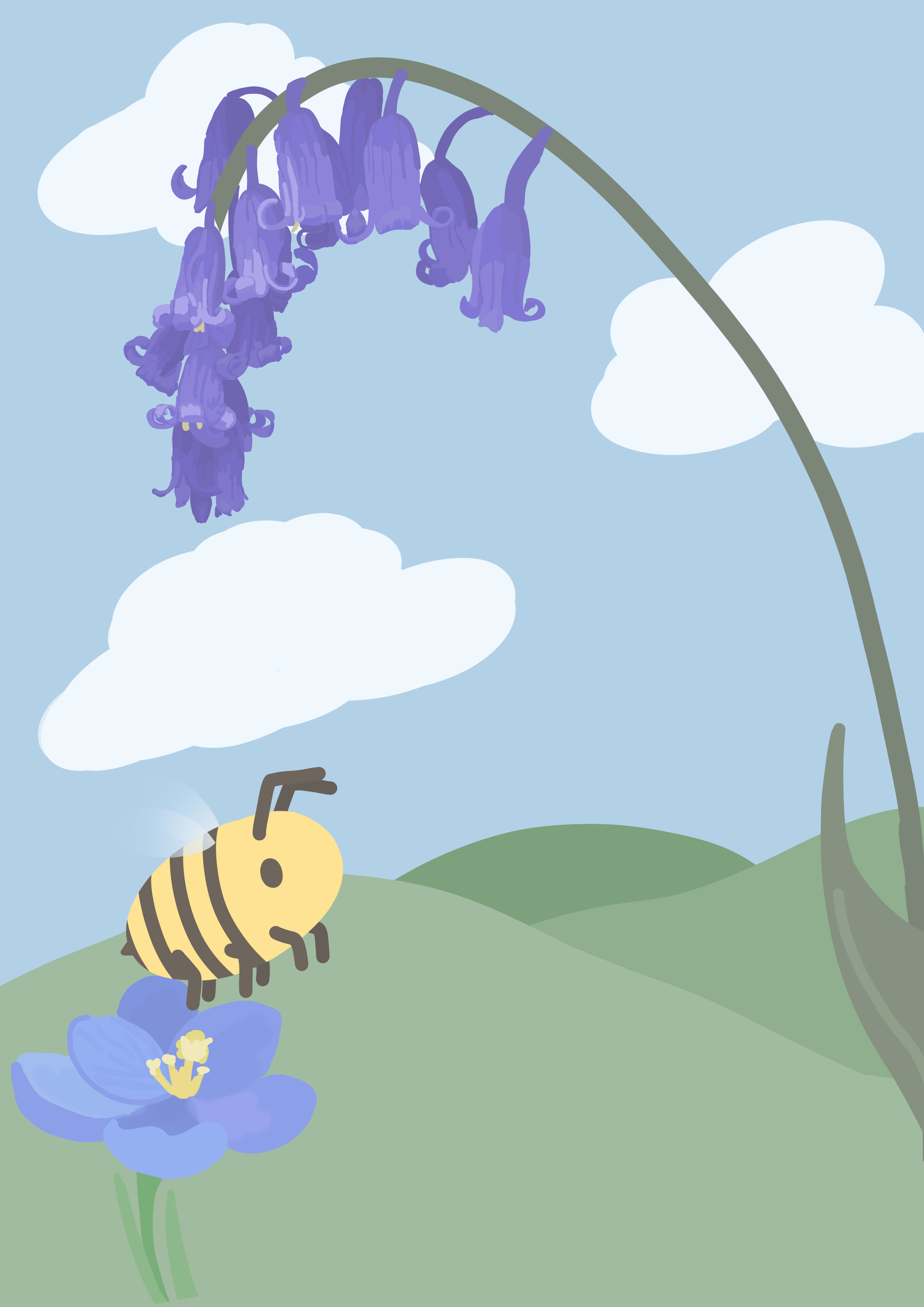
For the background, I chose to do an illustration, and so I used the golden ratio to achieve a good composition for this piece. By using the Golden Ratio I was able to make the bee the focal point of the illustration, as they were the focal point of my poster. I chose to make the illustration very stylised to appeal to children, as this was to be my target audience for the poster. Following on from this, I used light pastel colours as these would appeal to children, as well as making the foreground of the poster easier to stand out.
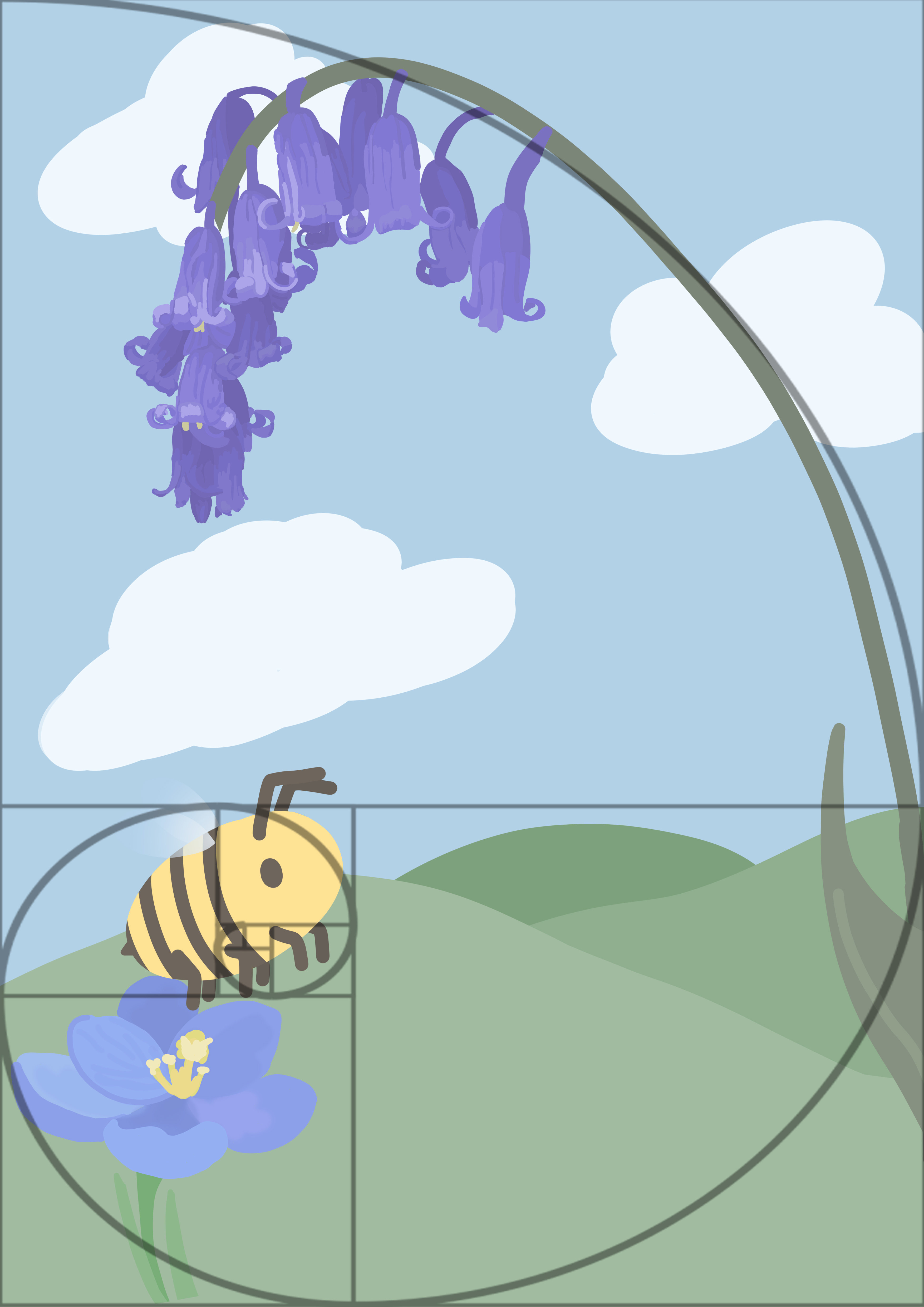
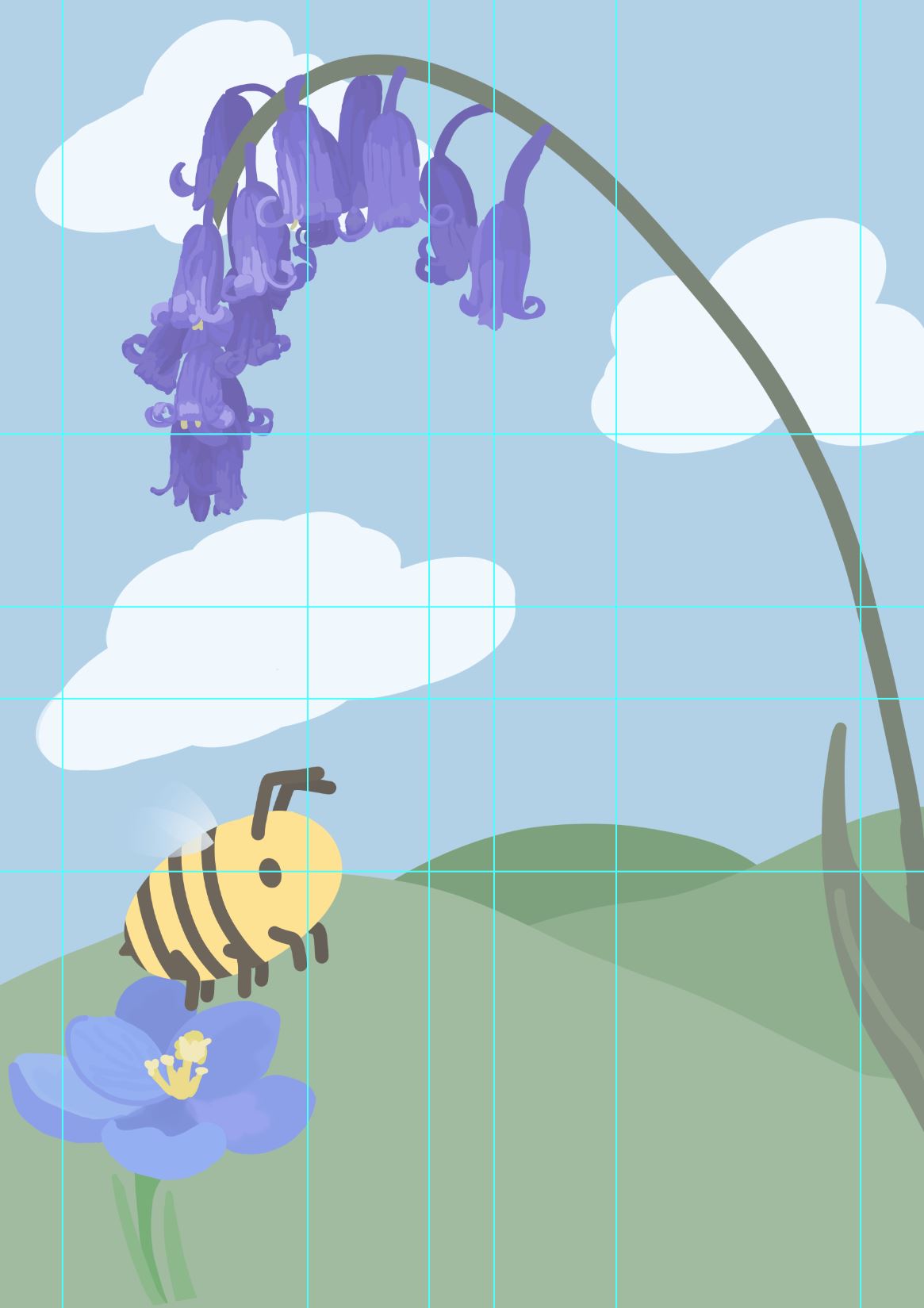
I then made some guides in photoshop to try to figure out where the main elements of my poster would go, such as the text and images. I had put the guides at thirds, if I had wanted to use the Rule of Thirds, but in the end I only used the thirds for my rows. For the poster, I chose to use two columns, as this seemed common-place for other posters I had looked at. I also added a margin and a gutter to better tell where my type was going to be.
After deciding how my text was going to be formatted with the guides, I made a bold title to draw attention to my poster. Originally, the type was black, but then I decided to theme it with some orange and a gradiented honeycomb texture. I felt as though this looked quite nice with the theming of the poster, and the bold title would catch the attention of children.
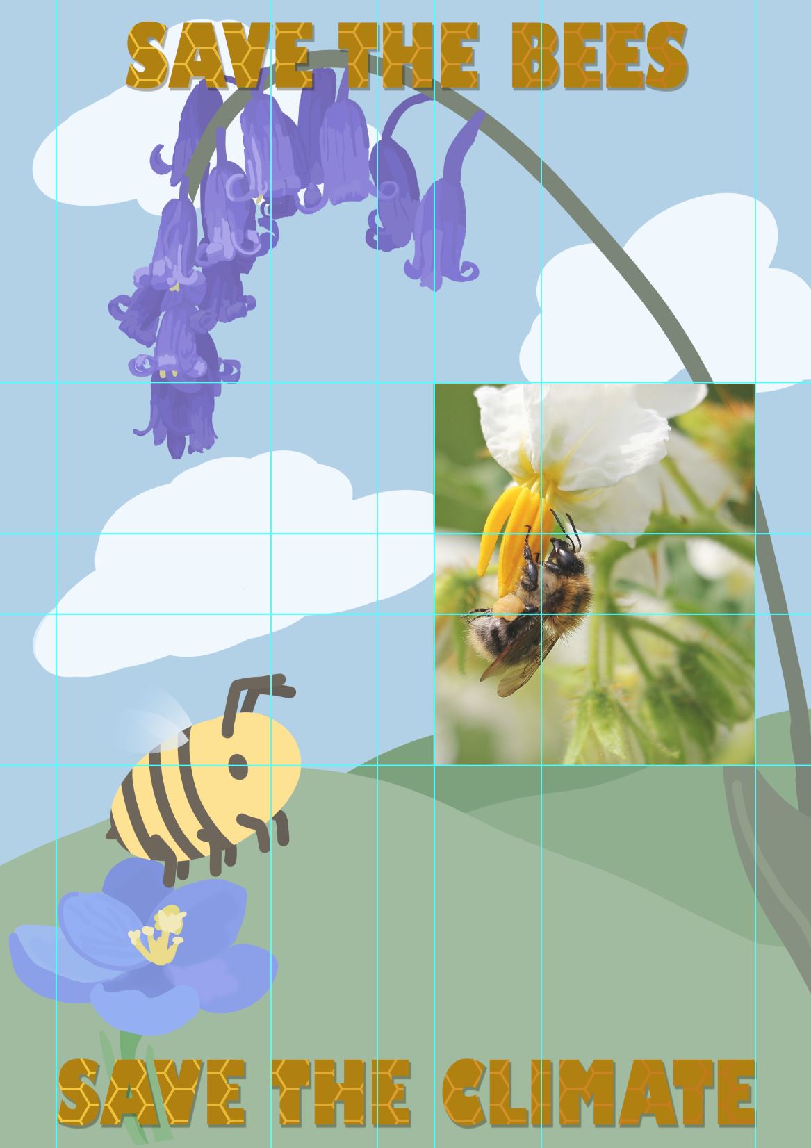
For the body of my poster, I started with adding an image, found on Pixabay, as most posters I'd researched had images on them to further the point made by the poster. I also felt as though the image would do well to break up the text of the poster. I wanted the image to be of a bumblebee, as this was what I had looked at when making my illustration, and I also felt as though it was the cutest bee species which would further drive the point of saving the bees across. If I had chosen a frightening looking bee, people would be more hesitant to read the poster.
Now that I had inputted my image, I now had the rest of the page for text, so I divided this into three different sections.
When writing the type for the poster, I'd originally had it at a smaller size, but afterwards I realised that a bigger font size would be more fitting for my younger audience, as the larger text would be easier for them to read, and if there was too much text they may get bored halfway through reading.
In review, though I do like sections of my poster design, as a whole the design is quite busy, partially due to the detailed background. Though I nice background did feel good originally to draw more interest to my poster, it probably wasn't the best decision to make. I also feel as though the black text isn't fitting for the poster. Initially, it had seemed as though it would be the best so it could stand out from the background, however the stark black doesn't really fit with the rest of the colour scheme which is quite soft.