This task was to create an animated logo that would be similar to something that would appear in a title sequence or a channel indent, this would also have to include audio. This logo could either be 2D or 3D, I chose to make an animation for the Olympics logo, as I felt as though there was a lot of potential for movement within the Olympic rings.
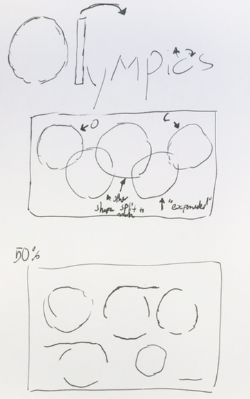
After looking at some examples of animated logos, I was very much inspired by the logo of Squid Game, the viral show on Netflix. I really enjoy how the beginning logo transitions into the Korean text, and the original shapes are still highlighted within the new text on the screen. I decided that I wanted to try this effect with my own chosen logo, which I had hoped would be easy to do as the Olympics logo consisted of a similar theme of geometric shapes interlinked. I then made a storyboard illustrating how each circle would be made up the text of 'Olympics'
After trying to start this idea, I had many issues with my attempt to make it, and soon realised that this chosen theme was a bit above my skill level being that this was only my second time making something within after effects. Due to this concern, I changed my storyboard so that my new idea would be a bit more simple.
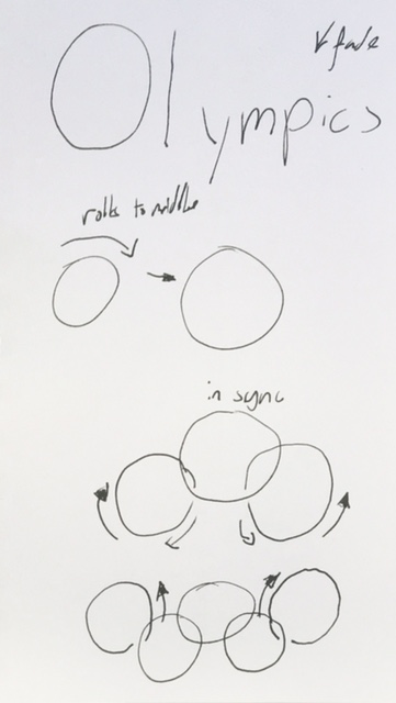
My new storyboard now fit a bit better within my comfort zone, whilst still incorporating aspects that were a bit challenging as I hadn't experimented with them yet. I considered this type of thing to be a bit more of a logical step for my next use of the program.
This storyboard started with the word 'Olympics' and then the 'lympics' part of the word would fade, which would be followed by the O rolling to the middle (by changing its position whilst rotating). This would now leave the O in the position of the black ring in the Olympics logo. After the ring had found it's place, the circles that linked to it would start appearing through the stroke line in sync, and both lines would be reflected from one another. After this the next two linked rings would appear through stroke as well, but this time counter to the direction of the ring it was linked to. After these circles had been complete, the logo would then have appeared and be finished.
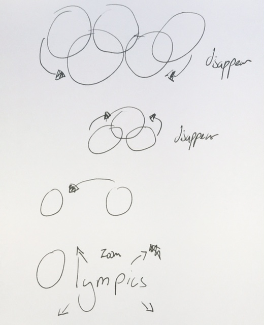
The previous storyboard illustrated how the text would transition into the logo, however I decided to create another storyboard showing the rings transitioning back into the original word. This would make the animation loopable, as well as using some of the ideas I'd had for the previous storyboard that I wasn't able to use.
With this section of the animation, the rings would fold back in under each other, similar to cards, going in the reverse order that they appeared, in a similar style of a unified two-by-two. By the end the rings would unite into one central ring again, after this, the one right would then roll back to it's original place, and then the 'lympics' would scale back up to it's normal size, becoming identical to the first frame.
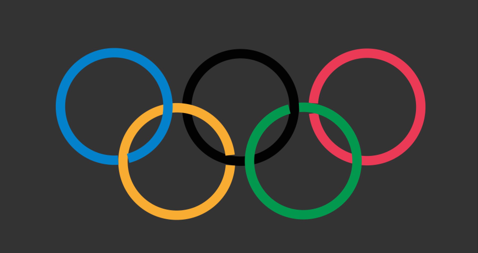
I started this animation with making the Olympic logo, as I felt this would be a key point in the timeline that would need to be exact. Unfortunately, due to my lack of knowledge in after effects, I wasn't able to figure out how to make the rings link, so I had to make the circles incomplete using the stroke at 97%, giving the illusion they were linked. Whilst at a distance they looked fine, but any further looking would result in being able to see they were unaligned and didn't quite look right.
I also chose to use a dark colour for the background as many animated logos had colours close to black as a background, however I couldn't make mine too dark as I still needed the black ring to stand out.
After making the logo, I came back and started on the beginning frame. I started by trying some ideas for the font of the 'lympic' of the word. I was trying to go for a bold serif, however not much looked right due to the difference in stroke and size of the O, but this couldn't be changed as it needed to function as the black ring in the logo. I tried increasing the spacing between the letters, which did make it fit better, however it did still look slightly out of place.
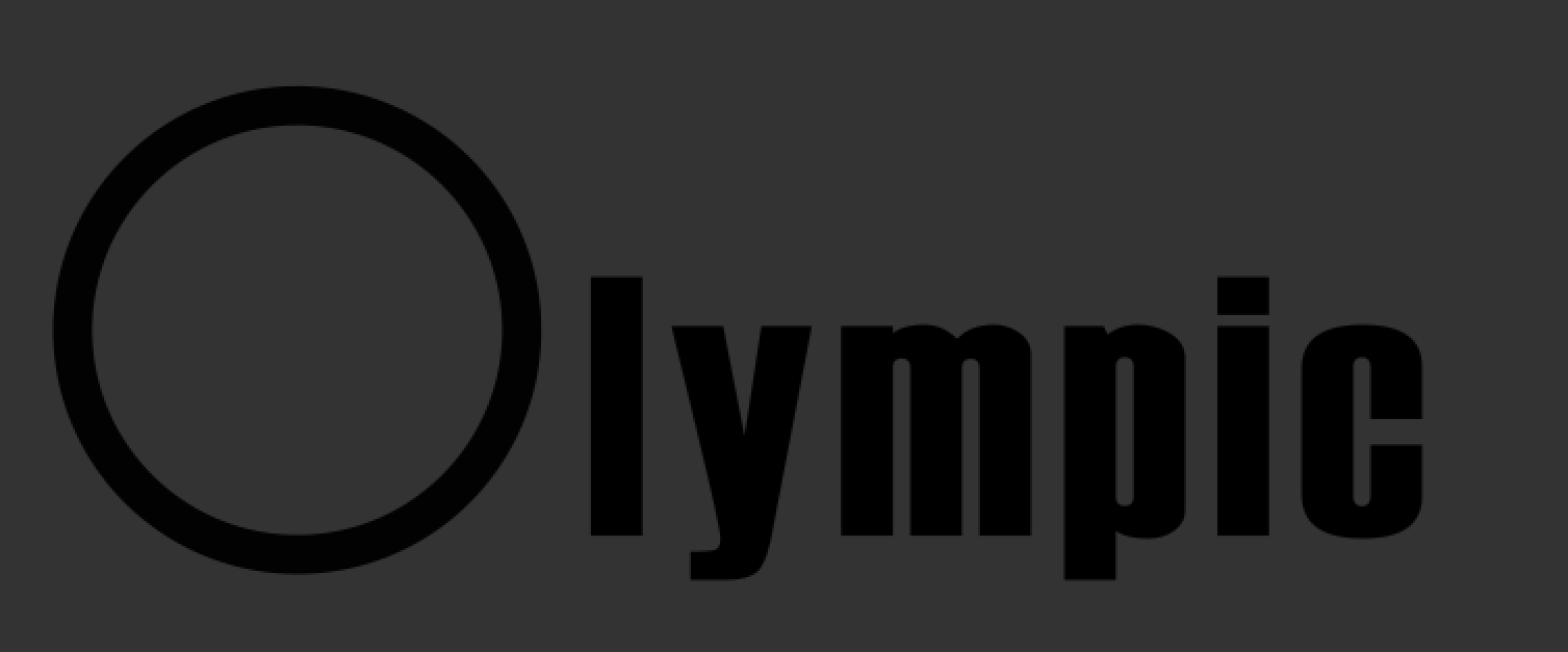
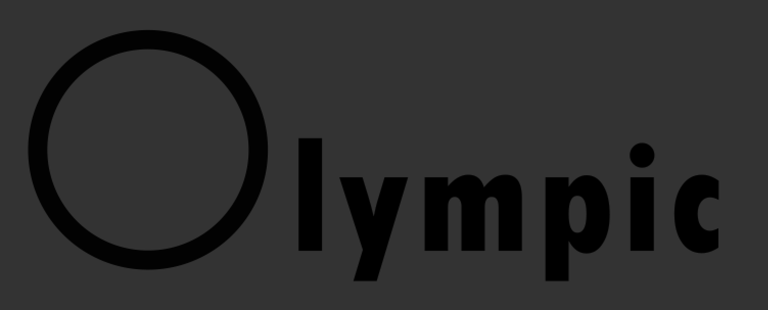
Immediately upon starting to animated this sequence, I realised that the animation of rolling the ring wouldn't work, as it wouldn't show the rotation with it being a ring. I had to then find a work around for this, as the circle just moving wouldn't be very interesting. In replacement, I though that a change in both scale and stroke size, in addition to the change in position, would give enough variety for the animation to look interesting. This change then allowed for more freedom when creating the first frame, as I was now able to make the O thicker, and smaller, so that it fit more reasonably with the font used for the rest of the word.
Another thing I found whilst animating, is that because I had used the stroke feature for the rings to look interlinked, the rings were now incomplete and so growing from the stroke wasn't synced up on both sides. This was because both rings had to start at the link, and this was not symmetrical. I'm sure if I was more knowledgeable in after effects, I could have come to a solution to this problem, but I couldn't. Instead I just had the rings start and end at the same time, whilst starting at different points. Though not exactly what I envisioned, I think it still looks quite nice. This problem then persisted when they folded up on top of one another, as now there would be large visible gaps. To fix this, I had them slowly grow whilst they were moving, so that it wouldn't be too glaring of a change to notice. Another issue I had with this section was that when they folded up, due to how they interlinked, blue was on top, and no amount reordering could change that black would need to be on the bottom (otherwise the main black ring would have gaps where it linked). With blue being on top, this meant that when it returned to position, the animation wouldn't be exactly loopable. To fix this, when the ring was returning to the original position, I had the stroke change slowly to black. I think this change was quite smooth and worked well.
Within the audio area of the animation, I had large issues. Not only have a I never worked with audio before, but I also had no knowledge on where the best place to find fitting audio would be. I did give the audio an attempt, with my lack of experience, and though I definitely learnt something about how to input audio in after effects, I'm quite unhappy with the result audio, but I don't really have the knowledge or resources to improve upon this.